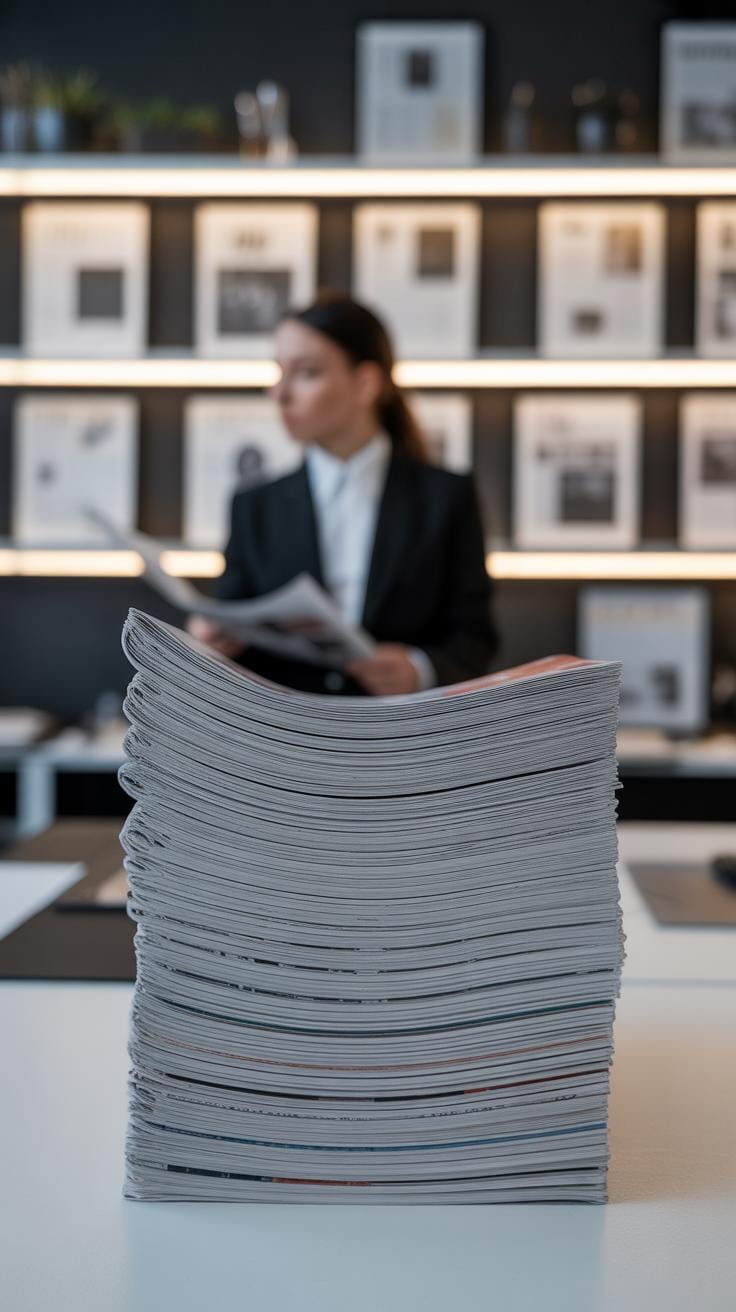
Introduction
The way a newspaper is laid out plays a big role in whether people keep reading. Modern newspaper layout strategies focus on making the paper easy to follow and enjoyable to read. These layouts help guide readers through the stories and keep their interest alive. With clear sections, smart use of space, and strong headlines, newspapers can hold the attention of busy readers.
In this article, you will learn about different methods and ideas that make a newspaper look good while staying practical. We will explore how layout choices like columns, images, and font styles work together. You will find simple tips to create layouts that make readers want to come back for more news every day.
Understanding Basic Newspaper Structure
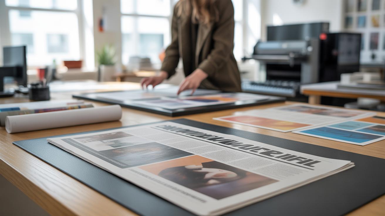
Newspapers are organized using a set of basic parts that help readers find and understand information quickly. You can think of these parts as the building blocks: sections, columns, headlines, and images.
Sections divide the paper into thematic areas like News, Sports, Opinion, and Lifestyle. Each one groups relevant stories, so readers know where to look depending on their interests. For example, someone curious about local politics won’t need to sift through entertainment news.
Columns, on the other hand, break text into vertical strips. This makes long articles easier to scan and follow. Wide blocks of text can feel overwhelming, so columns help by creating manageable chunks the eye can jump across without losing track.
Headlines serve as signposts. They grab your attention and hint at what the article is about in just a few words. Good headlines make you want to read more, sometimes sparking curiosity or emotion. They also help skim readers decide instantly which pieces matter most.
Images do more than decorate. They support the text by illustrating key points, adding context, and breaking up monotony. When a page feels too dense, photos or graphics give your eyes a rest, making the reading experience less tiring.
All these elements work together to guide how you move through a newspaper. They arrange information logically and visually, so your brain spends less effort figuring out where to go next and more on absorbing the news itself. Does your favorite paper use these parts effectively? Sometimes, they do it well — sometimes not quite so much.
Choosing the Right Layout Grid
When you look at a newspaper, you might not notice the grid holding everything together, but it plays a big role in how easy or frustrating the reading feels. A grid system is basically a framework that keeps all the content—text, images, ads—lined up in an orderly way. Without it, pages get chaotic pretty fast.
There are different kinds of grids. The column grid is probably the most familiar. Think of the typical newspaper columns you read daily. This style breaks the page into vertical sections and helps flow text naturally from one column to the next. Then there’s the modular grid, which divides the page into smaller rectangular blocks, or modules. This one gives more flexibility, especially if you have lots of different article sizes and images. This can make the page look balanced but also a little more lively, although sometimes it might feel a bit cluttered if overused.
You might wonder: does it matter which grid you pick? Well, yes, because each guides the reader differently. Column grids encourage steady reading, almost like a steady rhythm. Modular grids can highlight key stories by giving them more space, but if not careful, they might confuse the reading order. The choice depends on what you want the reader to focus on and how they’re likely to navigate your content.
Benefits of Grid Systems
Grids do two main jobs: structure and consistency. They keep each page balanced so nothing feels overloaded or empty. When the headlines, photos, and text blocks line up neatly, the eye moves smoothly across the page. Without this structure, readers can get lost or overwhelmed—something you definitely want to avoid.
For example, if a headline jumps around randomly from place to place, you might find yourself pausing, wondering where to look next. But with a grid, the headline always lands in the same spot relative to its article, creating a subtle but powerful guide for the eyes. This kind of balance makes newspapers easier to skim or dive into, depending on how much time you have.
You’ll also notice that grids help maintain consistency between pages. When every page follows similar patterns, readers become more comfortable. They sort of learn the “language” of your newspaper’s layout, making the experience smoother. On the flip side, too strict a grid can make pages feel dull or predictable—so there’s always a trade-off.
Common Grid Layouts
Most newspapers stick to a few classic layout grids. The 3-, 4-, or 5-column grids are common—these give enough flexibility to balance headlines and images without breaking flow. A 3-column layout can feel spacious and easy to read, but might limit how much you fit onto the page. A 5-column grid offers more spots for small articles or sidebars but can risk cramming.
Modular grids are more typical in weekend editions or magazines inside newspapers where varied article sizes matter more. They organize content into blocks, helping readers distinguish separate stories quickly. You might see an important story taking up two modules, while a minor piece fits into one.
There’s also the hierarchical grid, which mixes column and modular ideas to emphasize main stories above the fold and smaller ones below. Using grids this way helps maintain order and flow, preventing the layout from looking like a random collection of articles—and it helps you, as a designer, keep control over how readers move through information.
Effective Use of Typography
Typography does more than just carry the words; it shapes how readers feel and process the information. The fonts you pick, their size, and spacing influence readability and mood in subtle but real ways. For body text, clarity is key. Fonts like Georgia, Times New Roman, or even Helvetica often work well because they hold up in small sizes without causing eye strain.
Headlines can afford to be a bit bolder or distinctive—they catch attention and set tone. Think about fonts like Franklin Gothic or Futura for headlines; they’re clean but add character. You probably don’t want something too fancy or hard to read, especially when quick scanning is involved.
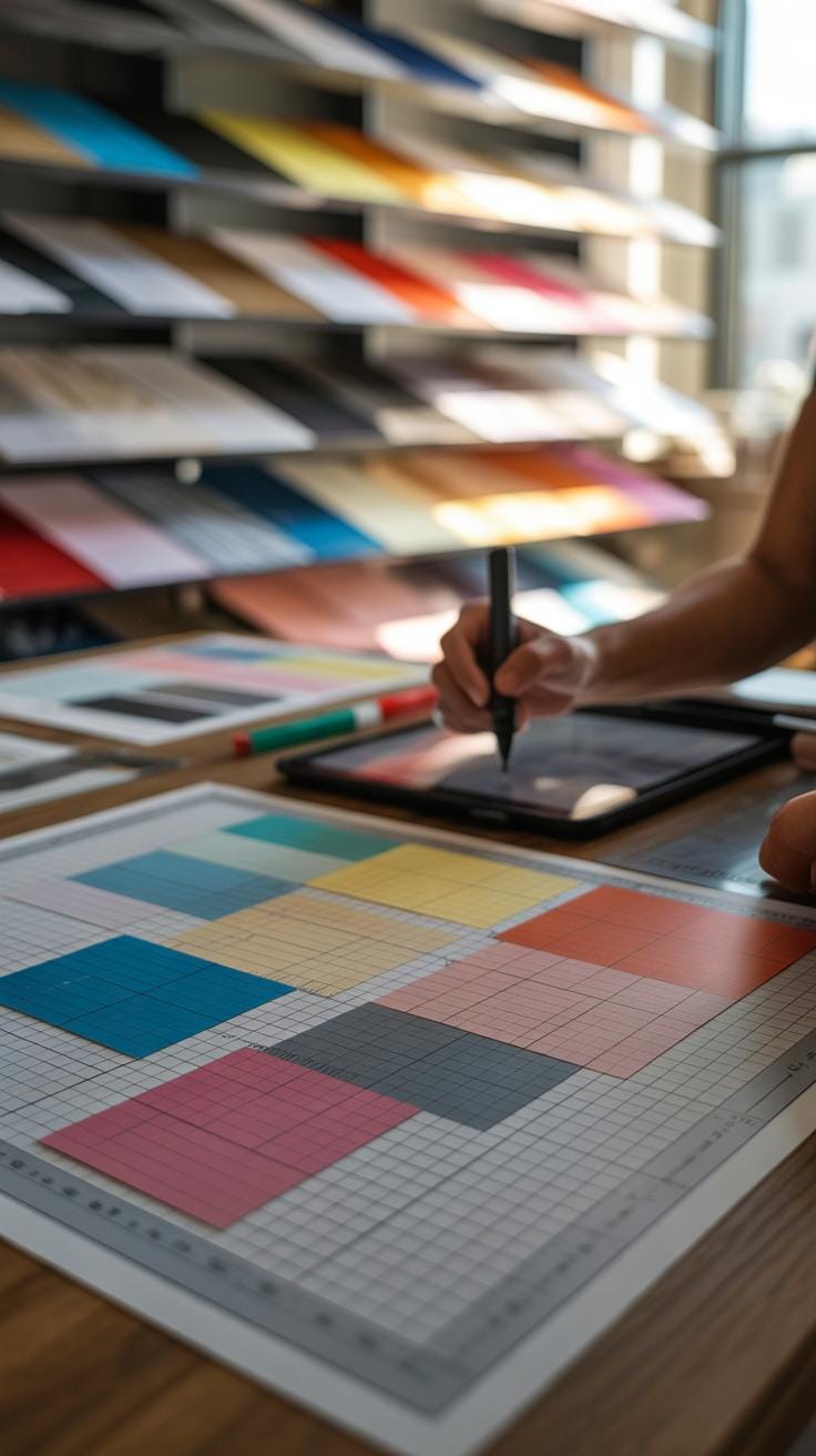
Font size is tricky. Too small, and readers squint or skip; too large, and you lose space and rhythm. A good rule: body text between 9 and 11 points typically fits well, with headlines sized to stand apart but not shout. Tone also matters—serious news sometimes calls for classic serif fonts, while lighter or modern sections might lean sans-serif.
Spacing often gets overlooked but shapes comfort immensely. Wider line spacing—about 1.3 to 1.5 times the font size—can ease reading over long articles. Letter spacing, or tracking, should be subtle; too tight and letters blur, too loose and words disconnect.
Alignment options affect flow as well. Left-aligned text is most common because it’s predictable and easy on the eyes. Justified text looks neat but can introduce awkward gaps that pull focus. Center alignment rarely works for body text but can highlight pull quotes or captions.
Have you noticed how reading a newspaper with cramped fonts feels tiring? That’s why balancing these elements matters so much. It’s not just about looking good but about helping your readers stay longer, dive deeper, and not get lost or distracted.
Balancing Text and Visuals

Combining text with images, charts, and graphics in a newspaper layout can be tricky. If you cram too much in, readers feel lost or overwhelmed. But too little visual content may make your pages look dull and uninviting. The trick lies in balance. Think about your story: does it need a large photo to grab attention or smaller visuals that complement the text? Experiment with size and placement, but don’t let visuals overpower the words.
White space plays a silent but crucial role here. It’s tempting to fill every inch of the page, but empty space gives eyes a rest and highlights the important parts. Without enough breathing room, readers might skip sections or glaze over. I once noticed a layout so packed it was like a wall of information—readers just skimmed. Let your content breathe. Use white space to guide, not just separate.
Using Images to Support Stories
Images shouldn’t be decoration alone. The best photos and graphics add real meaning to the story. A striking image can pull a reader in, making them pause and want to know more. But poor choices—blurry shots or irrelevant charts—can confuse or distract.
Consider placement carefully: images near the headline or opening paragraph grab attention early. Size also matters. A large photo can set tone; smaller images can highlight details. Don’t overuse captions—make sure they add context rather than restate obvious facts. Sometimes I’ve found that a single, well-chosen image can carry the story better than a dozen small ones scattered around.
Maintaining White Space
Empty space isn’t wasted space. It’s where your layout breathes and where readers focus. Having too many elements packed tight can tire eyes and blur messages. I’ve seen pages with just walls of text and graphics, and honestly, I moved on quickly.
White space helps readers pick out what matters, creating a natural flow between chunks of content. It also prevents clashes between text and visuals. If your page feels too busy, ask yourself: can anything be removed or shifted? Even small gaps make a difference, helping readers process without distraction. White space is your ally, not just filler.
Creating Clear Hierarchies
When you open a newspaper, your eyes usually don’t just wander randomly. They seek out the most important parts first. This is what a clear visual hierarchy accomplishes—directing readers naturally through the content without confusion. You want to make it obvious where to look first, second, and so on. That starts with headings and subheadings.
Using Headings and Subheadings
Headings come in different sizes for a reason. The largest heading signals the main story or section, standing out immediately. Subheadings break down the content beneath, guiding you step-by-step through it. For example, a bold headline might say “City Council Debates Budget,” while a smaller subheading under it could specify “Concerns Over Public Transportation Costs.” Readers get a quick sense of what’s coming without reading everything at once.
Try this: when designing, think about scanning patterns. Will your readers look at the big headlines first? How quickly can they jump to the parts that interest them? Different sizes also set expectations. A big heading promises important news. A smaller one signals details. You don’t want this muddled—or readers will hesitate and lose interest.
Emphasis Through Style
Besides size, style helps too. Bold text naturally grabs the eye, perfect for key points or names. Italics suggest something different—maybe a quote or a term needing subtle emphasis. Colors can highlight important info, but be cautious. Too many colors distract, but well-placed changes can make scanning easier.
For instance, you might bold important statistics like “30% increase in sales” or italicize expert opinions. A splash of color used sparingly on a key fact or quote invites the eye without screaming for attention. The goal is a smooth flow, not a jarring experience. It’s a bit of a balancing act, perhaps one that gets easier as you test what works with your audience.
Incorporating Interactive Elements

Digital newspapers have a different rhythm than print. You’re not just reading—they invite you to engage. Clickable links embedded in articles, for instance, help readers dive deeper or access related stories without leaving the page. It feels natural, but you have to use them thoughtfully. Too many links can be distracting.
Videos are a great way to break up text and offer richer context. A brief clip explaining a news event or showing interviews can hold attention longer than just words. Yet, not every story needs a video. Sometimes, a simple photo slideshow or an audio snippet complements the story better, depending on the topic and audience.
Digital Enhancements
Multimedia content changes how the story is experienced. Adding infographics or interactive data sets provides clarity, especially for complex topics. Readers can explore data on their own terms, which often increases engagement. Still, setting this up requires extra effort and tech support, which may not always be feasible.
Embedding social media posts or live feeds connects readers to ongoing conversations. But it can also pull focus away—from the core story. It’s a bit of a balancing act. When done well, these elements enrich the experience and give a sense that the news is unfolding in real time.
Engaging Readers Through Interactivity
Polls are small hooks to keep readers involved. They’re simple but effective ways to get a sense of public opinion while encouraging participation. For example, a quick poll after a political article invites readers to share their take, making them part of the conversation rather than just observers.
Comment sections offer another layer of interaction. When moderated carefully, they create community and keep visitors returning. Still, they can become noisy and off-topic without good oversight. Deciding when and where to enable comments depends on the story and the publication’s goals. Sometimes less is more.
These interactive tools don’t guarantee engagement but, when combined with clear layout and solid content, they nudge readers to linger—and maybe come back.
Testing Layouts for Reader Feedback
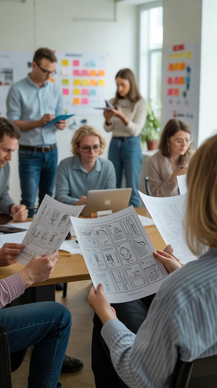
Getting real reader feedback on your newspaper layout can feel tricky. You think you know what works, but readers may surprise you. Testing designs with actual users reveals what holds attention and what gets ignored.
Conducting Reader Surveys
Surveys offer a straightforward way to ask readers what they like—or don’t—about your layout. Keep questions simple:
- Which sections catch your eye first?
- Do you find the headlines clear and easy to scan?
- What parts feel cluttered or confusing?
Short, focused surveys embedded in digital editions or printed inserts can gather helpful insights without overwhelming readers. Sometimes just a few open-ended questions reveal surprising preferences or frustrations you hadn’t considered.
Using Analytics and Observations
Analytics reveal actual behavior rather than stated intentions. Tracking clicks, scroll depth, and time spent on different stories spotlights what draws readers in, and what they skip. Even small shifts in layout can be tested through A/B experiments to see which layout holds readers better.
More advanced tools like eye-tracking studies provide deeper clues—where do readers linger? What do they skip right past? While costly, these observations can refine your design in ways surveys cannot. Still, not every newsroom has the budget for that. Sometimes, simple observation—like watching how people read in a library or café—gives unexpected clues.
Testing isn’t foolproof. You’ll rarely get a layout everyone loves. But by mixing surveys, analytics, and direct observation, you build a clearer picture of how your newspaper offers a smoother, more engaging reading experience.
Maintaining Consistency Across Issues
Keeping a consistent layout from one issue to the next helps your readers recognize your newspaper instantly. When they pick up a new edition and see familiar fonts, spacing, or design elements, it builds a quiet sense of trust. They know what to expect, and that comfort encourages them to engage more deeply. At the same time, too much sameness can feel dull, but without a stable foundation, your newspaper risks losing its identity altogether.
Establishing clear style guidelines is key. Setting rules about which fonts to use, the color palette, and how columns or images are spaced gives your layout a framework that everyone can follow. It doesn’t have to feel rigid—just consistent enough to prevent random shifts that confuse readers.
Refreshing designs while holding on to those core features can be tricky. You might try subtle tweaks: changing headline sizes a bit, updating photo styles, or modifying margins slightly. The goal is to stay recognizable, so regular readers don’t feel like they’re reading something completely new. It’s like updating a familiar outfit without losing the original fit.
Have you noticed how some papers change too radically and you find yourself flipping back, unsure if you’re looking at the right edition? That’s the risk when identity doesn’t anchor design changes. Your challenge: evolve, but keep the familiar.
Conclusions
Creating a newspaper layout that keeps readers interested is about mixing form and function. Strong headlines, clear sections, and good use of visuals all help your readers understand and enjoy the content. Simple designs that avoid clutter let the stories shine. This keeps readers turning pages rather than moving on.
As you design your newspaper, focus on making it easy for readers to find and follow what matters most. Test different layouts to see what works best for your audience. With attention to detail and clear goals, you can create layouts that not only look nice but also bring readers back with every issue.