Introduction
Magazine layout design is a crucial craft that combines creativity and structure to keep readers interested. A well-designed magazine draws you in and guides your eyes smoothly through the content. This article, Masterful Magazine Grid Design For Engaging Readership, explores how a thoughtful use of grids in magazine layouts helps you achieve this connection with your audience.
You will learn how grids act as the framework that holds text, images, and other design elements in balance. We will look at the practical steps and examples to create layouts that invite readers to stay longer, understand the content better, and enjoy the overall reading experience. Let’s begin by understanding what makes magazine layout design truly effective.
The Role of Grids in Magazine Layout Design
What is a Grid and How Does It Work?
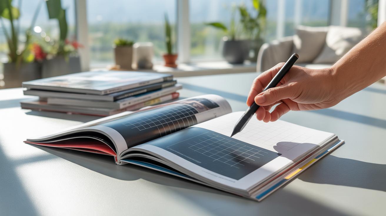
If you think about a magazine page, it might seem like a free-for-all where text, images, and captions just sit wherever there’s space. But that’s rarely the case in professional layouts. A grid is basically an invisible structure made up of vertical and horizontal lines that break the page into columns and rows. Imagine drawing straight lines top to bottom and side to side, creating boxes where different elements can fit neatly.
These columns guide where you place text blocks or pictures, while rows help keep everything lined up horizontally. So, instead of scrambling with random placements, designers use these grids as a kind of scaffold. It helps keep each page tidy and organized, even when juggling lots of content. Without this framework, corners or edges might not line up, and things can feel chaotic, which makes reading harder.
Benefits of Using Grids in Magazine Design
Grids offer more than just neatness. There’s a practical side to them that can really speed up your design process and improve the reader’s experience. For one, balance is easier to achieve — columns and rows give you a rhythm to follow, so your page doesn’t feel lopsided. This visual order guides the reader’s eyes naturally across the page instead of making them wander aimlessly.
Here are some benefits that might seem obvious, but are worth mentioning:
- Consistency across pages makes the whole magazine feel unified.
- A clear structure speeds up designing since you know where everything belongs.
- Readers can scan or dive deep without feeling lost.
- Balance between images, text, and white space makes content approachable.
From my experience, when you skip using grids, your page can quickly look overwhelming or just plain off. The grid keeps things in their place, even if you later tweak the layout. Sometimes, it feels a bit restrictive—like you’re boxed in—but often, that’s exactly what your design needs to stay clear.
Basic Elements of Magazine Layouts
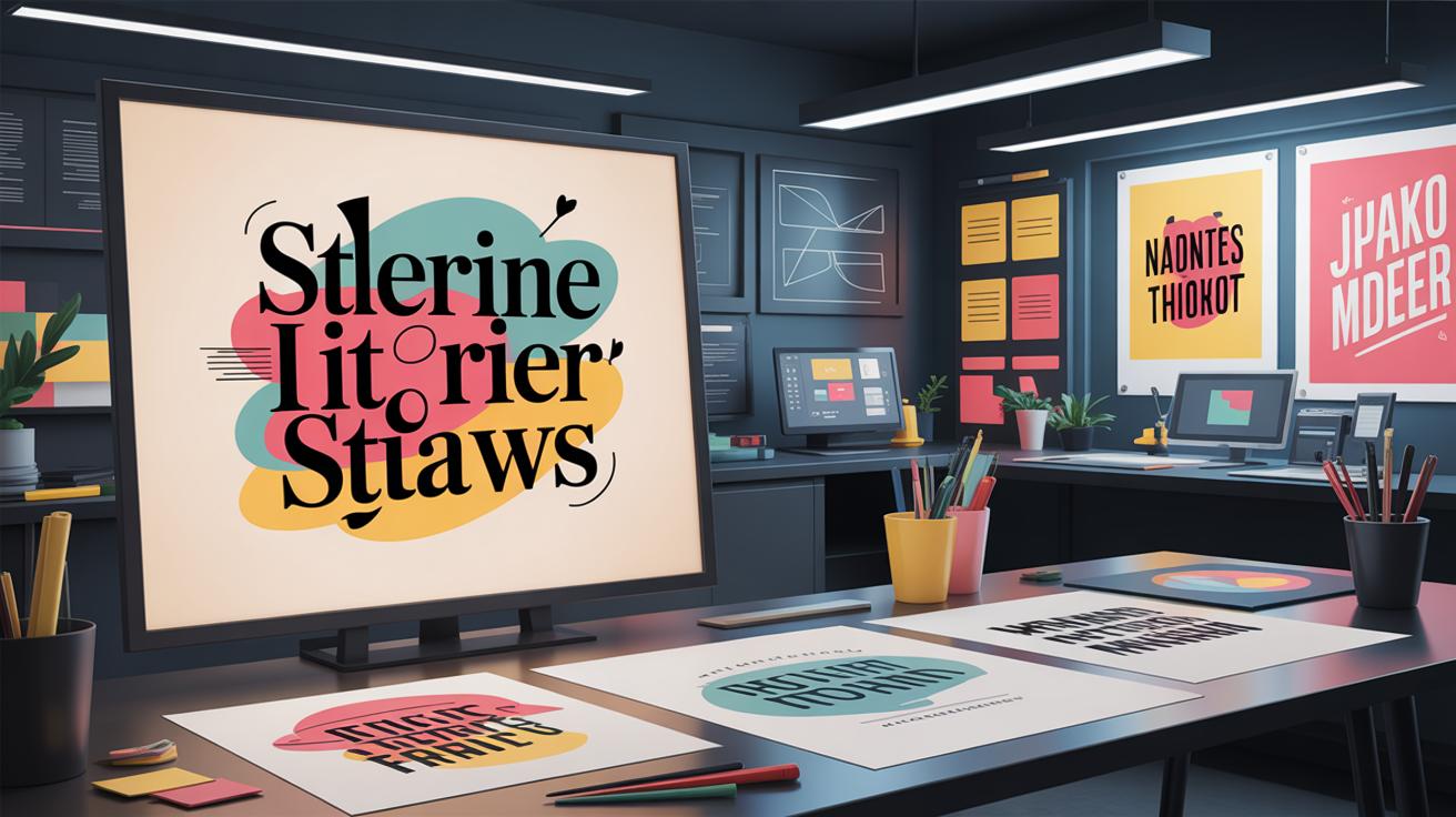
Magazine layouts rely on a handful of core elements that shape how you, the reader, experience the page. Take headers, for example. They announce sections, set the tone, and give you an entry point. Usually bold and spanning columns, headers need to stick to the grid’s vertical and horizontal lines—this keeps them predictable and easy to scan.
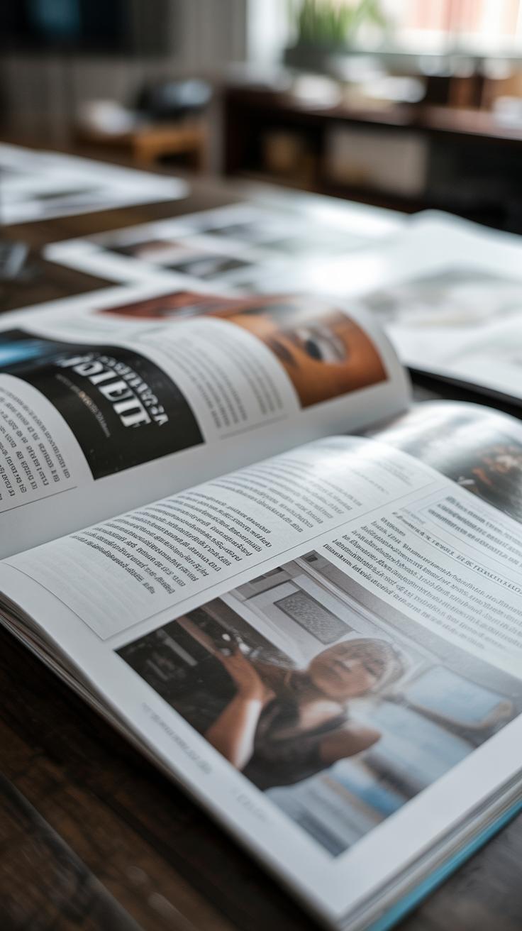
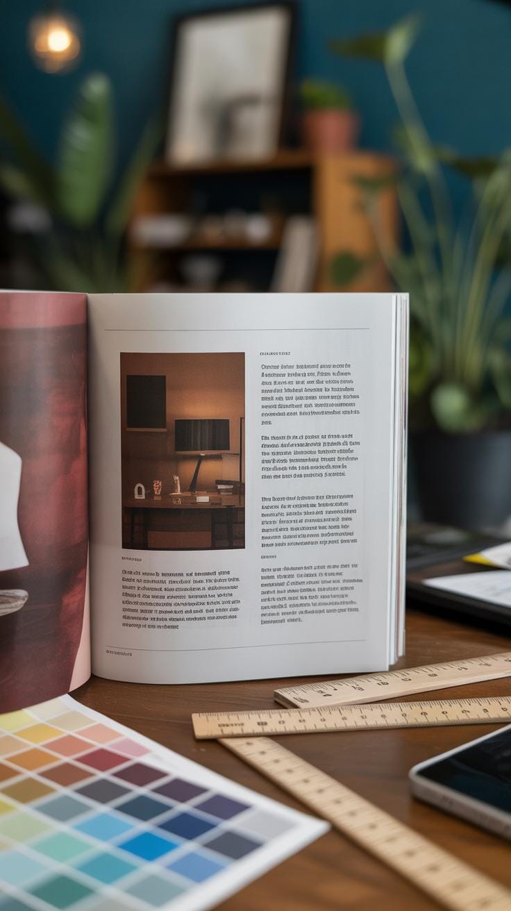
Columns break text into manageable chunks. Whether two or three columns, they offer rhythm and flow, making the dense content less intimidating. These columns follow the grid’s modular divisions, which means each block of text falls neatly inside a defined space. This structure helps you move naturally from one paragraph to the next without losing your place.
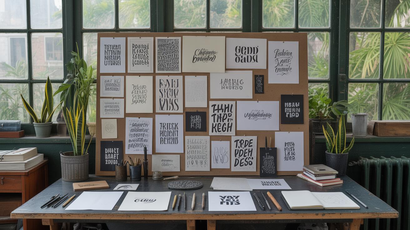
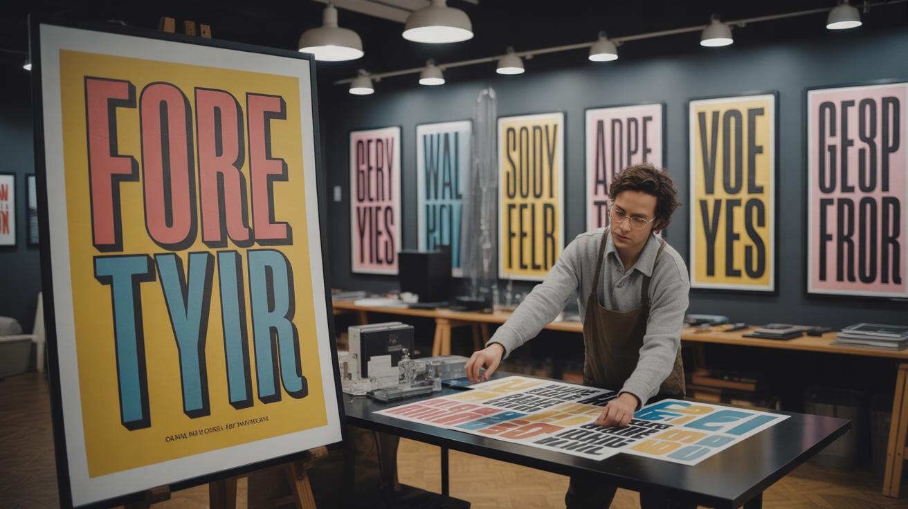
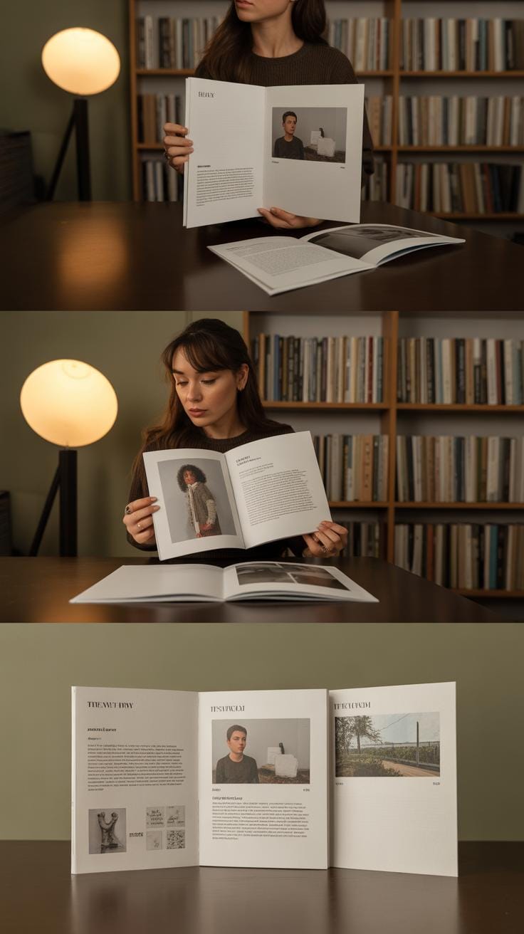
Images add life but also complexity. They often cross several columns or rows, depending on emphasis. Their placement within the grid demands balance; a large photo centered between text columns can pull focus but must avoid crowding other elements. Captions, simple as they look, anchor images with context, usually tucked right beneath or beside the photo, aligned carefully to the grid lines for clarity.
Pull quotes, those snippets that highlight a compelling part of the text, interrupt the flow intentionally. They live inside their own grid “cells,” breaking the uniformity without causing visual chaos. Their role is to entice you to read on, creating focal points amid paragraphs.
White space might be underrated, but it’s actually the quiet space that lets eyes rest. It frames content and defines breathing room. Structured within the grid gaps, white space prevents clutter, making the page feel orderly rather than overcrowded.
Think back to a magazine you’ve flipped through and quickly remember how these elements helped you find what interested you. Each item fits like a puzzle piece—invisible boundaries guide placement so that your eye glides across the page effortlessly. Without this invisible structure, pages would feel scattered, and reading would be tiring.
Choosing the Right Grid Style for Your Magazine
There’s no one-size-fits-all answer when it comes to picking a grid style. It really depends on what your magazine is about and who’s reading it. You might lean toward a single column grid if your content is linear, like long-form essays or in-depth features. It keeps things straightforward, which some readers appreciate, but others might find a bit plain.
Multi-column grids offer flexibility—think of a fashion magazine mixing text, sidebars, and images. They can keep pages lively but might risk clutter if not carefully handled. Modular grids break the page into uniform blocks, which is great for magazines that juggle diverse content types, such as news, images, and ads. They help organize but can feel a bit rigid, limiting creativity.
Then, hierarchical grids guide the reader’s eye through a clear order, suited for magazines with complex stories or strong editorial voices. This style can feel intentional but sometimes may come off as formal or heavy.
Ask yourself: Is your magazine casual or serious? Do your readers skim or dive deep? Your grid style should support the reading experience you want to build, balancing clarity with visual interest. Don’t be afraid to test a couple of layouts. Sometimes the best choice reveals itself only once you see your content in place.
Creating a Consistent Visual Rhythm
When you put together a magazine layout, one of the subtle but powerful helpers is the grid. Using grids does more than just organize space—it creates a steady visual rhythm that keeps readers from feeling lost or overwhelmed. Think about it as setting a kind of “pace” for the eyes to follow. This pace happens through alignment, spacing, and repetition.
Alignment is a core piece here. When text blocks, images, and titles line up along the same edges, the page feels intentional. But if elements jump around on the page without reference points, your readers might find it jarring, even if they don’t consciously notice. Consistent spacing supports this rhythm too. Equal margins around elements or between columns stop the eye from bouncing erratically. Repetition of design elements—like consistent font sizes for headlines or recurring image styles—builds a pattern your brain gets comfortable with. The steadiness feels almost… soothing, if that makes sense?
This consistent rhythm is central to how you guide readers through your magazine. If every page behaves a little differently, they might struggle to follow the flow of ideas. Your reader’s navigation becomes less about enjoying content and more about decoding layouts. It’s tempting to vary designs wildly for the sake of novelty, but often, less is more—at least when it comes to reader comfort.
To keep this rhythm intact, try these practical steps within your grid:
- Align all text and images to a common baseline or vertical axis.
- Maintain equal margins and gutters between columns or modules.
- Repeat key patterns, like headline placements or caption styles, throughout.
These small moves build cohesion. They channel the reader’s attention smoothly from one section to the next. At least, that’s the idea. Sometimes, breaking rhythm can work too—but that’s a different story.
Balancing Text and Images Effectively
When working within a grid layout, the relationship between text and images isn’t just about filling space—it’s about creating dialogue between the two. Images shouldn’t shout louder than the words but instead should quietly support or even anticipate the reader’s understanding. Placing photos or illustrations along the grid’s vertical or horizontal lines helps anchor them, giving a sense of order without rigidity. For example, an image aligned with a column of text feels connected but doesn’t intrude on the reading flow.
Think about image size carefully. A large image spanning multiple columns can pull the eye, but if it’s too dominant, it risks distracting from the narrative. Sometimes, smaller images peppered throughout text columns create a gentle rhythm, breaking up long passages and inviting pauses. There’s no hard rule here—trial and error often reveals the most natural-looking balance.
Maintaining white space is equally crucial. Leaving breathing room around visuals and text prevents the page from feeling crowded or overwhelming. This white space guides the reader’s attention and offers relief. I’ve seen layouts where images sit too close to blocks of text, making pages feel cramped and tiring to read. So, reserve margin on all sides—a little empty space can make a lot of difference. It may seem obvious, yet it’s easy to forget when packing content.
- Align images to grid lines for harmony.
- Use varied image sizes to maintain interest without clutter.
- Leave consistent white space around text and visuals.
- Let images complement ideas, not overpower them.
Finding that balance depends on context and content. Sometimes a bold photograph works best at full width; other times, a small illustration beside a paragraph enriches a subtle point. Ask yourself: does the image add meaning here? If yes, place it purposely within the grid. If it risks overshadowing, rethink its size or position. This mindset keeps your magazine inviting, clear, and engaging.
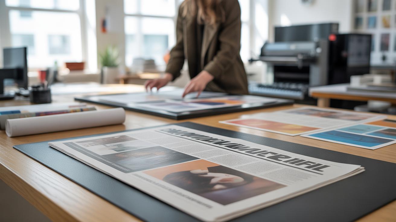
Adapting Grids for Different Content Types
When designing a magazine, one grid doesn’t fit all. Articles, interviews, photo essays, and advertisements each demand something slightly different. You might start with a base grid, but tweaking it is often necessary to make each section feel right—without losing the overall structure.
For instance, articles typically benefit from a multi-column grid. This supports readability and breaks text into manageable chunks. Interviews, on the other hand, might use a two-column layout, allowing for question and answer formatting. Meanwhile, photo essays lean on wider columns or even full-bleed images that span the page, giving visuals more room to breathe.
Advertisements present their own challenge. They often require a looser grid or even a custom format to catch the eye but shouldn’t clash with the magazine’s tone. You can adjust gutter widths or margins here, perhaps experimenting with placement, so ads stand out without feeling out of place.
How do you keep it all looking cohesive, then? Stick with consistent margins, color schemes, and typography. Use repeating elements like subtle grid lines or spacing to create rhythm across sections. It’s a bit like making different instruments play in tune—you want variation, but not chaos.
It’s tempting to think flexibility and cohesion oppose each other, but in design, balancing the two is key. Sometimes I’ve found that stepping back to see the whole spread helps decide whether a particular grid tweak feels harmonious or disruptive. Maybe you’ll try the same with your layouts.
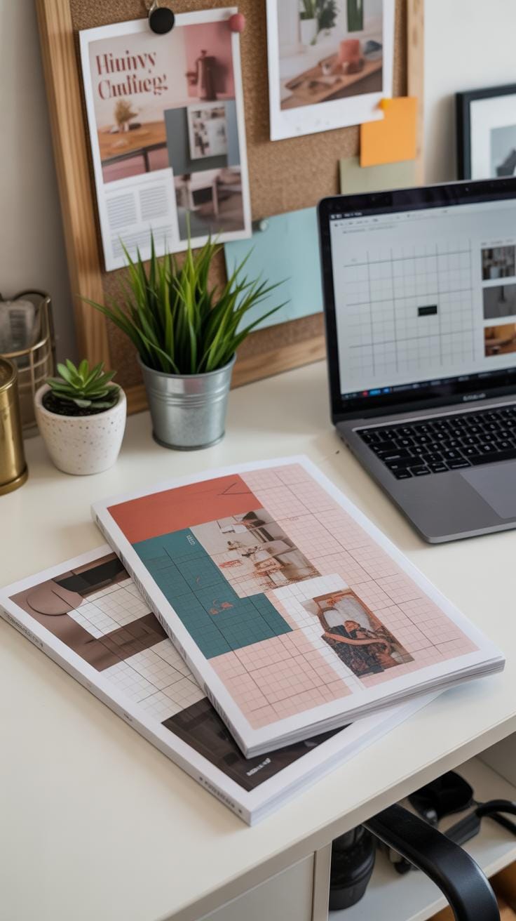
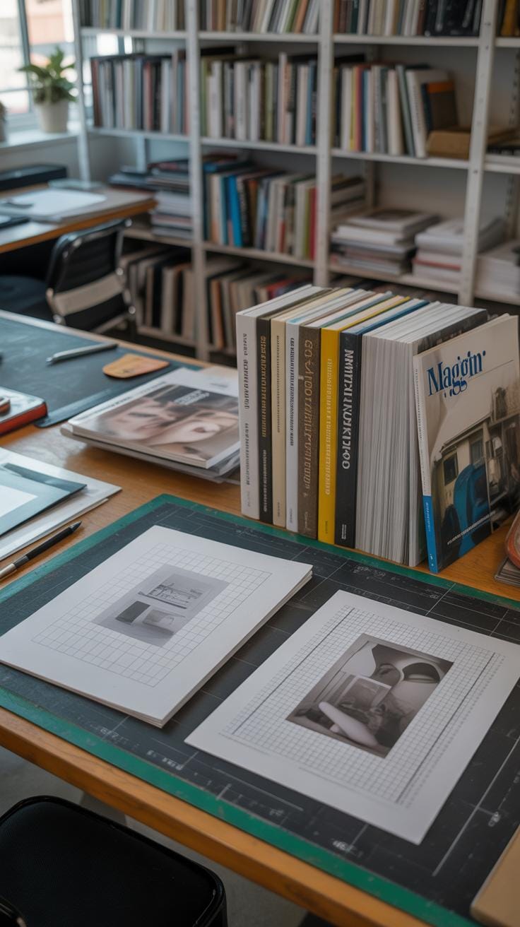
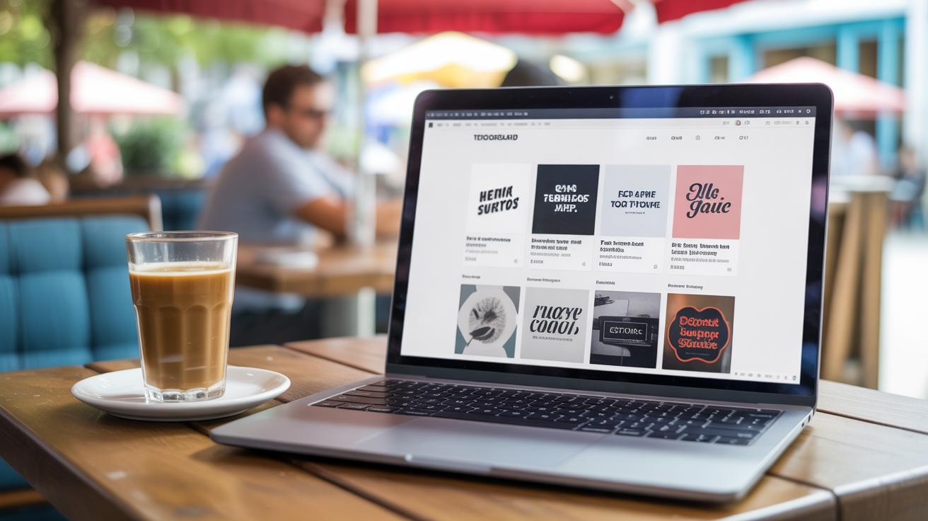
Tools and Software for Magazine Layout Design
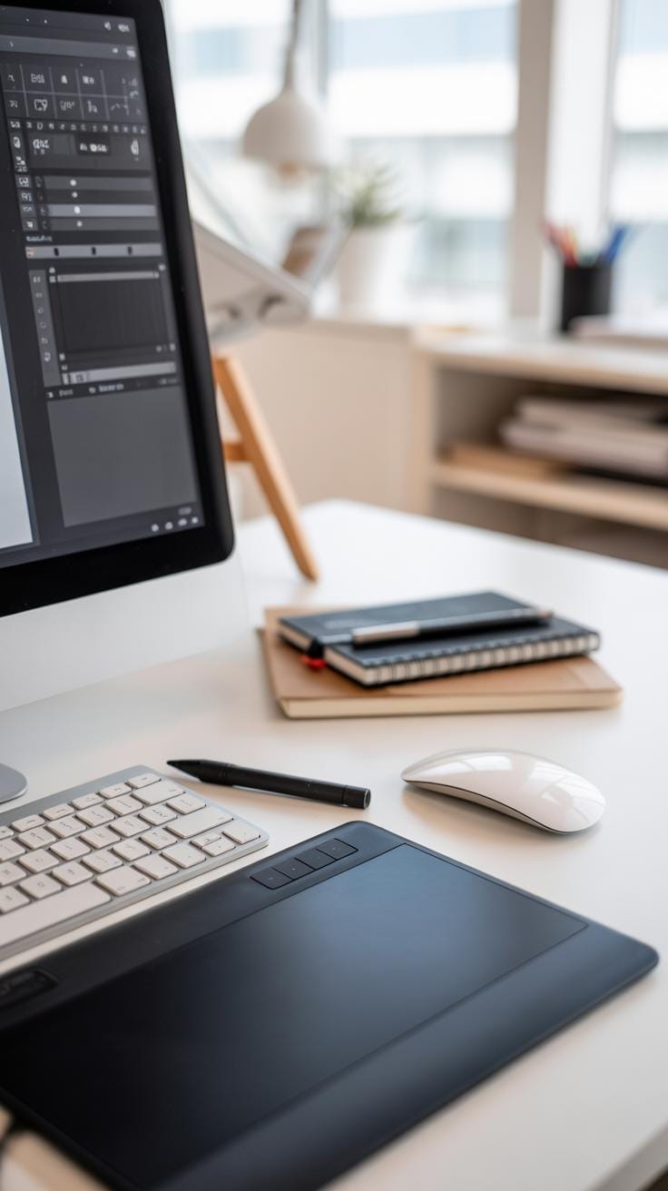
If you’ve ever tried to design a magazine layout without the right tools, you probably know how frustrating it can get. Thankfully, several programs make working with grids easier, providing templates and alignment tools that save time and reduce guesswork. Features like snap-to-grid and rulers help keep text and images neatly arranged, so you’re not constantly nudging elements around.
Popular software for magazine design tends to combine graphic design flexibility with desktop publishing precision. Adobe InDesign often leads the pack—its grid templates and master pages give you a solid foundation. Then there’s Affinity Publisher, which many find a bit more approachable but still powerful, with a neat interface to manage text flow and grid snapping.
Other options include QuarkXPress, celebrated by some traditionalists for detailed control, and Scribus, an open-source alternative that surprisingly holds its ground for simpler projects. Some designers even use Photoshop or Illustrator, mainly because they’re familiar, though those aren’t ideal for text-heavy layouts with grids.
When working within these programs, a few strategies help. Use grid templates from the start; they act like a guide but remember—they don’t have to restrict creativity. Try snapping your images and text blocks to the grid to maintain consistency without overthinking each alignment. Layering guides and locking them in place can prevent accidental moves, which saves headaches later on.
Don’t hesitate to create custom grid styles that cater to the specific needs of your magazine’s content. You might find yourself tweaking columns or gutters based on an image-heavy spread versus a text-dense article. And sometimes, breaking the grid just a little—intentionally—is what gives your layout personality.
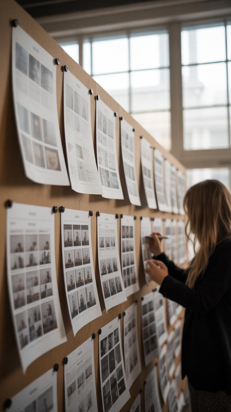
Reviewing and Refining Your Magazine Layout
Once your layout is mapped onto the grid, it’s time to step back and really look at how everything fits together. This stage, reviewing the layout against the grid system, is where clarity and visual balance emerge—or fall short. You might notice some elements feel squeezed or oddly spaced, or perhaps the rhythm between images and text seems off. Don’t be afraid to question whether each piece truly belongs where you placed it.
Checking Alignment and Flow
Focus on alignment first. Are columns lining up neatly? Do text blocks start and end consistently across pages? Sometimes, a headline off by a few pixels can distract more than you’d expect. Also, watch how your eye moves through the page. Does the grid help guide readers naturally, or does the layout feel choppy? If a visual or text box breaks the flow, tweak its position or size. You can even experiment with shifting elements a bit outside strict grid confines if it improves the overall flow.
Final Tweaks to Enhance Engagement
After alignment, look for clutter—and there’s usually some. Maybe some text boxes overlap, or there’s too many images competing for attention. Simplify by removing or resizing these. Play with spacing: wider margins or tighter padding can change the mood. If something important isn’t standing out, try adjusting font weight or introducing a splash of color. Sometimes, subtle changes—like increasing white space around a quote—can make readers pause exactly where you want them. It’s a careful balance, but those last tweaks often decide whether people keep reading or lose interest.
Conclusions
Strong magazine layout designs rely on clear grids to create order and focus. When you apply grid principles consciously, you make it easier for readers to scan pages, find important information, and enjoy the flow of the stories. The grid becomes more than lines; it turns into the silent guide that shapes every page.
As you design your magazine layouts, remember to use grids flexibly, keeping your reader’s journey in mind. Mastering these design techniques will help you engage your audience and deliver content in a way that feels natural and pleasing. Embrace grids as your tool, and watch your readership grow as a result.