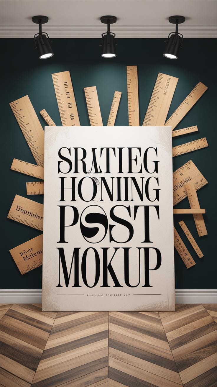
Introduction
Typography is a way to arrange letters and words to make messages clear and appealing. When used in poster design, typography can attract attention and deliver information effectively. Learning how to create eye catching typography posters can help you make your marketing stand out.
This article explores typography poster design and how it impacts marketing. You’ll learn the basics of typography, how to choose fonts, arrange text, use color, and create posters that grab viewers’ attention. By the end, you will have useful ideas to improve your own marketing posters.
Understanding Typography And Its Role In Poster Design
Definition and History of Typography
Typography is basically the art and technique of arranging type to make written language clear, readable, and visually engaging. It’s not just about picking a font but also how letters and words are spaced and organized on a page or poster.
Its origins go way back to ancient times—with carved inscriptions in stone, handwritten manuscripts, and early printing presses like Gutenberg’s in the 15th century. Each stage brought new changes: movable type led to mass printing, then industrial advances introduced mechanical typesetting, and now we’re in the digital age with endless font choices at our fingertips.
So typography has evolved alongside communication itself, shaping how people receive and interpret information.
Why Typography Matters In Posters
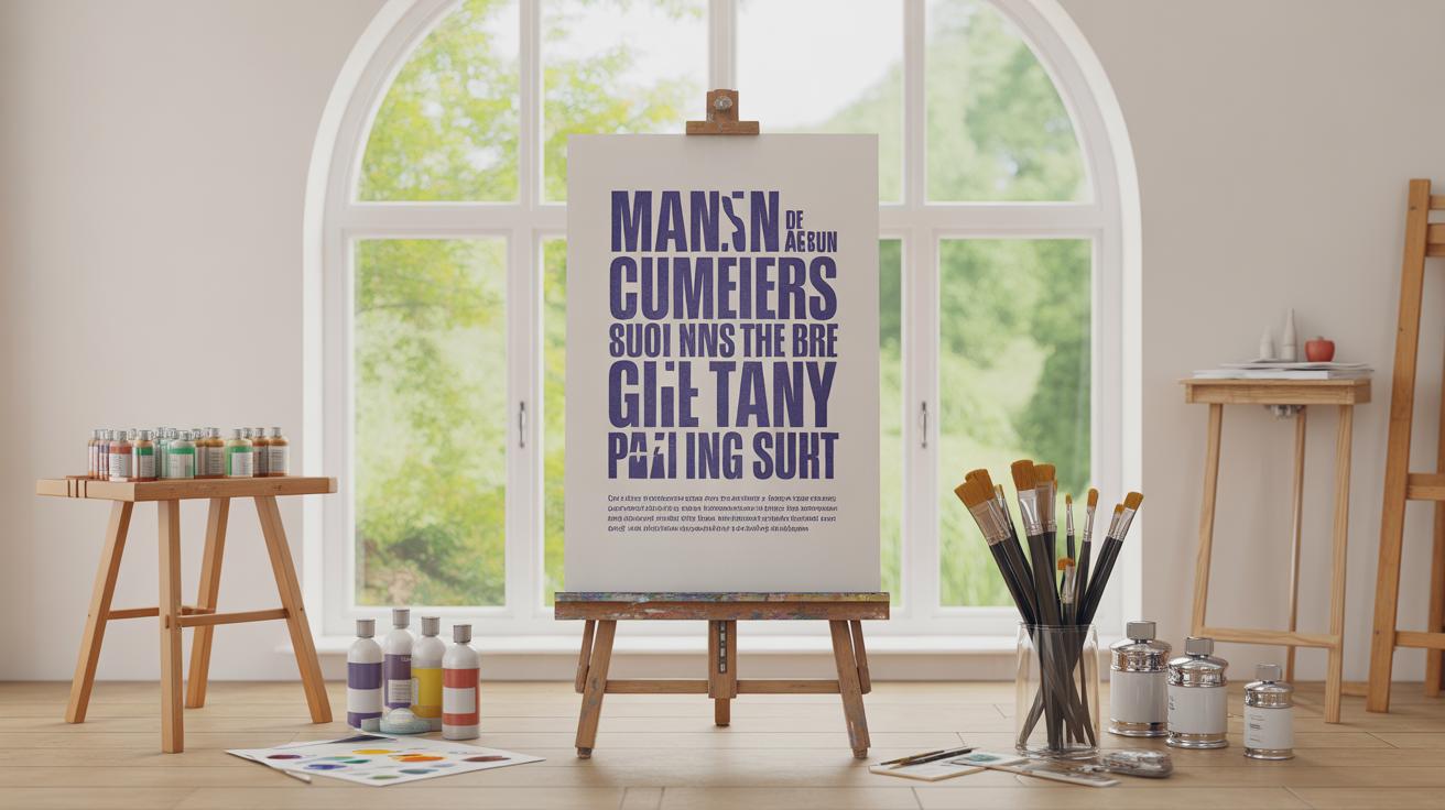
When it comes to posters, typography does a lot more than just display words. It grabs attention, sets the tone, and guides the viewer’s eye through the message.
Think about it: a bold, clear headline can pull you in from across a crowded room, while the right font choice can evoke emotion or build trust. Poor typography, on the other hand, might confuse people or turn them off entirely.
In marketing, where every second counts, the way type looks can influence whether someone remembers your product or just walks past. It creates an immediate connection and sometimes says more than images alone could.
So, typography isn’t just decoration— it’s a powerful tool in visual communication and marketing effectiveness that shapes how your message lands with your audience.
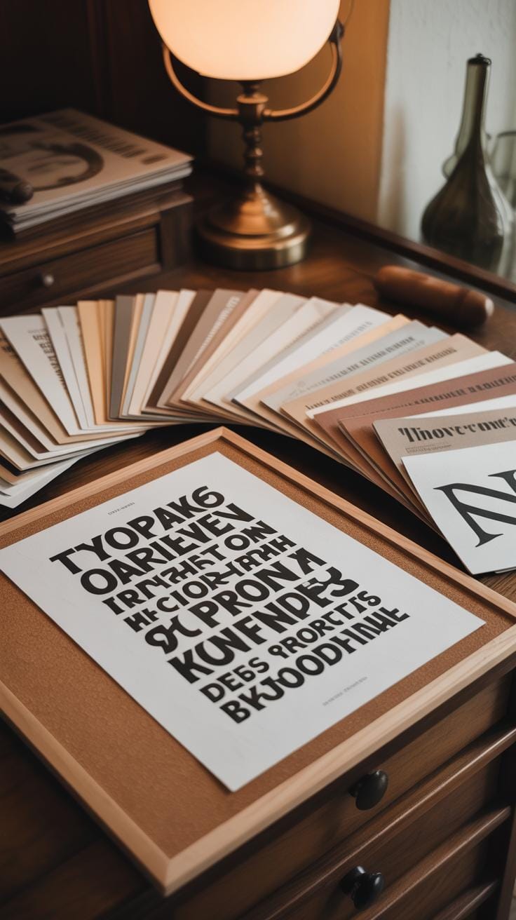
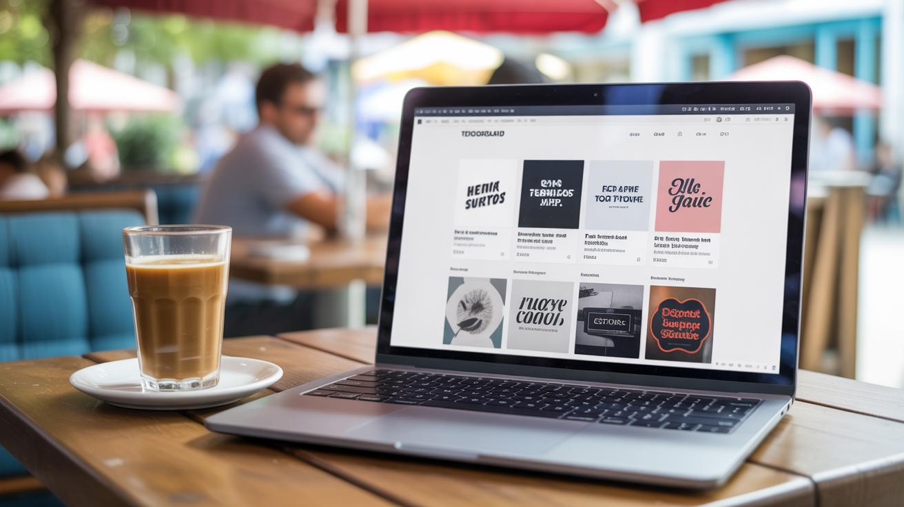
Choosing The Right Fonts For Your Poster
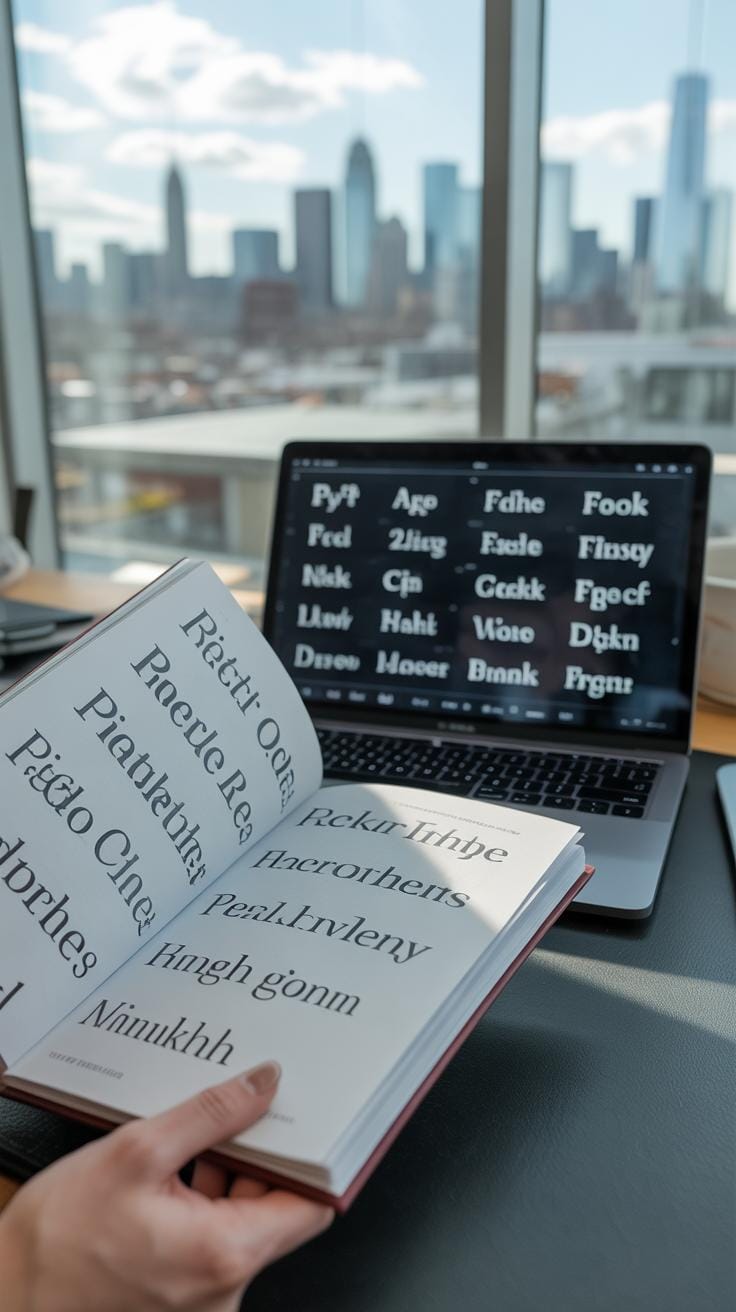
Picking the right font for your poster isn’t just about what looks cool—it’s about what fits your marketing goal. Fonts each carry their own personality, and they shape how your message feels before anyone even reads a word. You might want your audience to trust you, feel excited, or take something seriously. The font sets the stage for all that.
Let’s break down some common font types and where they tend to work best:
- Serif fonts like Times New Roman or Georgia have little strokes at the ends. They often feel traditional, reliable, and serious—good for anything that wants to say “professional” or “trustworthy.” You’ll see them a lot in finance or legal posters.
- Sans serif fonts such as Helvetica or Arial drop those strokes and look cleaner, simpler. They come across as modern, straightforward, and approachable. Perfect when you want a fresh, no-nonsense vibe, like in tech or lifestyle marketing.
- Script fonts mimic handwriting and tend to feel personal, elegant, or playful. They can be tricky though—too much script and your message might get lost or look less serious. Use script fonts carefully for invitations, beauty products, or artistic events.
- Display fonts are loud and attention-grabbing. They’re designed to stand out at large sizes, often with quirky or unique shapes. Great when you want to inject personality or grab quick attention, but perhaps not the best for the bulk of your text.
When choosing a font, think about your brand’s tone and the message you want to send. Are you aiming for warmth or authority? Excitement or calm? For example, a charity poster might use a friendly sans serif to invite empathy, while a luxury brand could opt for a sleek serif or an elegant script to signal exclusivity. Font choice influences how your audience interprets your message—it’s not just decoration.
Have you ever noticed how some fonts just don’t feel right even though the words are the same? That’s your brain reacting to the personality behind the letters. So, take a moment to hear what your font is saying, beyond the words themselves.
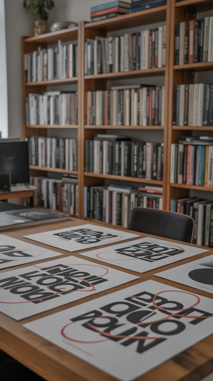
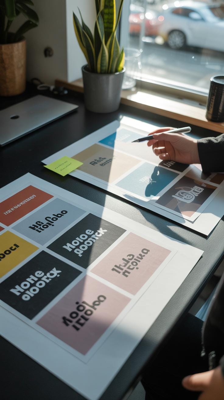
Mastering Typography Layout And Composition
Getting your typography layout right is more than just placing text on a poster. It’s about creating order—so your message doesn’t get lost or ignored. Think about alignment first. When text lines up neatly along a margin, it helps readers scan quickly. But too rigid an alignment can make things feel mechanical. Sometimes a bit of ragged edge or varied alignment can add personality. Still, a consistent baseline keeps things comfortable to the eye.
Spacing plays a key role too. Crowded letters or words strain the reader, while too much space breaks the flow. Margins, line spacing, and even the gaps between paragraphs must feel balanced—not forced. A quick trick I often use: imagine breathing room for each block of text; if it feels suffocating, give it more space. But don’t overdo it, or your poster might look empty.
Visual hierarchy guides the viewer’s gaze step-by-step. Use size and weight differences to highlight what’s important first: the headline, then subheadings, and so on. Placement matters as well—usually, people start reading at the top or center. Yet, don’t be afraid to experiment with unconventional layouts if your message calls for it. The goal? Make it obvious what to read first without overwhelming the eyes.
Try asking yourself: What do I want the viewer to notice immediately? What details can follow? Organize your text blocks so the journey feels natural, not rushed or confusing. Sometimes, less structure can also invite curiosity. Typography posters demand balance, but they don’t always need to be perfect to be effective.
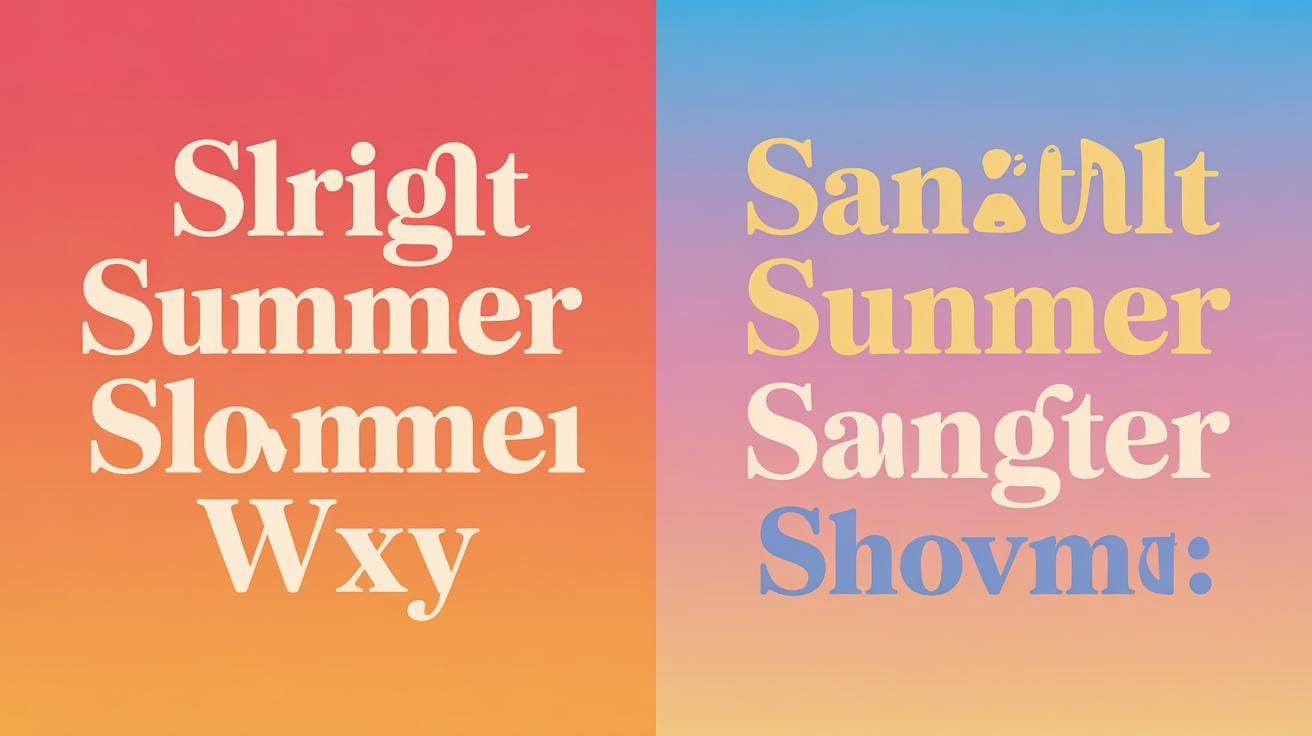
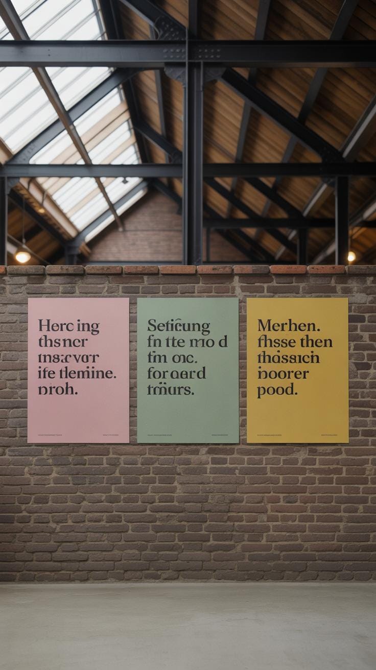
Using Color Effectively In Typography Posters
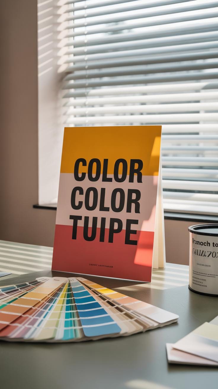
Color is more than just decoration—it shapes how your typography stands out and how people feel when they see your poster. Basic color theory helps here. Think of the color wheel: complementary colors sit opposite each other and create strong contrast, while analogous colors sit next to each other, giving harmony. Choosing the right colors can make your text pop or blend, depending on your goal.
But there’s a catch. Color can either highlight your message or distract from it. A bright background paired with a similarly bright font can make the words disappear. On the other hand, dull colors might wash out your poster. It’s a balancing act that can sometimes feel a bit subjective—what looks clear to one person might feel muddled to another.
Choosing Colors For Readability
To keep your text readable, focus on contrast. Dark text on a light background or light text on a dark background usually works best. Some pairs tend to cause trouble:
- Bad combos: red text on orange or green text on blue—these hurt the eyes and confuse the message.
- Good combos: black on white, navy on pale yellow, or white on deep charcoal—these create clear, sharp visuals.
Sometimes you want to soften the contrast to avoid harshness, but don’t sacrifice legibility. A faint pastel behind white text? Probably not a great idea. You might need to test your choices under different lighting conditions or on screens to be sure.
Color Psychology In Marketing
Colors evoke emotions and can influence decisions—though not always predictably. Blue often signals trust and calm, which explains why banks use it a lot. Red can create urgency or excitement but may also feel aggressive if overdone. Yellow might convey optimism or caution.
Think about your marketing goals before picking colors. Are you aiming for trust? Then blues and greens might help. Trying to spark quick action? Reds and oranges could push viewers toward that impulsive click. Want a fun vibe? Bright yellows or purples might work—though, depending on context, they could also feel childish.
In the end, color choice interacts with cultural backgrounds and personal preferences—so it’s not an exact science. Testing and paying attention to your audience’s reactions can guide your choices more than any rule.
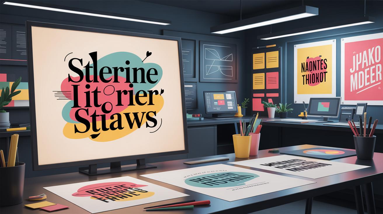
Incorporating Images And Graphics With Typography
Balancing Text And Visuals
Combining text with images in a poster can feel like walking a tightrope. Too much, and your message drowns; too little, and it falls flat. I’ve seen posters where the text almost disappears into the background because it wasn’t placed carefully. You want to avoid that.
Try placing your text in areas with ample negative space. Often, the edges or corners of images work well, but be mindful not to trap text in busy spots. Sometimes, throwing a translucent shape behind the text helps maintain readability without isolating it completely.
Also, don’t crowd your design. Keep some breathing room around text and visuals. Ask yourself: does this placement help the viewer focus? If the answer is no, then tweak it. You want harmony, not competition, between elements.
Using Graphics To Enhance Message
Graphics aren’t just decoration—they can actually carry part of your message. Small icons, simple illustrations, or geometric shapes can emphasize key points or guide the viewer’s eyes.
For example, a subtle arrow pointing toward a call to action or a minimalist icon representing a product category works well. They shouldn’t shout louder than the typography but rather support it, almost like a quiet nod.
Don’t feel you must add many visuals; sometimes, less is more here too. The graphics should feel intentional, not an afterthought thrown in to fill space. I remember a poster where a simple line drawing gave context to the headline without crowding the layout. It made the whole thing more engaging and clear.
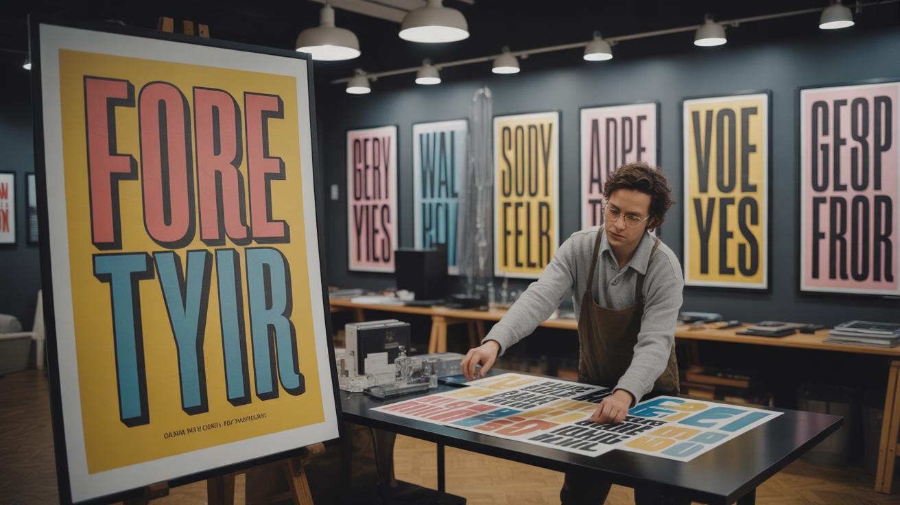
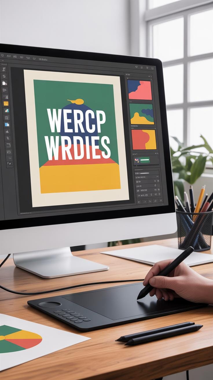
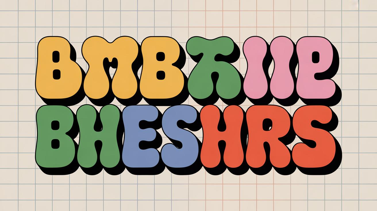
Creating Impact With Typography Style Choices
When it comes to making your poster’s message stand out, font size and weight are the quickest tools to grab attention. Larger fonts naturally draw the eye first—think of the headline or key offer. Using bold type not only adds emphasis but also gives the text visual weight, making it feel more important without screaming for attention. It’s almost like a hierarchy you build through size contrast: bigger and bolder means “look here first,” smaller and lighter means “supporting details.”
But choosing size and weight isn’t a simple on-off switch. Sometimes, too many bold elements compete for focus and end up diluting the impact. So, pick only one or two points to highlight strongly. The rest can stay subtle yet readable.
Now, about styles like italics or underlines. Italics work well for emotional or softer emphasis, such as a tagline or a call to action. Underlining can help but tends to clutter if overused—think twice before applying it. Color changes are probably the easiest way to draw attention while keeping the text scannable. Just keep enough contrast to avoid making readers squint or skim past.
Try this with your next design: bold your main message, italicize a supporting phrase, and maybe add a splash of color to a keyword. See how it guides your eyes naturally, rather than overwhelming.
Avoiding Common Typography Mistakes In Poster Design
Too many fonts can quickly ruin a poster’s impact. If you find yourself tempted to use more than two or three fonts, pause for a moment. Mixing several typefaces often creates clutter rather than style. I’ve seen posters where every word seemed to shout a different thing—confusing and distracting. Simplifying font choices helps focus the message and makes the text easier on the eyes. Stick to one or two fonts that complement each other, and reserve any extra variety for size or weight changes.
Poor contrast is another frequent culprit. Text blending into the background makes reading a task, not a pleasure. Try viewing your poster from a distance or on different screens—if it fades, fix it. Increase contrast by choosing text colors that sharply differ from the background. Also, avoid cramming text too close together; tight spacing causes letters and words to blur together, which strains the reader.
Improving clarity can be as simple as adding more space between lines and letters. Not every font pairs well with narrow spacing, so test and adjust. Let your text breathe. Good habits include consistent margins, logical grouping of information, and checking how your poster looks both up close and afar. These small tweaks build toward clean, effective typography that draws attention without overwhelming.
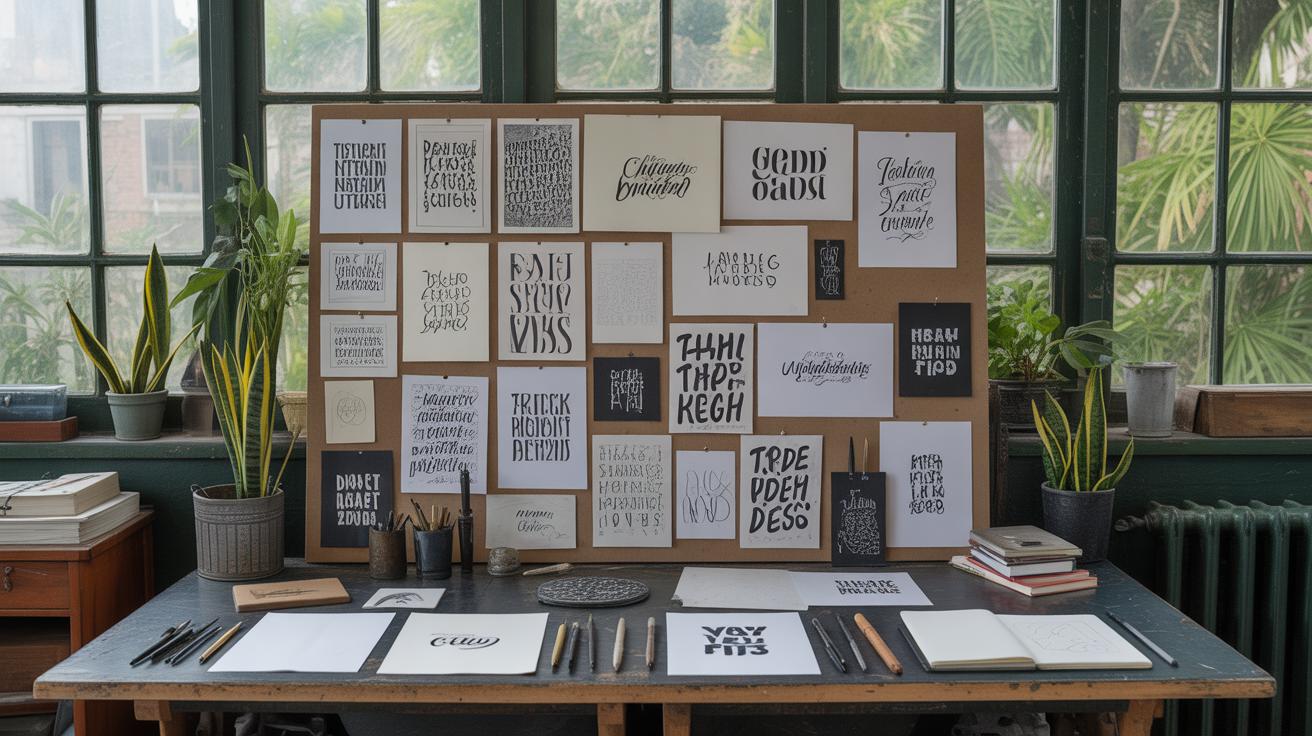
Testing And Refining Your Typography Poster
Once your typography poster takes shape, the real work begins—testing and refining. You might think it looks fine on your screen, but seeing it in different settings changes everything. Start by showing it to others. Ask them what catches their eye first, or if any part feels unclear. Questions like “Which words stand out?” or “Is there anything confusing?” can really help. Sometimes, feedback surprises you—what felt obvious might be missed by most.
Next, check visibility. Print a draft at the actual size and place it where it’s meant to be seen. Step back—say, three to five meters—and see if the text is readable. Squint a bit and note what fades away. Also, test on digital screens if you plan for online use. Lighting, screen resolution, and size can all affect how sharp the text looks.
Don’t skip print proofs. A quick print draft helps catch issues like color shifts or blurry fonts. Sometimes, what looks good in design software can print dull or pixelated. Adjust spacing or font weight accordingly. Testing this way can save you from costly reprints and ensure your poster really connects with its audience.
Using Typography Posters In Effective Marketing Campaigns
When bringing typography posters into your broader marketing mix, placement plays a bigger role than you might first think. Where you put a poster changes how people react to it—and that affects your design choices. For example, a poster in a busy café demands bold, simple type that can be read at a glance, while one in a quieter gallery space might allow for smaller, more intricate fonts.
Think about the flow of your audience’s day. Posters near transit stops or college campuses catch eyes while people wait or walk. Indoor spaces, like store interiors or event halls, offer moments for viewers to absorb more detailed messaging. Your typography needs to fit these contexts—too complex or tiny in the wrong spot, and your message disappears.
Keeping typography consistent with your brand is equally crucial. The typeface, weight, and spacing should feel like the same voice your customers hear on your website, social media, or print ads. When your posters echo that style, they reinforce your identity without saying a word. It might seem subtle, but this steady look across channels makes your campaign stick in people’s minds more.
And don’t shy away from mixing posters with other media. A striking typography poster can prime your audience for similar messages on Instagram or in newsletters. Imagine a bold headline on a poster that matches a social post’s tagline—this repetition helps connection and recall.
Have you noticed how some campaigns just seem connected, even without obvious links? That’s often typography at work. Matching tone and style creates a whisper of familiarity, guiding your audience through the different places your campaign lives. You might try placing your posters where people are likely to pull out their phones—then follow up with digital ads that carry the same look.
Ultimately, placing typography posters thoughtfully and keeping their style firmly in your branding toolkit can turn these visuals from standalone signs into parts of a bigger marketing story. It’s not just about looking good; it’s about making each piece contribute to a shared message that lingers.
Conclusions
Typography is more than just pretty letters. It controls how people see and understand your message in posters. By using clear fonts, smart layouts, and colors, you make your marketing posters work harder to pull attention and share information.
Start experimenting with typography design in your posters. Use the tips in this article to make text easy to read, interesting to look at, and powerful in impact. Your posters can become strong marketing tools when designed with good typography.