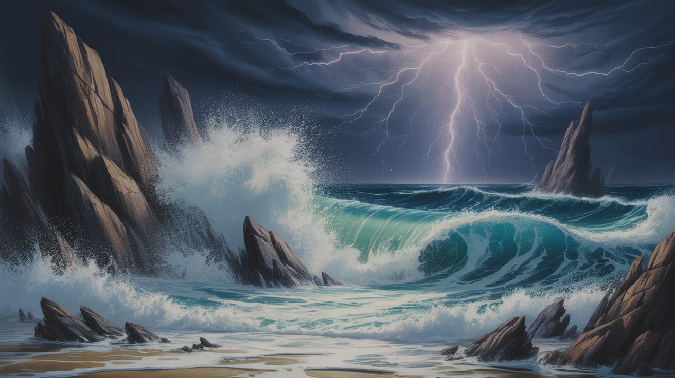
Capturing a Stormy Sea in Mixed Media
The stormy sea has fascinated artists for centuries. Its chaotic waves, dark skies, and intense energy offer a unique challenge for any creator. Capturing a stormy sea scene through dynamic mixed media techniques lets you explore this powerful natural phenomenon in depth. It allows you to combine different materials and methods to reflect the sea’s movement and mood.
This article will guide you through key aspects of painting a stormy sea. We will explore how to understand the sea’s elements, select suitable materials, and apply various techniques to make your artwork striking. Whether you are a beginner or experienced artist, you will find practical advice to inspire your next creation.
Exploring the Nature of Stormy Seas
A sea becomes stormy when weather conditions shift abruptly—strong winds marry shifting air pressures with turbulent ocean currents. You can’t separate the two; they feed off one another. The wind agitates the water’s surface, creating waves that grow taller and more chaotic as they collide and break apart. The ocean behaves unpredictably, sometimes violently, as currents shift and swirl beneath the surface, pushing and pulling against each other.
Stormy seas don’t just look wild—they feel unsettling, even overwhelming. There’s a nervous energy in the air, a kind of tension that vibrates through every crest and trough. Visually, it’s a dance of restless motion: dark, heaving water beneath a sky thick with roiling clouds. Emotionally, it stirs unease and awe simultaneously—as if you’re witnessing nature’s raw power right on the edge of control.
Key Features of Stormy Seas
Stormy seas blend several elements in a distinct, almost theatrical way:
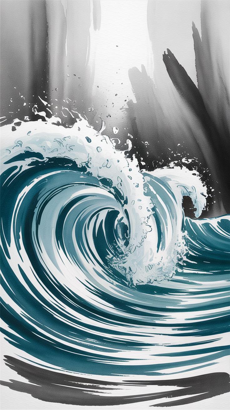
- Waves: Jagged, choppy, rising sharply; sometimes slamming back hard. Their shapes change quickly, unpredictable in size and force.
- Wind: A constant, howling presence that bends the spray and whips the surface into frenzy.
- Sky: Heavy, slate-gray clouds crowd the horizon, blocking sunlight or flickering with sharp bursts of lightning.
- Rain: Thick sheets or quick bursts that blur lines and soften edges, adding layers of texture and movement.
- Light: Stark contrasts between shadow and occasional shafts of fading sunlight or the eerie glow before a storm fully breaks.
These features don’t just create a scene—they set a mood. There’s tension, urgency, maybe even threat. Yet there’s also a strange beauty in the chaos, inviting viewers to lose themselves in the moment.
How Stormy Seas Affect Art
Artists often see stormy seas as more than just natural phenomena. They notice the story beneath—the conflict, the power, and the uncertainty inherent in turbulent waters. It’s one of those subjects that can carry heavy moods, from despair to exhilaration.
Depicting a stormy sea challenges artists to capture motion and feeling simultaneously. Sometimes that challenge is tempting precisely because it demands more than technical skill; it asks for emotional intuition. For many, painting or drawing stormy seas becomes a way to explore human vulnerability or resilience in the face of uncontrollable forces.
Does the struggle to master these elements mirror life’s own unpredictability? Maybe. In any case, stormy seas invite storytelling that words often fail to convey, making them a lasting subject for artists seeking depth and drama in their work.
Selecting Materials for Mixed Media Artwork
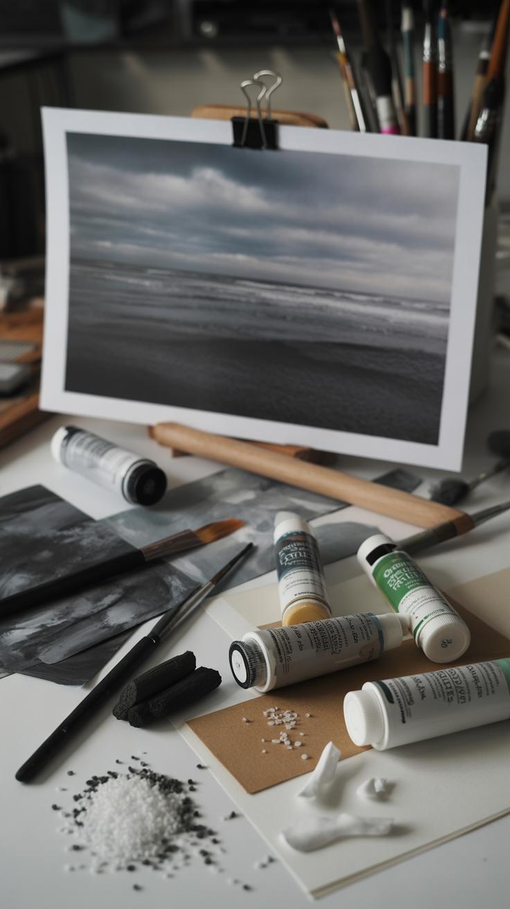
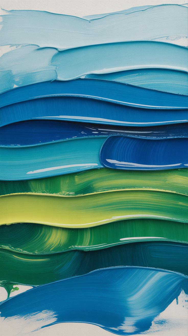
When choosing materials for a stormy sea scene, the right paints and textures can make all the difference. Acrylics are a solid choice—they dry fast and let you layer thick, expressive strokes that echo crashing waves. Their opacity can create solid storm clouds, yet you can dilute them for soft mist effects. Watercolors behave differently; their transparency captures the fluidity of water and sky but can feel less controllable, which might frustrate some. Oil paints, though slower to dry, offer rich pigmentation and smooth blending—perfect for deep, moody tones. The pigments themselves matter, too. Look for cobalt blue or ultramarine for serious depth, mixed with touches of green or grey. But, you know, sometimes the exact hue eludes you, and that can be a good thing—it invites experimentation.
Textures create undeniable impact. Mixing fine sand into your paint base can mimic gritty sea spray or textured shores. I’ve also found that scraps of sheer fabric or even torn paper glued onto the canvas hint at foam or endless movement. Using textured paper gives the surface life before you even start painting. But, then again, too much texture can overwhelm the piece—it’s a delicate balance. The tools matter, too—brushes with stiff bristles or palette knives help you sculpt waves, while sponges dabble unpredictable sprays and spray bottles can trickle water for random effects. Trust your instincts here; sometimes a failed attempt leads to your best wave crest yet.
Observing Real Stormy Seas for Reference
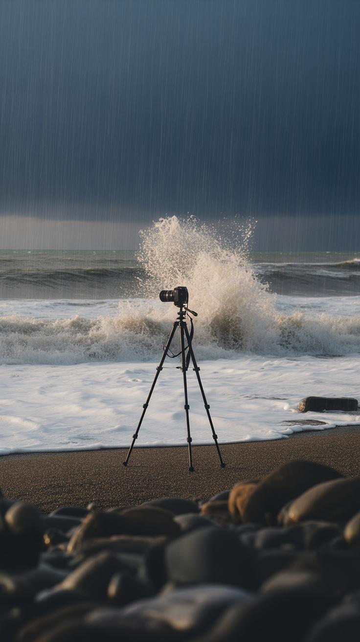
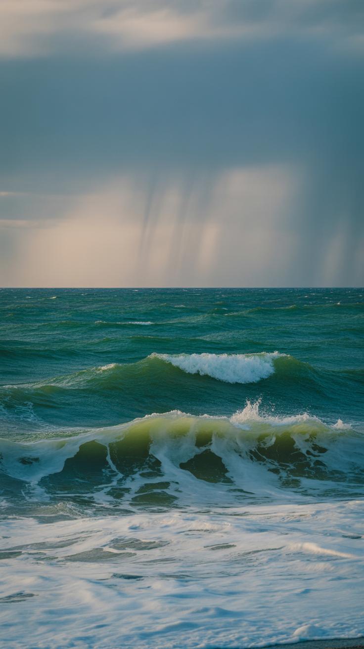
When you want to bring a stormy sea to life in your artwork, really studying the real thing—or close to it—makes a big difference. Photographs and videos capture moments you might not remember or notice when standing by the ocean, especially as storms can change quickly. Paintings by others also show creative ways to interpret turbulent waters. Taking time to observe these sources sharpens your eye for detail, which helps avoid guesswork that might make your scene feel flat or off.
Finding Reliable Visual Resources
Not all references are equal. Websites like National Geographic or the BBC Earth section offer incredible storm footage and photos. Books focused on marine weather or seascapes also hold a wealth of images. If you have access to coastal spots, watching stormy seas in person—even briefly—adds sensory details no picture can fully convey. When gathering visuals, zoom in on smaller elements like crashing waves or foam texture—the details often tell more about the storm’s mood than the big picture alone.
Noting Color and Light
Storm light isn’t just dim or dark. Look closely at how clouds filter sunlight, sometimes turning water a sharp silver-grey or deep blue-green. The foam and spray add white highlights but also carry tints from the sky’s subtle shifts. You might spot a faint purple or cold yellow in areas that don’t seem immediately obvious. Watching how the light moves and changes—perhaps flickering between shadow and brightness—can inspire where and how you place contrast in your work. It’s these small color shifts and light plays that help a sea scene feel alive rather than static.
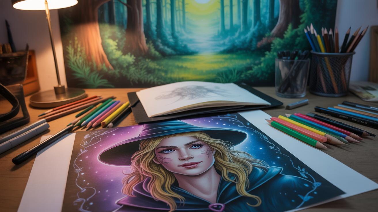
Creating a Base Sketch and Composition
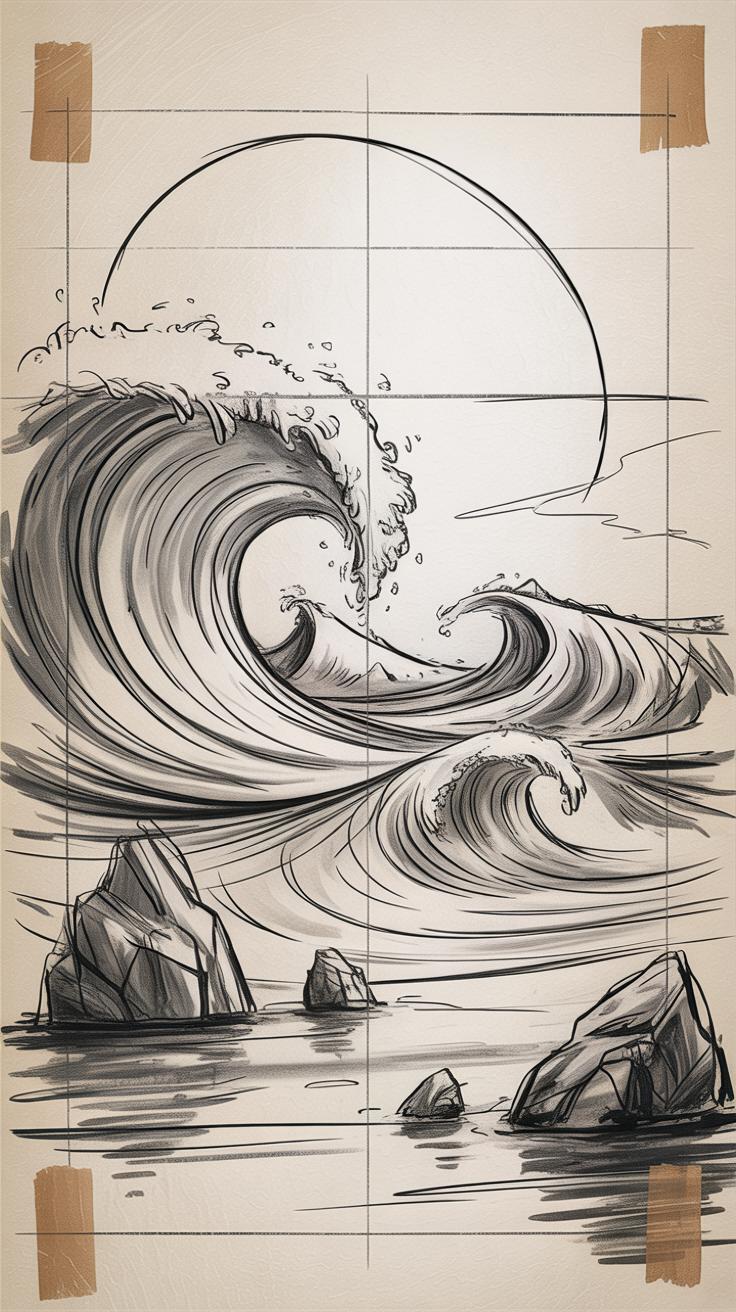
When starting your stormy sea scene, the first step is to lay down a rough sketch that captures the main elements: horizon, waves, and sky. This base sketch doesn’t need to be detailed—think more along the lines of a framework. You want to organize your space before diving into the details.
Deciding where to put the horizon line can change the whole feel of your painting. A low horizon emphasizes the sky’s drama, while a high one can focus on the sea’s energy. Sometimes, placing the horizon off-center feels more natural, even a bit chaotic—just like a storm itself.
To plan your scene, try these ideas:
- Mark major shapes lightly; big wave crests, cloud masses, and the horizon line.
- Think about where your eye should land first. Will it be a crashing wave or a dark sky patch?
- Balance is tricky. A messy storm scene doesn’t mean everything is jumbled—sometimes, visually odd placements create tension and interest.
For sketching tools, a soft pencil or charcoal stick works well. I often find that loose, confident lines help suggest movement better than rigid ones. Even if some marks go astray, they can suggest wave motion or wind direction in unexpected ways.
Don’t hesitate to experiment. Try roughening the outlines of waves, hinting at foam, or sketching swirling clouds with quick, energetic strokes. You might feel unsure about proportions or details—that’s okay. A preliminary sketch is a playground for ideas, not a finished blueprint.
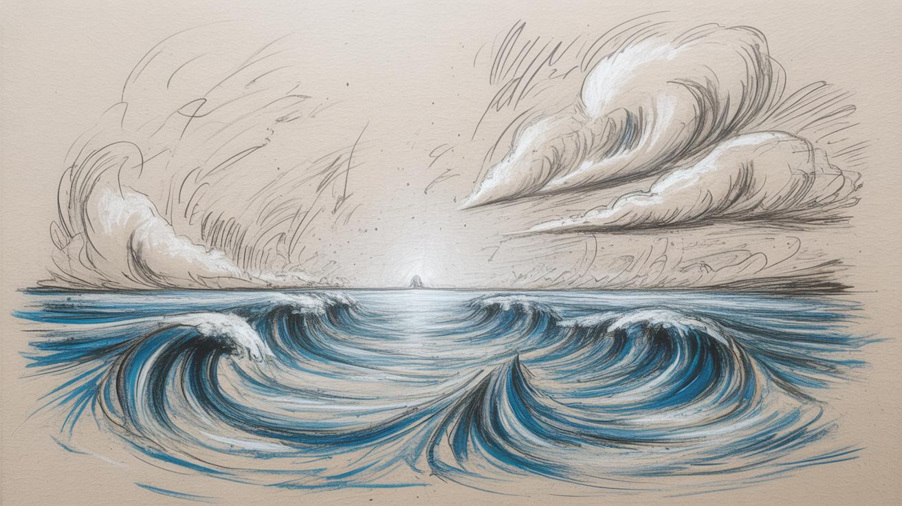
Layering Paints to Build Depth
When you want to capture the stormy sea, layering is your best friend. Start with darker blues and greens for the deep ocean, then gradually add lighter shades, breaking the surface tension. The trick is to think about what’s beneath and what’s on top—not just color but texture too. Rough, uneven strokes can hint at choppy waves, while smoother blends suggest calmer, deeper waters far away.
Using transparent layers early on lets you build subtle color shifts, almost like veiling over the depths. Then, switch to more opaque strokes where foam crashes or clouds thicken. This contrast between thin glaze and thick paint catches the eye and gives the scene a three-dimensional feel. Sometimes, I find pushing thick paint too far almost loses the sense of depth, so balancing is key.
Don’t be afraid to experiment with brushes. Soft brushes help blend sky colors—think moody greys fading into violent clouds—while stiff bristles or even a dry brush add scumbled effects across the water. The mix of smooth blending and rough, directional dry brushing makes your sea feel alive, moving, restless. Have you tried tapping a brush lightly to mimic spray? It’s subtle but can really sell the sense of wind and fury.
Ultimately, layering is about patience and observation. Watch an ocean storm if you can, or study photos. The waves aren’t one color or texture. They build, break, and disappear, revealing what lies beneath or behind. Layering helps to recreate that constant shift, that restless energy you want your viewers to feel.
Incorporating Mixed Media Elements
Bringing stormy seas to life often means going beyond paint alone. You might find that adding collage pieces like torn pages or fragments of marine maps can suggest tumultuous waters or shifting currents. Small amounts of sand can mimic gritty shoreline textures or hint at storm debris caught in waves. Fabric scraps—maybe loosely woven burlap or rough linen—can add unexpected texture, letting the eye catch tiny shadows and highlights as light changes.
When you introduce these materials, think about how they interact with your painted layers. Glue a thin layer of sand onto wet paint to lock it in place, or press fabric into thick acrylic while it’s still tacky to embed it subtly. The physical dimension changes how viewers engage—they may sense the roughness beneath smooth brushwork or notice shadows cast by lifted elements, making the storm feel almost tangible. It’s a way to pull someone closer, to look not just at the scene but through it, sensing the sea’s unrest.
But there are traps here too. Many artists make the mistake of piling on too many materials—more isn’t always better. Overloading can obscure your composition or make the surface unstable. Adhesion issues can cause pieces to peel away over time, especially if you don’t prepare your base properly or use the wrong adhesive with certain papers or fabrics. To avoid these problems:
- Test your materials on small samples before committing.
- Use archival-quality glue suited to your base and media.
- Apply textures in measured amounts—less can be more effective.
- Allow each layer to dry thoroughly before adding the next.
Experimentation is key, but patience pays off. I once rushed to add sand and fabric over a fresh acrylic layer; it didn’t stick well and cracked. Learning from those moments makes mixed media more of a conversation than a chore—something that surprises and challenges you, not frustrates. What textures speak to your vision of the storm?
Final Details and Highlights

When you reach the stage of adding fine details like white caps, rain streaks, and reflections, the scene starts to truly come alive. These small elements—tiny bits of foam breaking on waves or faint lines of rain—give your painting that touch of realism that can be elusive otherwise. You might find yourself hesitating over where exactly to place them, unsure if too many white caps will clutter the image or if a subtle hint of rain is enough.
Using fine liners or thin brushes works well for the delicate lines of rain streaks or small wave crests. Sometimes, I’ve used a small sponge pressed lightly for foam textures, which creates a natural randomness that brushes can’t quite replicate. These textures shouldn’t be uniform; trust that unevenness—some thicker, some thinner—better mimics real water.
Don’t forget to play with light and shadow while placing highlights. The areas where light hits foam or glints off wet surfaces need tiny bright spots contrasted with deeper, darker shadows nearby. This contrast builds depth and pulls viewers in. But watch out—overdoing highlights can flatten the scene or make it look artificial. Take breaks, squint at your work, and ask yourself if the drama feels right or forced.
Ultimately, these details are where patience and observation meet. The stormy sea is restless by nature. Your brushstrokes and textures should echo that—never perfectly neat, but always purposeful. Have you tried stepping back often to check how the small elements read from a distance? It’s surprising how the smallest touches can completely shift the mood.
Preserving and Displaying Your Stormy Sea Artwork
Sealing and Framing Mixed Media
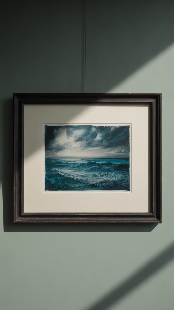
Mixed media pieces, especially those capturing stormy seas, often have delicate textures and layers. Protecting these surfaces requires careful sealing. You might try spray sealants designed for mixed media or acrylic mediums that dry clear. Some artists prefer matte finishes to avoid glare, while others think a gloss finish better enhances the wet look of stormy water. Experimenting on a small sample can help you decide what suits your piece.
Framing is another way to protect your work. Floating frames work well for pieces with raised textures, keeping the artwork from touching the glass. If your work has loose elements, a shadow box might be ideal. You could also consider using UV-protective glass—not necessarily mandatory but beneficial if you plan to display your art in bright spaces. Personally, I’ve noticed colors stay truer for longer with UV glass, though it can add some cost.
Sharing Your Artwork
Photographing mixed media art can be tricky. Natural light works best but avoid direct sunlight that might create harsh shadows or reflections. Try different angles to capture texture—sometimes side lighting reveals details that front lighting hides. If you have access to a macro lens, use it. It picks up subtle brushwork or layering much better.
When sharing online or in galleries, consider your audience. Are they more focused on the mood or technical skill? Sometimes close-up shots alongside the full piece offer a better story. And don’t hesitate to include brief descriptions of your technique. People are curious about the process, which can make your stormy sea scene more engaging.
Conclusions
Bringing a stormy sea to life with mixed media involves understanding the sea’s physical elements and emotional impact. By studying waves, skies, and the overall atmosphere, you can create a convincing scene that captures the viewer’s attention. Choosing the right materials, such as paints, textures, and collage items, helps convey the sea’s power and energy effectively.
Using the techniques described, from layering to brushwork, you can develop a personalized approach to painting stormy seas. Keep observing real seascapes and experimenting with your tools. Your effort will lead to art that not only shows a stormy sea but also makes people feel its force and beauty.


