Painting Strawberries in Watercolor
Watercolor painting offers a unique way to capture the natural beauty of strawberries. These fruits have distinct shapes, colors, and textures that can be amazing subjects for watercolor art. You will learn the techniques to mix colors, use brush strokes, and create realistic effects that bring strawberries to life on paper. Understanding the basics of watercolor combined with the specifics of painting strawberries will help you create art you can be proud of.
Creating a successful strawberry watercolor painting involves more than just applying paint to paper. It requires attention to detail and understanding the fruit’s structure. You will explore how to choose the right materials, prepare your workspace, and follow a step-by-step approach from sketching to final touches. By the end, you will gain practical skills and confidence to paint delicious-looking strawberries that stand out.
Understanding Strawberries as Subjects for Watercolor
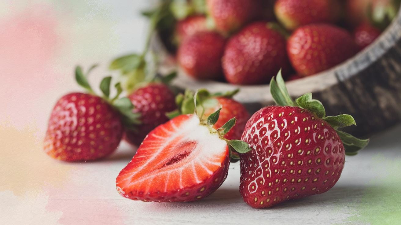
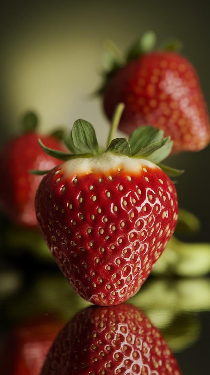
Strawberries have a distinct shape that makes them interesting to paint. Their heart-like form tapers gently from a wider top to a pointed tip. The bright red color varies across the fruit, with some areas appearing deeper and others lighter, which creates a natural gradient.
The surface is dotted with tiny yellow seeds called achenes. These seeds add texture and rhythm to the strawberry’s appearance. Often, the seeds catch light differently than the fruit’s skin, offering small highlights for you to capture.

Green leafy tops, called calyxes, crown the fruit with spiky, curved leaves that contrast sharply with the softness of the red body. These parts invite you to explore different shapes and colors in your work.
You’ll find strawberries rewarding because their colors respond beautifully to watercolor’s transparency. The play of light and the subtle color changes allow you to practice blending, layering, and capturing texture in simple yet visually rich ways.
What Makes Strawberries Unique to Paint
The bright red surface of strawberries immediately draws attention. The color changes subtly in areas, from orange-red near the seeds to deeper red near the center. This natural variation challenges you to mix vibrant shades and control your brushwork.
Small seeds scattered across the surface are not just dots; their size and spacing influence your brush strokes. Capturing the seeds’ pattern adds to the overall realism and depth.
Green leafy tops provide a strong contrast to the red body. Their slightly rough edges and layered shapes call for sharper, more defined brush strokes and careful color mixing of various greens.
The juicy texture of strawberries shines through how you handle water and pigment. Areas where the fruit catches light demand lighter washes, while the shadows require deeper tones. This combination of features encourages you to observe carefully before each stroke.
How Strawberry Anatomy Guides Your Painting
Knowing the parts of a strawberry helps in painting them accurately. The tiny seeds, or achenes, sit slightly raised on the fruit’s surface. Recognizing this means you can use small but deliberate brush marks or even leave tiny white spots to suggest their shape.
Understanding the calyx, the green leafy top, shows you how leaves overlap and curve. Capturing this correctly gives your painting structure and authenticity.
Light plays a key role. It often lands on the rounded side of the strawberry, creating bright highlights and soft shadows. Painting these contrasts highlights the fruit’s roundness and juicy look.
When you study the strawberry’s anatomy this way, your painting becomes more than a flat red shape. Each part supports your choice of shading, color, and detail, allowing you to create a lively, believable image.
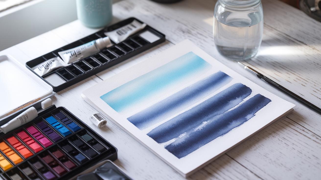
Materials Needed for Strawberry Watercolor Painting
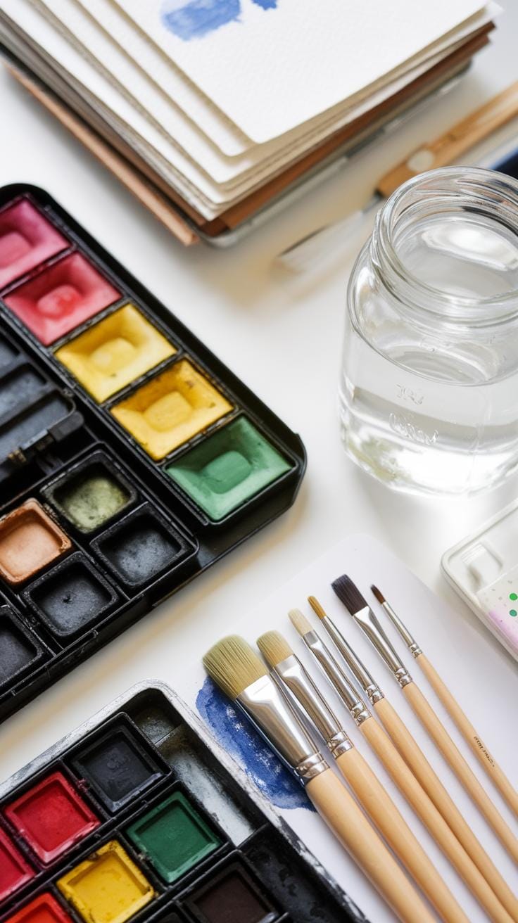
Choosing the right materials shapes the success of your strawberry watercolor painting. You will need quality watercolor paints, brushes, and paper designed to handle the demands of layering and detail work.
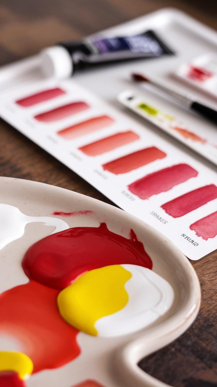
When picking paints, look for those with rich pigment and good lightfastness. These qualities help your strawberries maintain vibrant reds and deep shadows after drying. Brushes come in various shapes and sizes; select ones that offer good control for small seeds and leaf details. Choose paper that can hold water without buckling or bleeding, usually 140 lb (300 gsm) cold-pressed paper is a solid choice for this subject.
Think about your skill level when gathering supplies. Starter kits with basic colors and synthetic brushes might suit beginners. Intermediate artists might want to invest in better pigments and a variety of brush types to capture texture. Preparation saves time and frustration so assemble your workspace with these tools before starting.
Choosing the Right Watercolor Paints
Select watercolor paints with strong pigment concentration. Tube paints often give more intense colors and smoother blends than pans, but pans offer portability and convenience. Consider which fits your style and budget. For strawberries, pick reds like cadmium red, alizarin crimson, or permanent rose to achieve natural and lively hues.
Start mixing reds with tiny amounts of yellow or orange to warm the shade or add a touch of violet for cooler shadows. Highlight areas by leaving parts of the paper white or lifting paint with a damp brush. This contrast makes strawberries look plump and juicy. Experiment with color layering instead of mixing all colors at once to retain vibrancy.
Selecting Paper and Brushes for Best Results
Select paper that manages water well and shows texture suitable for strawberries. Cold-pressed paper has a slight texture to capture the strawberry’s seeds and leaf veins clearly. Hot-pressed paper offers a smooth surface, good for soft blending but less texture detail.
Round brushes come in handy for painting strawberry curves and tiny seeds. Small to medium sizes (around #4 to #8) offer precision and versatility. Flat brushes help with broader strokes like leaves and background washes. Synthetic brushes hold their shape longer and respond well to washes, making them good choices for beginners. How do you want to balance detail and flow in your painting? Your paper and brushes can guide that decision.
Preparing Your Workspace and Sketching the Strawberry
Organizing your painting space helps you stay focused and work smoothly. Arrange your watercolor paints, brushes, paper, and water container within easy reach to avoid interrupting your flow. Position your palette where you can mix colors without moving too much. Keep clean water and paper towels ready for quick brush rinsing and blotting. A clutter-free area reduces distractions and keeps your materials clean.
Good lighting makes a difference. Use natural light or a bright LED lamp that mimics daylight. Avoid harsh shadows or glare on your paper. Position your light source so it shines evenly over your workspace. Consider how your hand or arm might cast shadows while painting. Setting up this way keeps your colors true and your details clear.
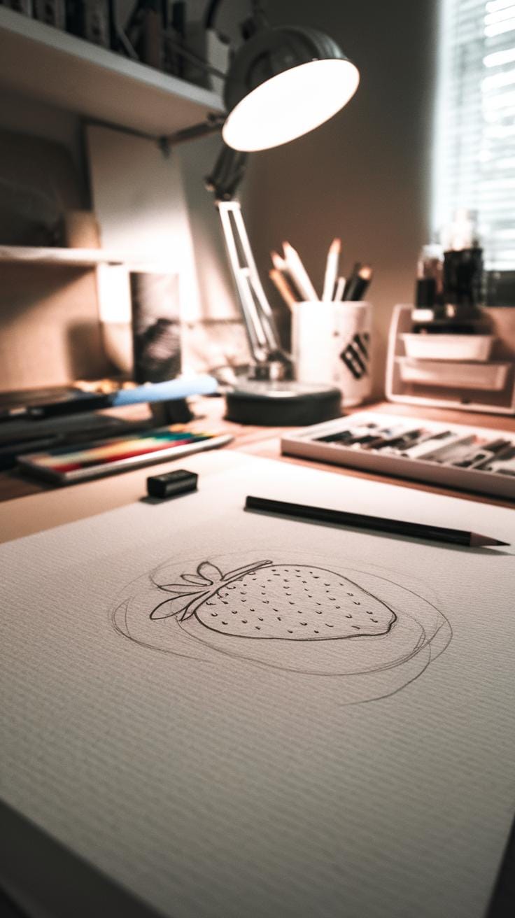
Start sketching your strawberry lightly with a pencil. Focus on its general shape—wider at the top and narrowing down. Add the placement of leaves on top and roughly mark where seeds will go. Use soft, faint lines to avoid leaving marks under your watercolor. Think about balance and spacing so the strawberry fits well on your paper. This simple outline guides your painting without forcing you to follow strict details.
Optimizing Your Painting Environment
Light can change how colors look while you paint. A table near a window works well during the day, but an adjustable day-light lamp keeps you painting anytime. Check for shadows from your hand that might block your view. Arrange your brushes in a cup or holder so you can grab the right size quickly. Place your paper towel close by to clean brushes or absorb extra water fast. Your water cup should be large enough to rinse brushes without needing constant refills.
Keep your palette organized with separate areas for each color and space for mixing. Clean your palette often to avoid muddy colors. Lay your paper flat or fix it with tape to prevent warping. Keep scraps or test paper nearby to check brush strokes or color mixes before applying to the strawberry painting.
Simple Sketching to Capture Strawberry Shape
Begin with a light oval or heart-like shape to represent the strawberry’s body. This shape doesn’t need to be perfect but should capture how wide or narrow the strawberry looks. Sketch softly to make adjustments easy. Notice where the strawberry tilts or curves.
Add leaves at the top with gentle curved lines that fan out. Keep them simple and avoid pressing hard on the pencil. Next, map out tiny seed spots by drawing small dots or short dashes lightly on the strawberry’s surface. These marks help you place details when painting without overpowering the image.
Try not to draw heavy outlines. Watercolor blends better with faint pencil marks. If your sketch feels off, erase lightly and redraw. Use your eyes more than your hand to judge proportions. How tall is the strawberry compared to its width? Are the leaves balanced? Taking time here makes your watercolor easier and more effective.
Mastering Realistic Shine through Highlight Management
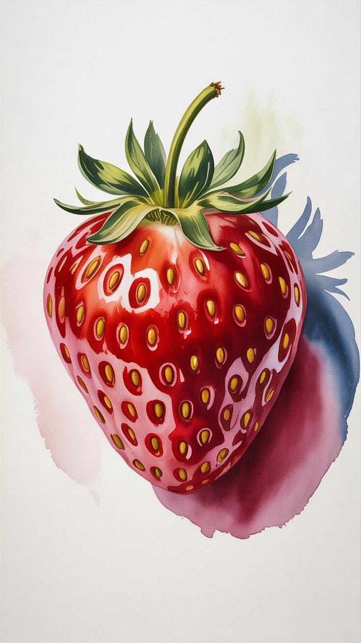
To achieve juicy, realistic strawberries, you must leave specific highlight areas with no paint whatsoever at the start of your process. These primary and secondary highlights provide the fruit with its 3D form and signature shine. An accurate drawing, often scaled up from a macro photograph, is essential to ensure these bright spots remain protected throughout the layering process. This disciplined approach prevents the final painting from looking flat or artificial.
Toning Highlights for Three-Dimensional Form
Once your base red layers are dry you must refine highlights that appear too stark or highcontrast Using a watery neutral gray or pale brownishgray glaze allows you to gently tone down highlights on the edges of the fruit This step creates a graduated transition into the areas of shine adding immediate depth Always pay close attention to your reference photo to recreate the specific marks of reflection seen in nature

The choice of hotpressed watercolor paper further enhances this realism as its smooth surface allows for fine linear precision and detail Highquality absorbent cotton paper ensures that glazes do not bleed uncontrollably into the red flesh Because watercolor is resoluble even when dry use a soft brush and very little pressure when glazing to avoid disturbing the underlying red pigment This meticulous method captures the essence of botanical illustration
Situating the Subject with Realistic Shadows
Adding cast shadows is vital for placing your strawberry in a physical space so it does not appear to be floating on the page Shadows establish the subject on the surface it rests upon and provide necessary depth to the composition For a natural look use wetonwet techniques to create soft dissipating edges for the largest areas of shadow Consistency in your light source placement is required for these values to look believable
For the shadows themselves avoid pure black which can appear dull instead mix complementary colors to create vibrant neutrals A mix of ultramarine blue and cadmium red is effective for suggesting the subtle reflection of the strawberry onto the ground You can also build visual rhythm by adding a darker red shadow directly around individual seeds This contrast ensures the seeds pop against the flesh and adds rhythmic interest
Basic Watercolor Techniques for Painting Strawberries
Start with washes to cover large areas smoothly. A wash is diluted paint spread evenly across the paper. Apply a light red wash to the strawberry’s surface to create a base color. Avoid overworking the paint to keep it smooth. You want the paper to stay slightly wet for the next step.
Use the wet-on-wet technique next. Wet the strawberry area with clean water, then drop in red or pink tones. The colors will blend softly, creating natural gradients and curves on the strawberry. This step works well to show how light hits the fruit and forms gentle shadows. Practice controlling water and pigment to keep edges soft without losing shape.
Try layering to add depth once the base is dry. Paint thin layers of darker red or touches of purple to define shadows or the strawberry’s contour. Let each layer dry before adding the next to build color intensity without muddying.
Finally, apply the dry brush technique for fine details like seeds or tiny highlights. Use a near-dry brush with small pigment amounts. Lightly drag it over textured paper to create crisp lines or rough dots that stand out against the smooth washes. This technique helps your strawberry look alive and detailed.
Using Washes and Wet-on-Wet Techniques
Begin your strawberry by painting a light wash of red over the whole body. Dilute your paint so the color appears soft and translucent. This wash sets the base and prevents harsh color blocks later.
While the wash is still wet, add spots of deeper reds or pinks using the wet-on-wet method. This allows the colors to flow and blend inside the wash, creating gentle transitions. You will see the shape take form naturally.
Think about where your light source is. Add lighter washes near those areas and darker washes on the shaded parts. This contrast gives the strawberry volume without sharp lines.
Watch how the wet colors blend softly on the paper. If you want stronger edges, wait for the wash to dry before applying additional layers. Do you notice how the strawberry starts to look round with these smooth transitions?
Applying Layers and Dry Brush for Details
Wait until the initial washes dry completely. Apply thin layers of deeper red on areas needing more depth. Each successive layer builds richness and shadow that makes the strawberry appear three-dimensional.
For the seeds, switch to the dry brush technique. Use a brush with just a little paint and barely damp. Tap or lightly brush small dots on the strawberry surface to mimic seeds. These should look slightly rough and uneven to feel natural.
Add white or light reflections by dragging a clean dry brush over the berry’s highlights. This adds subtle texture and emphasizes shine on the fruit’s skin.
Building up texture with layers and dry brush makes your strawberry detailed and realistic. What details do you think stand out the most when you vary paint thickness and brush pressure?
Color Mixing and Achieving Realistic Strawberry Hues
Mixing colors correctly helps your strawberry paintings look believable and vibrant. Start by understanding how warm and cool tones affect the overall feel of your strawberry. Warm reds bring out ripeness, while cooler shades suggest shadows and depth.
For the strawberry’s body, combine different reds with touches of orange to mimic the fruit’s warm spots. Adding a hint of purple can create shaded areas that keep the color from appearing flat. Think about the light source in your painting. Where the strawberry catches sunlight, you can lighten reds by adding water or a bit of white mixed with paint to create soft pinks.
Leaves require a different approach. Green shades come from balancing yellows and blues. Using a cooler blue can add shadows, while a warmer yellow gives the leaves life. When painting backgrounds, soft greens complement strawberries without drawing attention. Mixing colors this way gives your painting harmony by balancing warm reds and cool greens.
Creating Red Tones with Watercolor Mixes
Start with a pure red paint like cadmium red or alizarin crimson. Mixing red with orange creates warm tones that suggest ripeness and freshness. Use more orange for lighter or brighter reds, perfect for sunlit parts of the strawberry.
Adding a small amount of purple or blue to red helps you paint shadows and cooler areas. These mixes prevent the strawberry from looking flat and give it natural color variation. When you want lighter red tones, use clean water to dilute the paint gradually rather than adding white directly. This maintains the transparency and glow of your watercolor.
Try layering different red mixes. Begin with the lighter orange-red, then glaze cooler red-purple layers for shadow. Ask yourself where the light hits the fruit most and where shadows lie. This approach makes your strawberry appear round and realistic.
Mixing Greener Leaves and Background Colors
Mix greens for leaves by starting with yellow and adding small amounts of blue. Use lemon yellow and a cooler blue like phthalo blue to get leafy greens that feel fresh and natural. If you use a warm blue, your green shifts warmer too. Adjust depending on the light and mood.
To make leaves look dimensional, add touches of burnt sienna or red to the green mix for shadowed areas. This technique keeps your greens from seeming flat or artificial.
A soft background color can highlight your strawberries without overpowering them. Mix a muted green with plenty of water to create a gentle wash. Consider using a complementary color softly blended to make your red strawberries pop but fit well within the scene. What colors in your palette can balance the warmth of the strawberries best?
Painting Seeds and Leaf Details on Strawberries
Small details like seeds and leaf veins bring strawberries to life in your watercolor painting. These tiny features might seem tricky, but with the right techniques and tools, you can add them with confidence and clarity.
Choosing the right brush is key. A fine-tipped round brush, such as size 0 or 1, gives you precision when painting seeds and veins. The control it offers helps form small, accurate shapes without smudging your base layers.
Work slowly and in thin layers. Avoid overloading your brush with paint to maintain sharp edges on the seeds and leaf veins. Use darker or contrasting colors for seeds to make them stand out against the juicy red of the strawberry. For leaf veins, mix greens with a touch of brown or gray to mimic natural textures.
Have you tried practicing seed shapes separately before applying them to your painting? This builds steadiness and improves accuracy. Painting these details last, after the fruit and leaves are dry, helps maintain clarity and avoids bleeding colors.
Adding Seeds with Fine Brushwork
Painting seeds requires patience and a steady hand. Dip your fine brush lightly into a color that contrasts the strawberry’s red, such as a muted yellow or light brown. Use gentle dabs instead of strokes to create the tiny seed shapes.
Space seeds unevenly for a realistic look. Seeds rarely appear perfectly uniform, so varying their position and size adds natural charm. Keep your brush pointed, and practice controlling pressure to avoid blotches.
If you notice paint pooling or bleeding, wait for the strawberry’s surface to dry before painting seeds. This prevents colors from mixing and blurring your fine details. Do you recognize how much subtle variation in seed shape helps capture that realistic touch?
Drawing Leaf Veins and Texture
Capturing the leaf’s vein structure sets the strawberry’s leafy cap apart. Mix a green that’s slightly darker than your leaf base. Thin your paint with water to create fine, sharp lines.
Draw veins radiating from the leaf’s center, tapering them as they reach edges. Use a size 0 brush for thin, consistent lines. Adding a few secondary branches to main veins creates texture and depth.
To add natural texture, gently dry brush irregular strokes over your leaf to mimic tiny wrinkles and bumps. Varying your line pressure helps create organic shapes instead of stiff, straight lines.
Have you looked closely at real strawberry leaves and noticed the irregular vein patterns? Replicating those details gives your painting a fresh, believable appearance. Take your time and adjust veins as you go to maintain balance and flow across the leaf surface.
Finishing Touches and Enhancing Your Strawberry Watercolor
After painting the seeds and leaf details, focus on refining your strawberry. Look closely at your work and decide where it needs more contrast or brightness. Use a small brush with white paint to add delicate highlights. These highlights bring shine and make the strawberry look juicy and fresh. Place them where light would naturally hit the fruit, like the raised bumps or near the edges of the strawberry’s surface.
If some areas appear too dark or flat, lift color gently with a clean, damp brush. This technique removes excess paint and creates subtle light spots. You can reapply thin layers to fix uneven color and improve depth. Adjust shadows and reds to keep the strawberry vibrant but not overpowering. Stand back and ask yourself if the fruit looks alive or flat. Making small changes now can improve the overall balance and realism.
Using Highlights to Add Shine and Depth
Placing white highlights on the right spots makes your strawberry look shiny and juicy. Typically, small spots near the top, where light hits first, work best. You might add thin lines on the bumps or along the edges of the strawberry’s surface to mimic light reflections. Use a fine brush or even a white gel pen for precision.
Be careful not to overdo the highlights. Too many can distract from the natural texture. Instead, think about how light moves across a real strawberry. Where would you see tiny glimmers? Adding highlights in these areas helps the fruit pop from the paper and feel more three-dimensional.
Correcting and Adjusting Colors for Balance
Lifting color with a damp brush can soften harsh areas and bring out natural highlights. If a red patch looks too dark, touch it lightly with water and blot with a paper towel. This reduces intensity and creates variety. You can also layer another wash of color after drying to enrich shadows or add depth.
Try tweaking greens on the leaves or adjusting warm tones on the strawberry’s skin to keep the image balanced. Look for any spots that seem dull or unnatural and ask how you can make them brighter without losing realism. Making these small tweaks helps your strawberry feel alive rather than flat or painted.
Practicing and Developing Your Strawberry Watercolor Skills
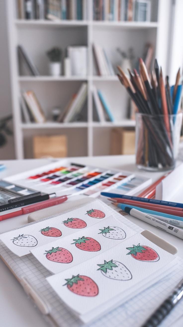
Keep painting strawberries in different ways to improve your skills. Try simple, single strawberries on the page, and then create groups or bunches of strawberries to see how they interact visually. Adding other objects, such as flowers or a bowl, will give your artwork more variety and challenge your composition sense. Have you thought about how changing the background or the angle of the strawberries affects the feel of your painting?
Set small challenges for yourself, like focusing on capturing the texture of the seeds or the shine on the strawberry’s surface. Each painting teaches you something new if you pay close attention. Don’t hesitate to paint the same subject multiple times with small changes. This practice will build your confidence and sharpen your eye.
Experimenting with Different Compositions
Try painting one strawberry on its own to focus on detail and color. Next, group strawberries together to explore how shapes overlap and cast shadows. You can mix strawberries with green leaves, white blossoms, or even place them inside a bowl for an added challenge. Changing these combinations helps you learn how to balance your composition and guide the viewer’s eye.
Have you noticed how including elements like leaves can change the color harmony? Or how positioning strawberries at different angles alters the mood? Use these ideas to create a variety of engaging paintings and keep your practice interesting.
Reflecting on Your Work to Improve
Look at each painting and ask yourself what worked well and what could improve. Did you capture the strawberry’s bright red color accurately? Is the texture realistic? Did your brush strokes create the right softness or sharpness? Writing down your thoughts after each painting will help you track progress.
Choose one skill to focus on next time, whether it’s blending colors smoothly, adding more detail, or improving shadows. Setting clear goals turns practice into growth. Have you considered keeping a visual journal of your progress to compare your early works with recent ones? This simple step can reveal your improvements and highlight areas to target.
Conclusions
Painting strawberries with watercolor connects you with both nature and art. You have seen how breaking down the process into simple, clear steps makes it manageable. Using the right tools and techniques helps you effectively capture the fruit’s color, shine, and delicate seeds. Practice will improve your detail work and your ability to use light and shadow.
Keep experimenting and challenging yourself with new ideas and styles. Every painting gives you a chance to refine your abilities. With patience and passion, you can create watercolor strawberry artworks that are visually appealing and satisfying to make. Do you feel ready to pick up your brush and try your own strawberry watercolor painting?


