Introduction
Watercolor painting uses pigments suspended in a water-based solution to create artworks that are known for their transparency and softness. This medium has a long history, tracing back to ancient times and crossing cultures worldwide. Watercolor has evolved from being a primary medium in East Asian painting traditions to a favored sketching tool for Western artists preparing oil paintings. The versatile nature of watercolor allows you to experiment with transparency, layering, and blending, making it ideal for abstract art where shapes, lines, and colors combine freely without strict adherence to reality.
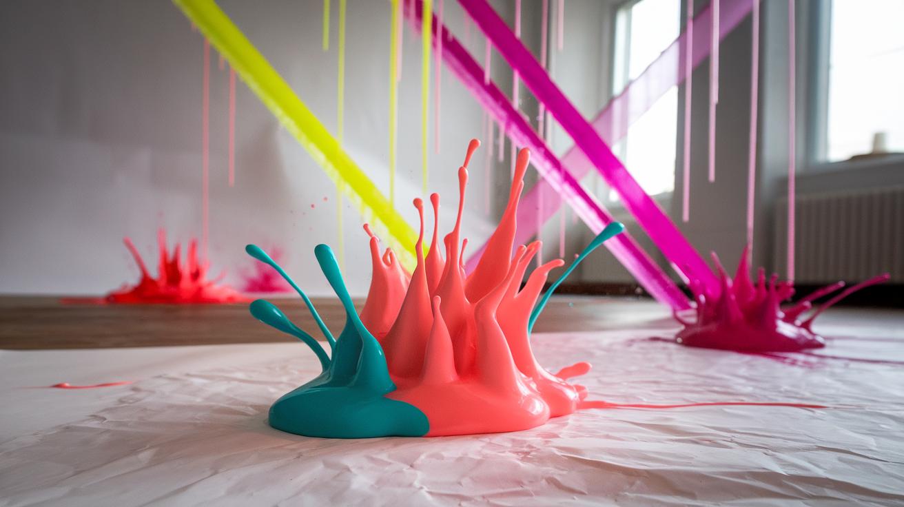
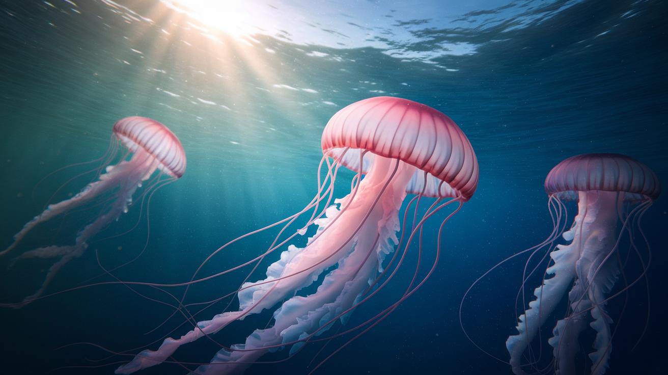
Abstract art embraces shapes, forms, color, and lines to communicate visually without necessarily depicting real-world objects. Watercolor’s fluid qualities align well with abstract art’s freedom, enabling artists to generate dynamic compositions. Bright watercolor ideas support vivid expressions, capturing emotions and movement through bold uses of color and form. This article guides you through practical watercolor ideas and techniques to create bright and engaging abstract artworks, empowering your creative process step by step.
Understanding Watercolor Medium
Composition and Qualities of Watercolor
Watercolor paint consists primarily of finely ground pigments mixed with a binder, usually gum arabic, and a water-based solution. The pigments provide color, while the binder holds the particles together and attaches them to the paper. When you add water, the paint thins out, allowing you to create washes or build layers of color. The concentration of pigment in the mixture influences how intense or light your colors appear.
One feature that sets watercolor apart is its transparency. This means light passes through the paint, reflecting off the paper beneath, which gives the colors a luminous quality. You can see the paper’s texture through the paint, affecting your final result. Choosing the right paper is critical because watercolor responds differently on hot-pressed, cold-pressed, or rough surfaces. Understanding these elements helps you decide what techniques will work best for your artwork.
Historical Background and Cultural Influence
Watercolor has a long and varied history. It began as a practical tool for sketches and studies in ancient civilizations. Early examples appear in Egyptian and Chinese art, where artists used pigments mixed with water on silk or paper. During the Renaissance, watercolor gained popularity in Europe as artists used it for detailed illustrations and botanical studies.
In East Asia, watercolor techniques developed unique styles influenced by nature and calligraphy. This cross-cultural exchange shaped how the medium evolved globally. Watercolor’s portability and quick drying time made it ideal for travelers and explorers who wanted to capture landscapes or daily life on the go. Recognizing this history can inspire how you approach your own use of watercolor for abstract work, encouraging you to combine tradition with innovation.
Basics of Abstract Art
Abstract art moves away from showing things exactly as they appear. Instead of capturing real-life objects or scenes, it focuses on shapes, colors, and forms to express feelings and ideas. You can think of abstraction as a scale. At one end, the image still hints at real subjects but in a simplified or altered way. At the other end, it has no recognizable objects at all, relying entirely on visual elements to create meaning.
Elements like lines, shapes, and colors combine to form an abstract work. What matters most is how these parts interact and create an effect or mood. Abstract art invites you to interpret what you see rather than pointing to one clear story. This approach gives you freedom to create without the limits of realism. How could you use abstraction to represent your own thoughts or emotions in your watercolor art?
Elements and Principles of Abstract Art
Abstract art builds on a few key visual elements. Shapes can be geometric or organic, and they often form the core of a composition. Lines guide your eye and create movement or stillness in a painting. Color carries emotion and energy, especially when you use bright or contrasting hues. Form adds depth, making parts of the work seem closer or farther away.
Composition ties everything together. Arranging elements thoughtfully helps keep your painting balanced and dynamic. You might place shapes off-center or use color sparingly to draw focus. Testing different layouts before starting can save time and give you clearer results. Ask yourself where you want the eye to land first and how the parts work as a whole. Does your arrangement encourage the viewer to look longer or move quickly through the piece?
Evolution and Influence of Abstract Art
Abstract art began taking shape in the late 1800s when artists started pushing away from strict realism. Movements like Expressionism in the early 20th century put color and form above accurate representation. Artists such as Wassily Kandinsky and Franz Marc explored how colors and shapes could express inner feelings rather than what the eye sees.
These ideas changed how people viewed art. Instead of just copying life, painting became a tool for personal or emotional expression. That shift gave rise to many styles, including Cubism, Futurism, and Abstract Expressionism. Knowing this history helps you consider how your own watercolor works connect to broader ideas about art’s purpose. What can you learn from past abstract artists to bring new energy into your bright, colorful creations?
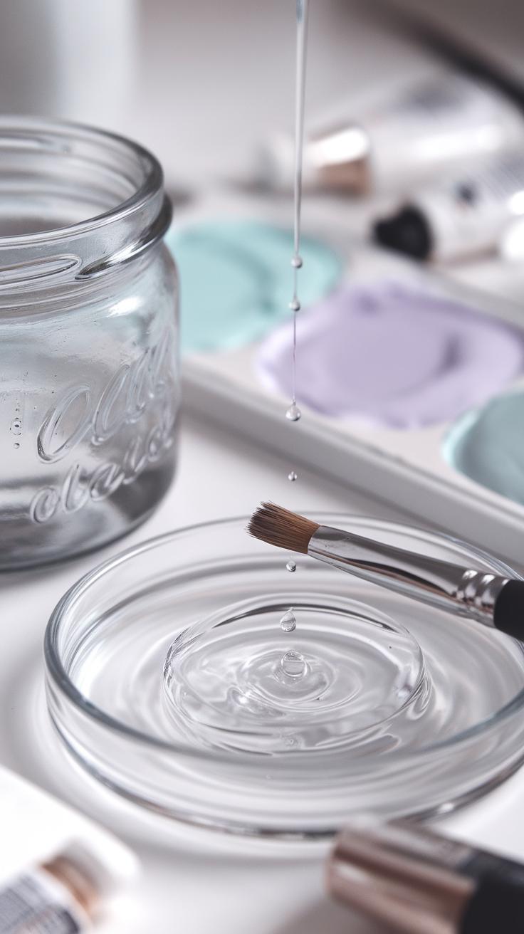
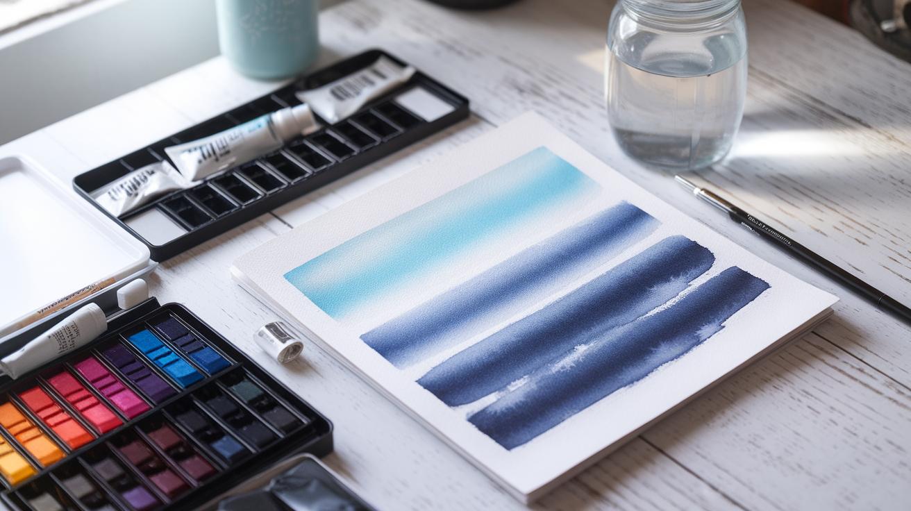
Tools and Materials for Watercolor Abstract Art
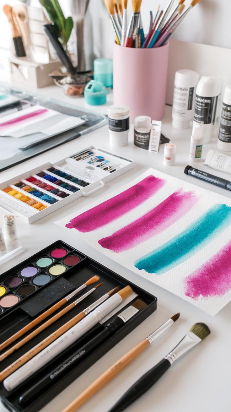
Your choice of tools shapes how your abstract watercolor pieces turn out. Selecting the right paints, brushes, and paper affects brightness, texture, and flow.
Watercolor paints differ in pigment strength and quality. Using paints with higher pigment concentration gives your colors a more vivid and solid look. This is especially useful for bright, eye-catching abstracts. Less concentrated pigments appear lighter and more transparent, which might suit softer or layered effects.
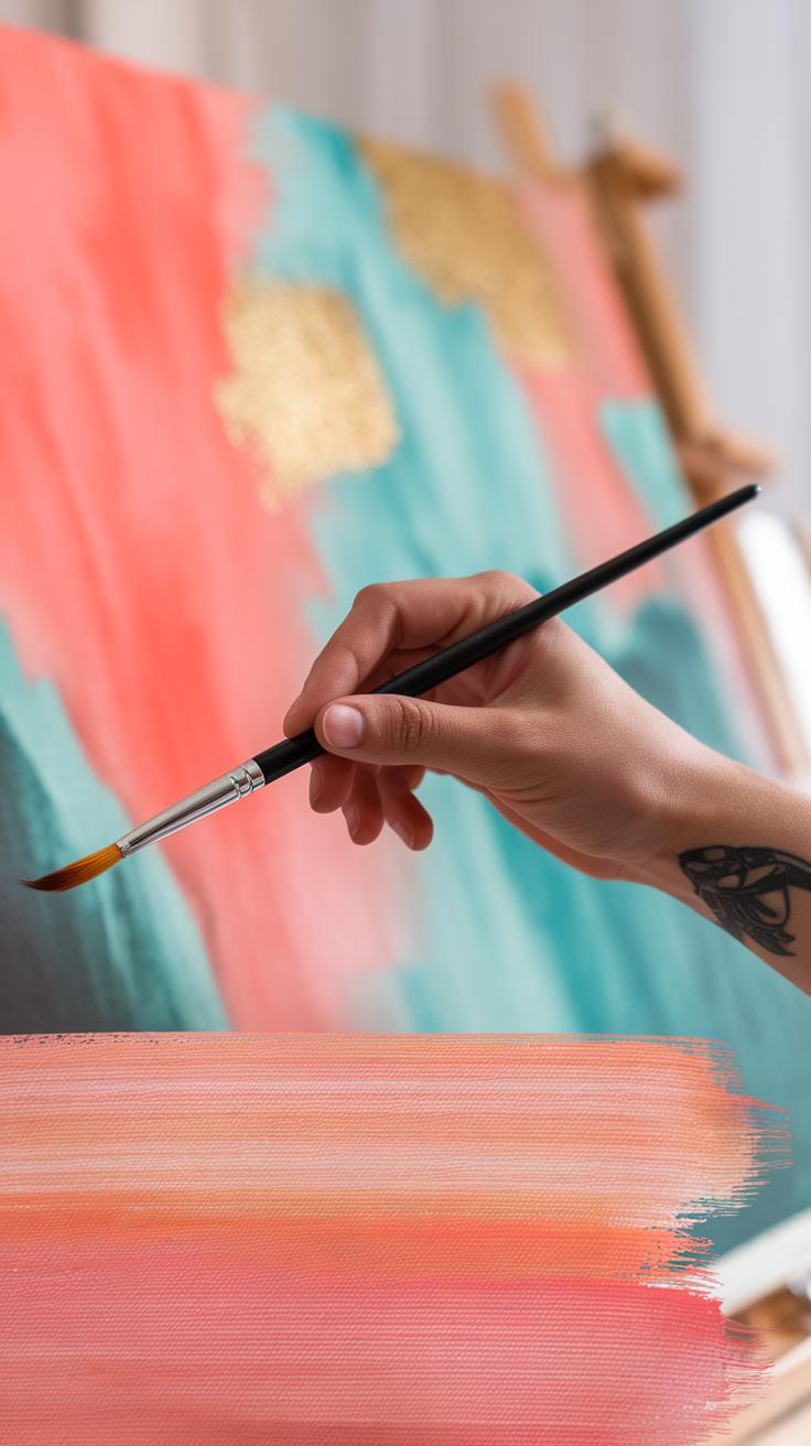
Brushes must match your painting style. Round brushes work well for detailed shapes, but flat or large wash brushes allow you to cover big areas with bold strokes. A mix of brush shapes lets you shift between sharp lines and smooth washes in your abstractions.
Paper choice influences how paint behaves. Heavier papers absorb more water without buckling and support layering. Cold-pressed paper has a textured surface to hold pigment unevenly, creating natural effects. Hot-pressed paper is smooth, allowing crisp lines and fine details. Decide which paper texture fits your vision for vibrant, abstract compositions.
Choosing the Right Watercolor Paints
Watercolor paints come in student and professional grades. Student-grade paints have less pigment and more fillers, so colors look weaker and fade faster. Professional-grade paints use pure, high-quality pigments for intense, lasting color.
Pigment concentration impacts how bright your colors appear. High-pigment paints deliver richer, more opaque coverage. This helps you achieve sharp contrasts and vibrant layers in abstract work.
Using stronger pigments also means you need less paint per stroke, which preserves paper quality. When choosing your palette, ask yourself which colors you reach for most. Invest in quality pigments for those shades to make your abstracts come alive.
Selecting Paper and Brushes
Watercolor paper types affect absorbency and texture. Cold-pressed paper feels rougher and creates more grainy textures. This surface works well if you want unpredictable color patterns or organic shapes in your abstract art.
Hot-pressed paper is smooth and allows clean, fluid brush movements. Choose hot-pressed if your abstract involves crisp edges or detailed layering.
Brush shapes suit different techniques. Wide flat brushes spread color quickly and cover large areas with controlled strokes. Rounds and filberts excel at curves and varied stroke widths. Synthetic brushes hold shape better under heavy water but natural hairs soak up more pigment.
Think about your style when assembling your brushes and paper. Mixing textures and tools gives you flexibility for unique, bright, abstract pieces.
Techniques to Create Bright Watercolor Effects
Maintaining bright, luminous colors in your watercolor abstract art requires precise control over water, layering, and color mixing. Start by balancing the amount of water you use; too much water can dilute pigment and reduce vibrancy, while too little restricts fluidity and blending. Try testing your brush strokes on scrap paper to find the right wetness before painting your artwork.
When mixing colors, avoid combining too many hues at once. Stick to two or three to prevent muddy results and keep your colors clean and bright. Use pure pigments directly from your palette for punchy accents.
Consider your layering technique carefully. Allow each layer to dry enough to avoid lifting colors, but work while the paint is still slightly damp to blend edges softly where needed. Ask yourself: How will the colors react as you build them up? Observing this will help you control luminosity and effect in your piece.
Layering and Glazing for Depth
Apply thin, translucent layers of color one at a time to build depth without muddiness. Use light brushstrokes and avoid pressing too hard; this keeps the paper surface intact for better readability of each layer. Let every glaze dry completely before adding the next to keep colors sharp.
Plan your color placement so underlying layers enhance rather than dull the upper ones. For example, start with warm tones before layering cooler shades to add vibrancy and a sense of light. Test drying times with different pigments and paper types—you may notice some colors absorb faster, affecting how layers interact.
What happens if you apply a new layer before the first dries? Experiment to see if you prefer soft edges or clearer separation of colors. Controlling this timing is key to mastering depth in your watercolor abstracts.
Wet-on-Wet and Wet-on-Dry Applications
Wet-on-wet painting lets colors spread and blend naturally, creating soft edges and gradients. Use this method when you want smooth color transitions or a diffused look. Apply clean water to paper, then drop in pigment and watch it flow. This technique works well to build bright, airy backgrounds with unpredictable shapes.
Wet-on-dry painting involves applying wet paint to dry paper or layers. This leads to sharper edges and more control over shapes. Bright colors stay bold and defined when applied this way. You might use wet-on-dry to add crisp accents or detailed forms on top of softer backgrounds.
Which technique fits your abstract idea best right now? Combining both allows you to balance fluidity and precision, keeping your colors fresh while defining your composition’s energy.
Generating Abstract Shapes and Compositions
Creating abstract shapes with watercolors starts with trusting your instincts while keeping an eye on balance. You can begin by applying loose washes, allowing colors to spread and blend naturally. Watch how the pigments move and settle; these organic patterns often inspire unique shapes.
Try layering shapes of different sizes to create depth and interest. Think about how these forms interact—do they feel connected or separate? Experiment with overlapping and spacing to find a rhythm that pleases your eye.
Consider the flow of your composition. Are the shapes leading your gaze across the paper smoothly? Try tilting the paper or adding splatters to generate movement. How does your work change if you add sharp edges versus soft curves?
Encourage yourself to explore without fear of mistakes. Some of your best ideas may come from unexpected results. What if you combined geometric shapes with freeform washes to create contrast?
Using Spontaneity and Control
Balance is key when working with watercolors for abstract art. Let the water and pigment flow freely to form soft, unpredictable textures. This spontaneity introduces life into your painting.
At the same time, use your brush to define or adjust shapes. You might add crisp lines or carefully placed color spots to guide the eye. How much control you use depends on what story you want your piece to tell.
Try switching between wet-on-wet and wet-on-dry techniques. Wet-on-wet produces fluid blending while wet-on-dry offers sharper details. Can you find a rhythm that combines both?
Considering Color Relationships and Contrast
Color choices shape how your abstract forms interact on the paper. Using complementary colors, such as blue and orange, creates vivid contrast and can make shapes pop. Consider placing these colors side by side to energize your composition.
Analogous colors, like green, blue, and teal, provide a smoother transition and harmony. These combinations suit artwork that feels calm but still visually rich.
Ask yourself: What mood do you want? Play with warm and cool tones to affect the energy in your painting. How do changes in color value affect which shapes stand out or recede?
Mix colors carefully to avoid muddy results. Layering transparent glazes can preserve brightness and enhance color relationships. Which colors give your shapes the strongest voice?
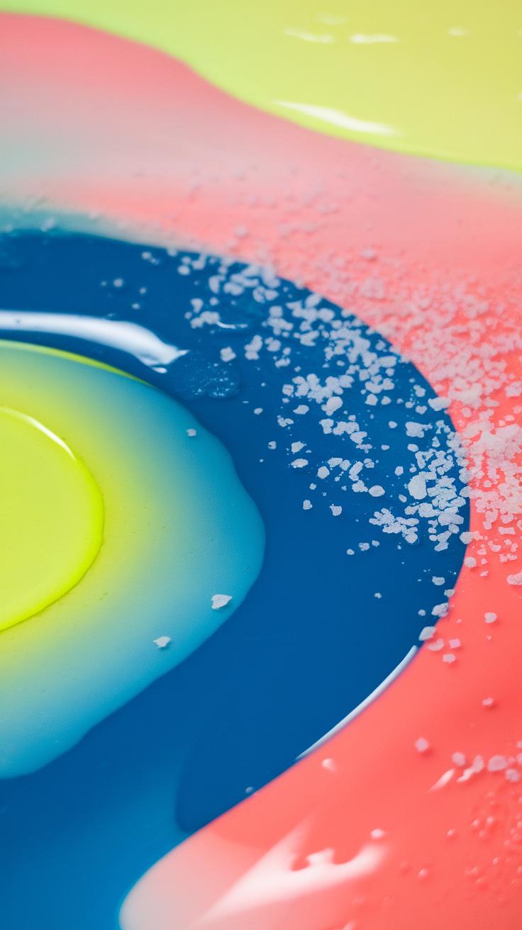
Incorporating Bright Watercolor Ideas
Choosing vivid colors can transform your abstract watercolor art. Focus on using pigments that offer strong brightness and clarity. Try combining warm reds like cadmium red with cool blues like cobalt. This contrast boosts vibrancy and draws the eye.
Mix colors carefully to avoid murky results. Use clean water and avoid overblending. For instance, layering transparent yellows over blues creates fresh greens without dulling intensity.
Consider adding small touches of pure pigment as highlights to bring energy into your piece. Can you try working with unexpected color pairs, such as bright oranges with deep purples?
Experiment with washes that start saturated and fade out, letting bright colors pop alongside softer areas. Keep your palette limited when starting so your brightness stands out without becoming overwhelming.
Selecting Vibrant Pigments and Combinations
Look for pigments known for their brightness and lightfastness. Quinacridone magenta, phthalo blue, and cadmium yellow light are excellent choices. These pigments retain color strength after drying.
When mixing, use small amounts and build gradually. Mixing two intense colors of equal strength can sometimes dull the tone. Instead, let one color dominate and add just a touch of the second.
Try mixing split primary colors—red, yellow, blue that can mix a broad range. For example, using cadmium red and ultramarine blue gives you vibrant purples.
Do you notice how some mixes feel dull or muddy? Adjust by adding clean water or a brighter pigment. Your goal is to keep colors lively.
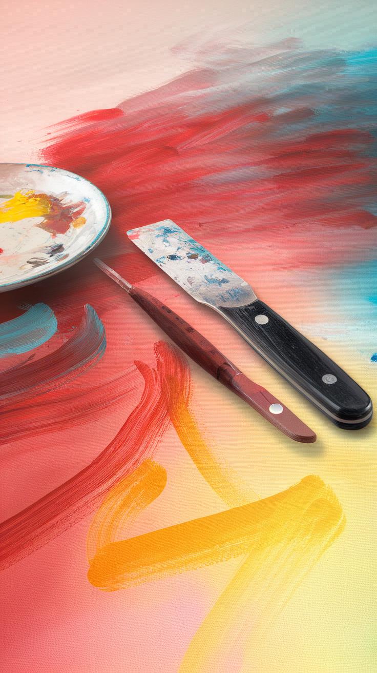
Applying Bold Strokes and Patterns
Bold brushstrokes increase the sense of energy in your abstract painting. Use larger brushes or even palette knives. Strong, sweeping strokes pull attention and emphasize bright colors.
Repeated patterns can add rhythm and movement. You might try dots, lines, or geometric forms painted in bright hues. Repetition makes the colors pop and creates cohesion.
Try layering bold strokes on top of lighter washes. The contrast will make the colors appear more vivid. How can you vary stroke direction and size to maintain interest?
Don’t hesitate to experiment with unexpected gestures. Bright colors paired with confident strokes often create powerful visual impact in abstract work.
Common Challenges and How to Overcome Them
Working with watercolor for abstract art presents some common hurdles you might face. One frequent problem is color bleeding, where pigments flow into unwanted areas and blur your design. This happens when water overwhelms the paper. Managing the right water-to-pigment ratio helps reduce this. Try testing on scrap paper to understand how much water your brush holds before painting. Another issue is paper buckling, which occurs when too much water soaks into weak paper. Use heavier weight paper or stretch your paper before painting to keep it flat. Dull colors often result from overworking the paint or layering too many washes without letting them dry. Allow layers to dry fully before adding new ones. What challenge have you faced most in your watercolor abstracts? How did you fix it?
Managing Water and Pigment Control
Control over water and pigment starts with your brush and paper. Dip your brush lightly into clean water before picking up paint. This keeps the pigment from becoming too watery and washing away the detail. When applying paint, spot test how water spreads on your paper. You can try using a dry brush technique for sharper shapes or a wet-on-wet method for soft blends, depending on your goal. Avoid flooding your paper. Instead, build layers gradually. Remember to blot excess water with a tissue if needed. Do you notice how water affects your colors? Practicing control turns surprises into intentional effects.
Maintaining Paper Integrity and Color Quality
Preserving paper quality requires good preparation. Stretch your watercolor paper by soaking it briefly in water and taping it on a firm board before painting. This reduces warping as it dries. Use good-quality, cold-pressed paper designed for watercolor. Let each painted layer dry completely before adding another. Drying can be natural or with a fan but avoid direct heat, which weakens the paper. To keep colors bright, layer transparent washes instead of mixing pigments excessively on the palette. This keeps your hues clear and vivid. Have you tried changing your drying methods or paper types? What impact did that have on your artwork?
Developing Your Personal Style in Watercolor Abstract Art
Finding your unique style in watercolor abstract art means focusing on what draws your attention and what feels natural to you. Start by observing how you handle bright colors and fluid shapes. Which colors do you reach for first? Do you prefer sharp edges or soft blends? Answering these questions shows your evolving taste.
Watch how your hand moves with the brush. Notice if you like fast, loose strokes or slow, careful washes. Your personal style emerges from these choices. Use fluid forms to express motion or emotion. Try to let your feelings guide your color choices and shapes instead of copying others.
Think about what message you want your artwork to deliver. What story do you want to tell with your bright, abstract pieces? When you paint with purpose, your work develops a signature look. Which combinations of brightness and flow excite you? Your style grows with each experiment.
Experimenting and Taking Creative Risks
You develop your style by trying different tools and techniques often. Use brushes with varied shapes or sponges. Mix colors on the paper instead of the palette. Test adding salt, alcohol, or plastic wrap for unique textures.
Change your compositions by painting wide washes one day and tight details the next. Push your comfort zone regularly. Don’t worry about mistakes; they often lead to fresh ideas. Ask yourself, “What happens if I try this color next to that one?” or “How will this wet-on-wet technique affect the flow?”
Your journal can help track what works. Record which methods create the brightness or fluidity you want. Revisiting experiments helps you focus your style over time. How often do you challenge yourself to try something new with your materials?
Reflecting on Your Work and Seeking Feedback
Step back and look at your paintings with fresh eyes. Notice which parts attract you and which feel off. Write down what you observe about your use of color and form. Ask yourself what emotions emerge from your bright watercolors.
Show your art to others—friends, fellow artists, or online communities. Ask specific questions like, “Does the color choice feel balanced?” or “How does the movement in this piece make you feel?” Listen to their thoughts but weigh them against your instincts.
Use feedback to adjust your approach. If many people find a piece dull, try changing the colors or values next time. If they respond well to a texture or flow, explore it more. Reflecting and reacting sharpens your style and helps you grow as an artist. When did you last ask for input on your watercolor work?
Conclusions
Watercolor painting offers you a blend of tradition and innovation. By understanding its history and qualities, you gain confidence in selecting tools and materials suited for abstract projects. You can control transparency, integrate vibrant pigments, and use layering to add depth and texture. Experimenting with color and form helps you unlock new ideas while remaining true to the essence of abstract art: visual independence from concrete references. Your creative choices and techniques shape an artwork that communicates beyond direct representation.
Exploring bright watercolor ideas expands your artistic range, encouraging you to challenge norms and express emotion through bold colors and compositions. As you experiment with different styles and effects, questions arise about balance, contrast, and harmony within your work. Reflect on these aspects to enhance your abstract creations. Keep practicing and refining your approach to achieve artworks that resonate with viewers and reflect your personal style.