Fresh Ideas for Watercolour Painting
Watercolour painting offers a unique way for you to express your creativity with pigments suspended in a water-based solution. This artistic method has a rich history that dates back to ancient times, where it was used in manuscripts, botanical illustrations, and landscapes. Watercolour’s transparency and fluidity allow for a variety of styles, from delicate sketches to bold, vibrant compositions. Understanding the properties of watercolour paints, the importance of quality pigments, and suitable paper supports will set a strong foundation for your work.
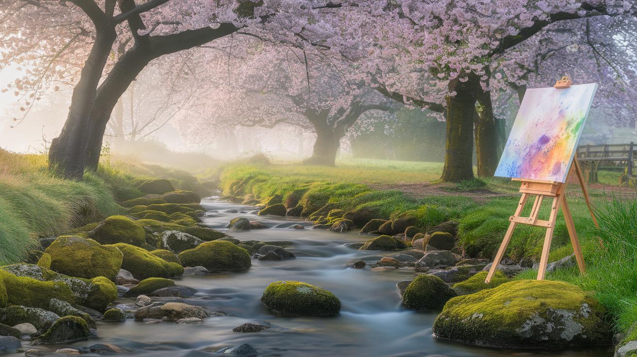
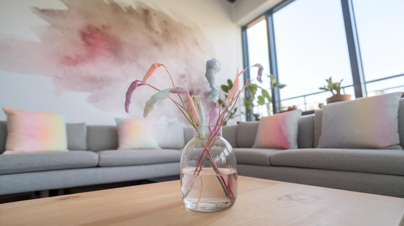
Fresh watercolour painting brings additional inspiration drawn from the natural world. Drawing from freshwater habitats such as lakes, rivers, and wetlands presents opportunities to capture reflections, water movements, and organic elements. Your choice of materials and techniques can enhance how these water themes are portrayed. This article offers practical ideas and guidance to help you develop fresh watercolour painting projects, whether you are a beginner or looking to advance your skills.
Understanding Watercolour Basics
Watercolour painting uses pigments mixed with water to create images on paper or other surfaces. These pigments are tiny particles that give color and sit suspended in the water, allowing you to apply thin layers that build up with transparency. This transparency helps you create light effects and subtle color changes in your artwork.
Quality pigments make a big difference. Strong pigments with good brightness and transparency let you layer colors without losing their vibrancy. Poor pigments might become dull or muddy when mixed. Choosing the right paper or support also affects how your paint flows and absorbs.
Watercolour paper absorbs water and pigment differently depending on its texture and weight. This interaction shapes the final look. Understanding these basics will help you make creative choices in your painting process.
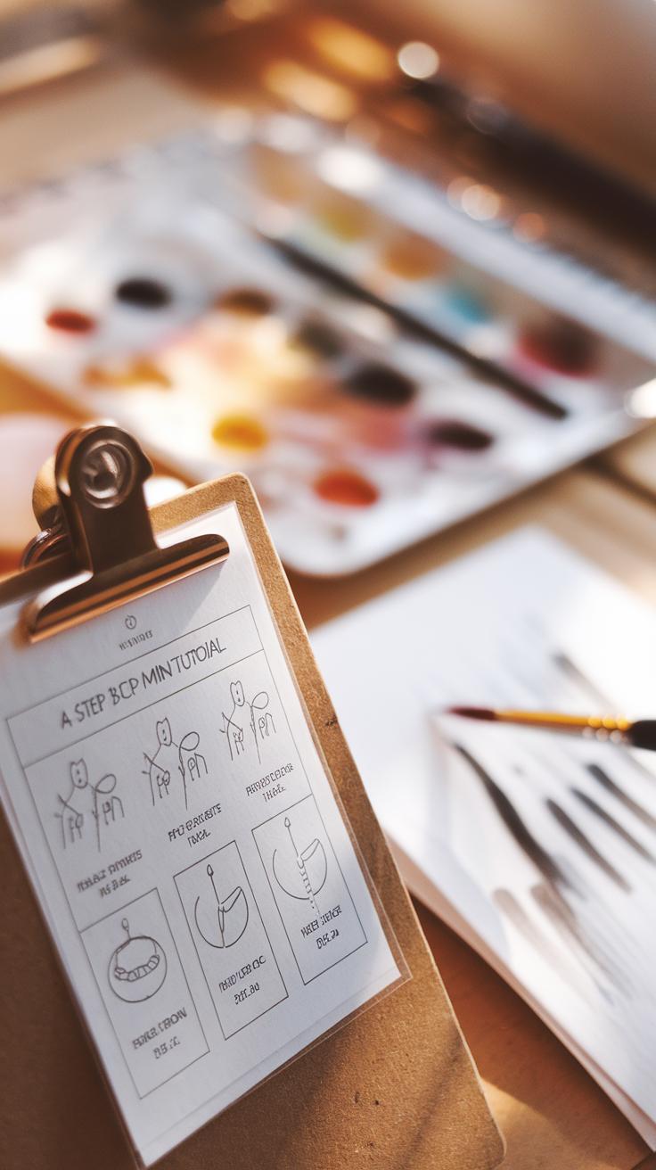
Composition and Medium
Watercolour paints consist mainly of pigments, binders, and water. Pigments provide the color you see. The binder, usually gum arabic, holds these pigments together and sticks them to your surface when dry. Water acts as the medium to carry the pigment and binder, controlling the paint’s flow and transparency.
The natural transparency of watercolour allows you to layer colors in washes, creating depth without losing light. You can mix pigments on your palette or directly on paper, blending colors smoothly or leaving clear edges depending on your technique.
How you control water and pigment affects your painting’s brightness and clarity. Do you prefer thin glazes or strong, bold strokes? Knowing how these components interact helps you achieve your desired effect.
Supports for Watercolour Paintings
Watercolour paper is the most common support. It comes in various textures like hot-pressed (smooth), cold-pressed (medium texture), and rough. Smooth paper suits detailed work while rough textures enhance washes and texture effects. Paper weight also matters; heavier paper holds more water without buckling.
Other supports can include silk and untreated wood panels. Silk lets paint flow uniquely but requires special preparation. Wood offers a smooth surface that absorbs less water, creating brighter colors but limiting blending time.
Choosing your support depends on your style and project. How will the surface texture influence the paint’s flow and drying time? Experiment with different materials to find what works best for your vision.
Exploring Fresh Water Themes in Watercolour
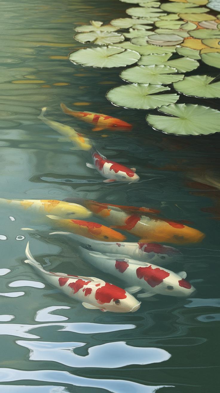
Freshwater scenes like ponds, rivers, and wetlands offer unique challenges and inspiration for your watercolor work. Observing these places closely helps you understand how water moves and changes with light. Notice how the surface shifts when a breeze passes by or how reflections alter during different times of day. Try to spend time outdoors watching these details instead of relying solely on photos.
Capturing reflections demands attention to subtle color changes and shapes, which water distorts. Painting still water versus flowing water requires different approaches. You may want to test layering techniques that preserve transparency to show depth and clarity. Experiment with wet-on-wet to suggest softness in moving water and sharp, dry brush strokes to capture ripples or edges of aquatic plants. How does water in a pond differ visually from a slow river in your area?
Natural Freshwater Features
Ponds often have clear water with visible plant life beneath the surface. Lilies, reeds, and algae create texture and interest in your paintings. Rivers can show cleaner or muddier water depending on location and recent weather. Try to capture the color shifts caused by depth and movement. Wetlands offer a mix of water and land with grasses and shrubs partially submerged. These provide a rich variety of greens and browns to practice mixing.
Practice looking carefully at reflections on water. Calm ponds show near-perfect mirror images, while rippling river water breaks reflections into patterns. Observe how light plays on wet leaves or stones to add realism. Your painting will gain life when you consider these small freshwater details and how water itself affects what you see.
Capturing Water Movements
Depicting water flow means observing how it moves around obstacles like rocks or branches. Smooth currents create gentle ripples, while faster flows produce sharper, jagged lines. Try using horizontal brush strokes to show calm water, and more irregular vertical or diagonal strokes for turbulence. Alter your brush pressure to mimic the softness or sharpness of edges.
Using light color washes can suggest transparency and depth. Layering slight variations in blues, greens, and earth tones adds interest and realism. Let your paper shine through in highlights to resemble reflected sunlight. Think about how water changes with wind or wildlife activity and try capturing a moment rather than the entire scene. Can you show the ripple of a fish jumping or a breeze stirring reeds?
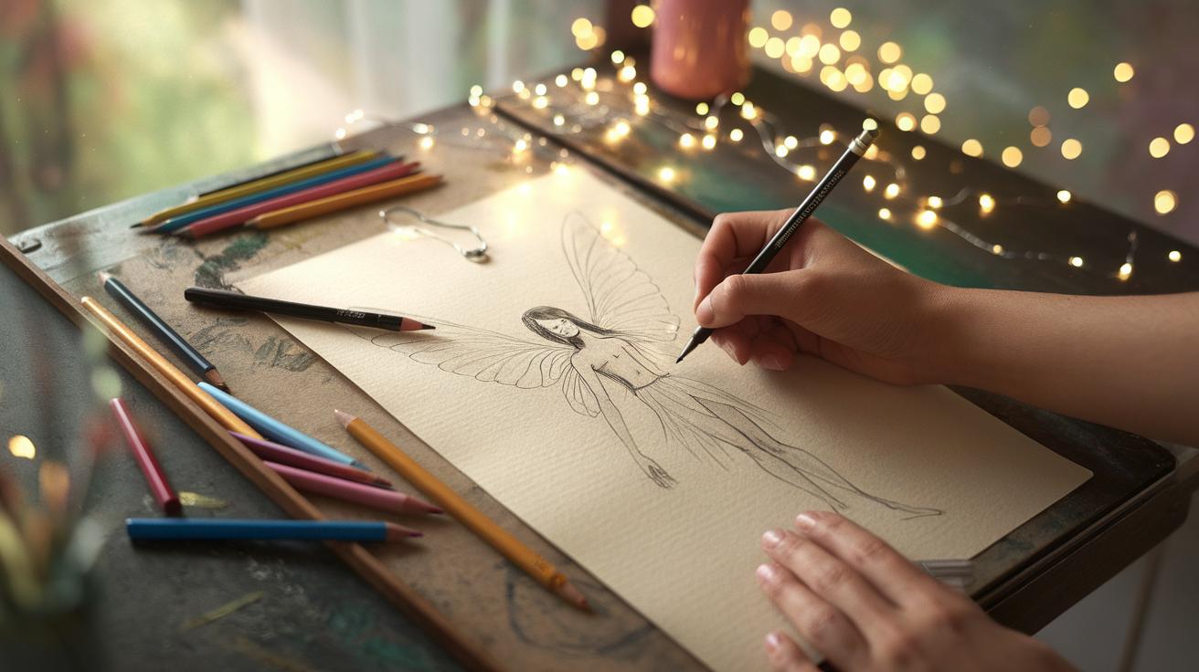
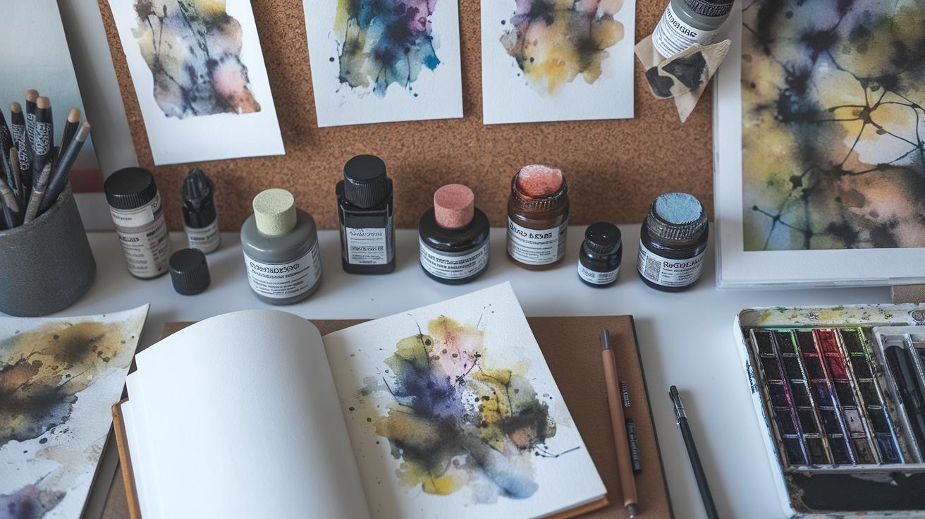
Materials You Will Need
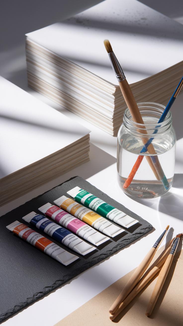
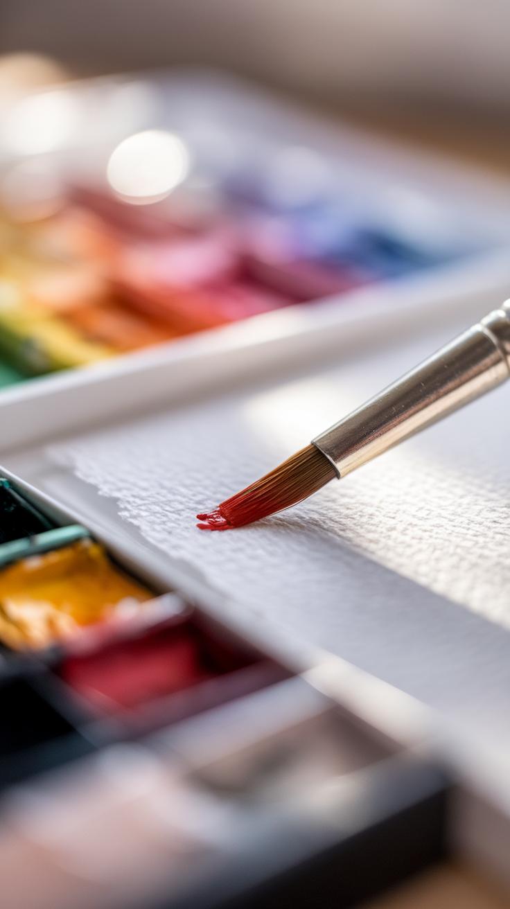
Choosing the right materials builds the foundation for your watercolor work. Start with paints, brushes, paper, and palettes tailored to your skill level. Student-grade paints offer a cost-friendly way to practice color mixing and layering. These have less pigment, so expect softer shades. If you want deeper colors and smoother blending, professional-grade paints provide higher pigment concentration for brighter and more lasting hues.
Brushes come in many shapes and sizes. Synthetic brushes suit beginners because they are affordable and hold paint well. Natural hair brushes, like sable, offer better spring and water retention for more control. Round brushes work for details and washes, flat brushes create straight edges and broad strokes, while mop brushes hold a lot of water for smooth washes.
Watercolor paper must handle water without warping. Cold-pressed paper has a slight texture that catches pigment nicely and is good for most techniques. Hot-pressed paper feels smooth and is great if you prefer sharp lines and fine detail. Weight matters — heavier paper (140 lb or more) resists buckling during wet washes. Don’t forget a palette for mixing colors and a container for clean water to avoid muddy paint. A blotting cloth or paper towel is handy for lifting excess water or paint from your artwork.
Selecting Watercolour Paints
You will notice a difference in quality between student and professional watercolor paints. Student paints contain more fillers and less pigment. These factors give lighter tones and less vibrant colors. Professional paints use higher amounts of pigment, which boosts color intensity and permanence.
Think about your goals—is your work for practice, experiments, or finished pieces? If your focus is learning techniques, student paints are enough. For artwork you want to last and stand out, professional paints are a better investment. Pigment concentration affects not just color strength, but also how your paint behaves when diluted or layered.
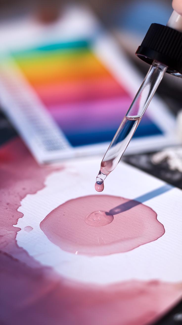
Test a color on paper to see its transparency and granulation. Some pigments separate into speckles when dried, which can add texture. Others remain smooth. Understanding these traits helps you pick shades that match your style and subject.
Choosing Brushes and Paper
Brushes affect how comfortable you feel and how much control you have. Synthetic brushes hold less water than natural hair but offer good precision, which is helpful when you paint detailed freshwater scenes. Sable hair brushes provide more water capacity and a springy feel, enhancing longer strokes and smooth washes.
Paper with a rough or cold-pressed surface traps pigment unevenly, which works well for textured subjects like rocks, reeds, or ripples in water. Hot-pressed paper offers a smooth surface that suits delicate reflections or fine lines. Consider paper weight; thinner paper tends to buckle when wet unless stretched, while heavier paper can take multiple washes without damage.
Try using different papers to notice how color behaves and how brushstrokes respond. Have you ever wondered if the feel of your brush affects your creativity? Finding brushes and paper that feel right in your hand can make painting more enjoyable and your results more satisfying.
Fundamental Watercolour Techniques
Mastering basic watercolor techniques shapes how your artwork unfolds. Start with washes, which allow you to spread color smoothly and evenly across your paper. Layering adds depth by placing transparent colors on top of each other, revealing hues beneath. Wet-on-wet lets colors blend naturally by applying wet paint over wet paper or paint, perfect for soft edges and gradients. Wet-on-dry means you paint wet color onto dry paper, giving you more control and sharper lines. Lifting helps correct or lighten areas by removing pigment with a damp brush or cloth.
Which technique suits your subject? Try wet-on-wet for skies to capture softness. Use wet-on-dry for detailed objects like branches. Lifting can save highlights or fix mistakes while layering builds complexity in shadows. Practicing these methods helps you understand how your brush interacts with water and pigment. Let your curiosity guide you toward effects that match your vision.
Wash Techniques
Washes form the base of many watercolor paintings. A flat wash spreads one tone evenly, ideal for backgrounds like a calm sky or a smooth wall. To do this, keep your brush loaded and brush in one direction with consistent moisture. A graded wash transitions from dark to light or one color to another. Start with saturated color and gradually add water as you move down, creating a smooth fade.
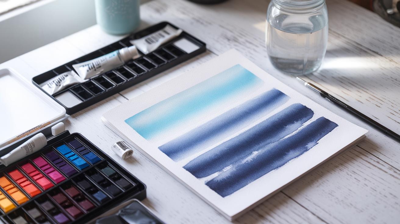
Variegated washes combine different colors while still wet, producing soft blends with gentle color shifts. Use this to suggest light or change in atmosphere. Each wash requires steady hand and timing; too dry and edges harden, too wet and colors may run uncontrollably. Practice these washes to decide how much fluidity or control you want in your painting.
Layering and Textures
Glazing means applying thin layers of transparent color after the first layer dries. Layering intensifies color without losing detail beneath. Use glazing to adjust tones or add shadows gradually. This technique helps avoid muddy colors that happen when mixing directly on paper.
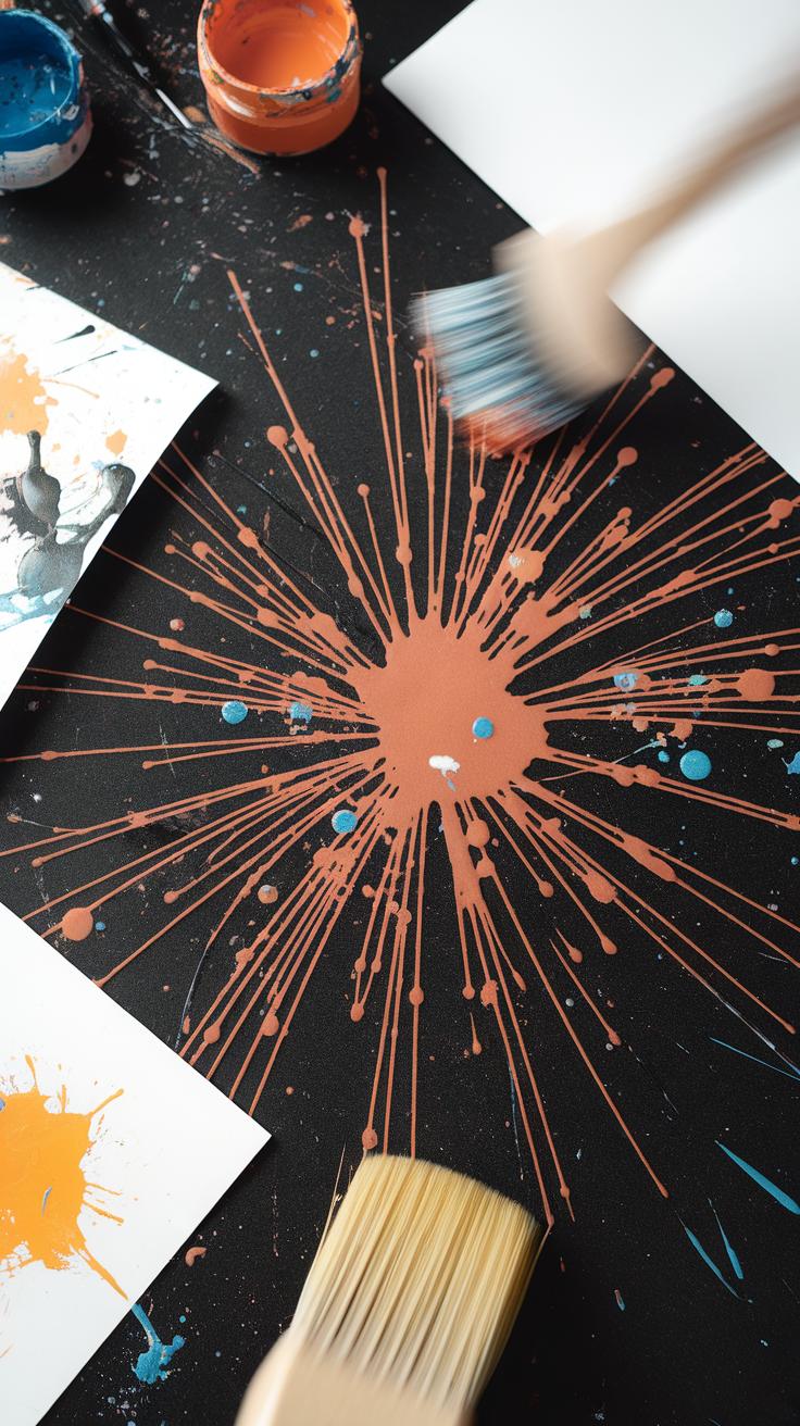
Texture adds interest. Sprinkling salt on wet paint can create star-like patterns as salt absorbs pigment. Sponging with a natural or synthetic sponge lifts some paint, making rough textures like foliage. Dry brush technique, where you drag a brush with little paint over dry paper, creates scratchy, textured marks suitable for grass or tree bark. Experiment with these tools to introduce variety and bring your paintings to life.
Applying Color Theory to Watercolour
Primary and Complementary Colors
You start with three primary colors in watercolour: red, blue, and yellow. These colors cannot be made by mixing others but form the foundation for all other hues.
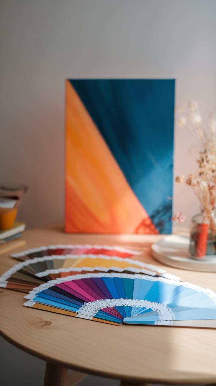
Complementary colors sit opposite each other on the color wheel, like blue and orange or red and green. Using these pairs side by side creates strong contrast and makes each color appear brighter.
When painting, place complementary colors next to each other to add energy and depth. For example, adding a touch of green next to red can make your subject pop. Experiment with these pairs to find unexpected color combinations in your artwork.
How often do you test color pairs before starting your watercolour piece? Trying these contrasts can give your paintings a fresh edge and catch the viewer’s eye through vibrancy.
Color Mixing and Harmony
Mix colors carefully to avoid muddy results. Use limited colors in small amounts, and add water gradually to control intensity. This approach helps you keep colors clear while producing the shade you want.
Balance warm and cool colors to create harmony. Warm reds and yellows bring energy, while cooler blues and greens provide calm. Arranging them thoughtfully guides the viewer’s eye across your painting.
Try mixing two primary colors in different ratios to see how the hue shifts. This will give you control over tone and mood in your work.
Ask yourself if your color choices support the feeling or story you want to tell. A harmonious palette strengthens a painting’s impact and makes it more enjoyable to create.
Advanced Techniques for Realistic Freshwater Scenes
You can create lifelike freshwater scenes by focusing on how water behaves in nature. Observe how reflections distort and ripple on the surface, and how light passes through shallow areas. To capture reflections, paint the shapes and colors of objects above water but soften edges and add slight waviness. Try wet-on-wet techniques to blur reflections and make them look fluid. Consider the angle of view to decide how much of the reflection is visible.
Capturing transparency requires layering. Start with a light wash showing the water’s color. Then, add thin layers of color for underwater plants or stones. Leave some paper white to suggest clarity and brightness. Use lifting techniques with a damp brush to create highlights within the water, mimicking its clear quality.
Painting Reflections and Transparency
Reflections often show a mirror image but with subtle distortions. Start by sketching the reflected shapes upside down before introducing color. Use softer brush strokes and dilute pigments to avoid harsh lines. To paint transparent shallow water, allow the paper to shine through thin washes. Apply darker tones only in deeper spots.
Look closely where the water overlaps objects, like leaves or rocks. Paint these with less opacity to simulate how they appear through water. Experiment with negative painting around shapes to create clean edges that look submerged. Ask yourself: how does the water change the color and clarity of what lies beneath?
Light and Shadow in Water Scenes
Light filtering through water changes constantly. Paint this by layering colors that shift from light to dark. Use warm tones where sunlight hits, and cool colors in the shadows. To show light refraction, soften edges of sunlit patches on the water and create sparkling effects with tiny white highlights.
Shadows from plants or rocks deepen the sense of depth. Block in shadow shapes with cooler, darker colors before adding details. Remember the shapes may be irregular and influenced by water movement. Try contrasting soft shadows with sharp highlights to make the scene feel dynamic. How does the light source affect each element in your composition?
Creativity and Experimentation
Watercolour painting offers endless opportunities to try new approaches and fresh ideas. Combining watercolour with gouache or ink can change the feel of your artwork. Gouache lets you paint with solid, opaque colors on top of transparent washes. Ink adds sharp, fine lines or bold shapes that stand out from soft watercolor areas. These tools help you focus on details or add striking contrasts to your freshwater themes.
Trying mixed media brings your paintings to life in unexpected ways. Imagine painting a calm lake with watercolour and then using ink to draw reed patterns or fish scales. You can also use gouache to highlight the light reflecting off the water. What new effects will you find by mixing these materials?
Mixed Media with Watercolour
Gouache is a water-based paint like watercolour but thicker and less transparent. It lets you add bright, solid areas that won’t get lost under watery washes. Use gouache to paint highlights like splashes, water droplets, or bright leaves on a riverbank. Ink works best for fine details. You can draw insects hovering over a stream or the veins in a leaf.
Start by painting a soft watercolour background. Let it dry, then add gouache or ink details on top. This layering creates depth and texture in your freshwater scenes. Try using a brush pen for ink lines or a small flat brush for gouache shapes. How will layering impact the story your painting tells?
Exploring Different Styles
Freshwater subjects suit many painting styles beyond strict realism. You might enjoy loose, impressionistic brushstrokes to capture the play of light on a pond. Or explore abstraction by focusing on shapes and colors rather than exact forms. Expressive styles allow bold colors and unusual brushwork to show mood and movement.
Ask yourself what part of freshwater inspires you most. Is it the reflections, the flow, or the life within the water? Try painting these qualities without aiming for detail. Use large brush strokes and simple color blocks to represent waves or water plants. What feelings do you want to express through your style?
Experiment with different styles side by side. One day paint a river with fine realism. Another, create an abstract piece inspired by water ripples. Which approach connects with your vision? Freshwater themes adapt well to many creative paths. Let your curiosity guide your experiments.
Tips to Improve Your Watercolour Painting Skills
Practice and Setup
Choose a space where you can keep your watercolour supplies ready to use every day. A small table near natural light works well. Organize paints, brushes, and paper so you spend more time painting and less time searching for tools.
Set clear goals for each session. Instead of aiming to finish a whole painting, focus on mastering one technique, like wet-on-wet or layering colors. Short, focused practice builds skill over time and keeps frustration low.
Ask yourself what you want to improve before you start painting. Track your progress by keeping your older work and comparing it with new pieces. This helps you see what worked and what needs more effort.
Learning and Evolving
Study the work of other watercolour artists. What details catch your eye? How do their color choices affect the mood? Try to recreate small parts of their paintings to understand their methods without copying their whole work.
Attend workshops or watch online tutorials. These experiences introduce you to new ideas and tools you might not find on your own. They also offer feedback from teachers and peers that sharpen your skills.
Reflect on your mistakes instead of hiding them. If a wash looks splotchy or a color runs, figure out why. Mistakes can reveal how water and pigment react, guiding you to better control. What did your last painting teach you about handling water and paint?
Conclusions
Watercolour painting is a versatile and accessible medium that invites you to explore your artistic ideas with clarity and spontaneity. By selecting the right materials and mastering key techniques, you can create works that effectively capture light, color, and form. Fresh water themes provide rich subject matter that can stimulate your creativity and challenge your skills. Approaching your watercolour projects with an open mind and willingness to experiment will lead to rewarding results.
Ultimately, your journey with watercolour painting benefits from understanding color theory, paint behavior, and how to work with water to control transparency and texture. Observing natural freshwater environments and practicing with different approaches will deepen your appreciation and ability within this medium. Keep asking how you can express your vision through watercolour, and persistently refine your craft to produce meaningful and engaging artworks.


