Introduction
Watercolor painting offers a unique way to bring architecture to life on paper. This method combines water-based pigments that create transparent layers, essential for capturing light and shadow in buildings. You can use watercolors on various materials, mainly watercolor paper, which controls paint flow and texture. The history of watercolor shows its evolution from simple sketches to refined art forms that detail architectural elements with clarity and depth. Learning how to apply watercolor techniques lets you recreate the charm of historic and modern structures.
Drawing architectural sketches with watercolors requires skill and patience. Your choices of brush strokes, color mixing, and layer management define the final image quality. Detailed sketches demand careful planning and observation to reflect accurate proportions and intricate designs. Many artists use watercolors for preliminary studies, showing how this medium suits quick, yet expressive representations of architecture. This article guides you through practical steps to refine your watercolor architecture sketches and improve your technique.
Understanding Watercolor Materials
The materials you choose shape how your watercolor architecture painting looks and feels. Watercolor paper, brushes, pigments, and other tools each play a role in the process and final artwork.
Choosing the right paper helps control how your paint spreads and dries. Different papers absorb water in unique ways, which influences detail and texture.
Brushes affect your precision and the type of strokes you create. Some brushes hold more water, while others allow sharp lines perfect for architectural elements.
Pigments vary in color strength and transparency. Strong pigments help capture bold architectural shapes, while lighter ones add subtle shadows and details.
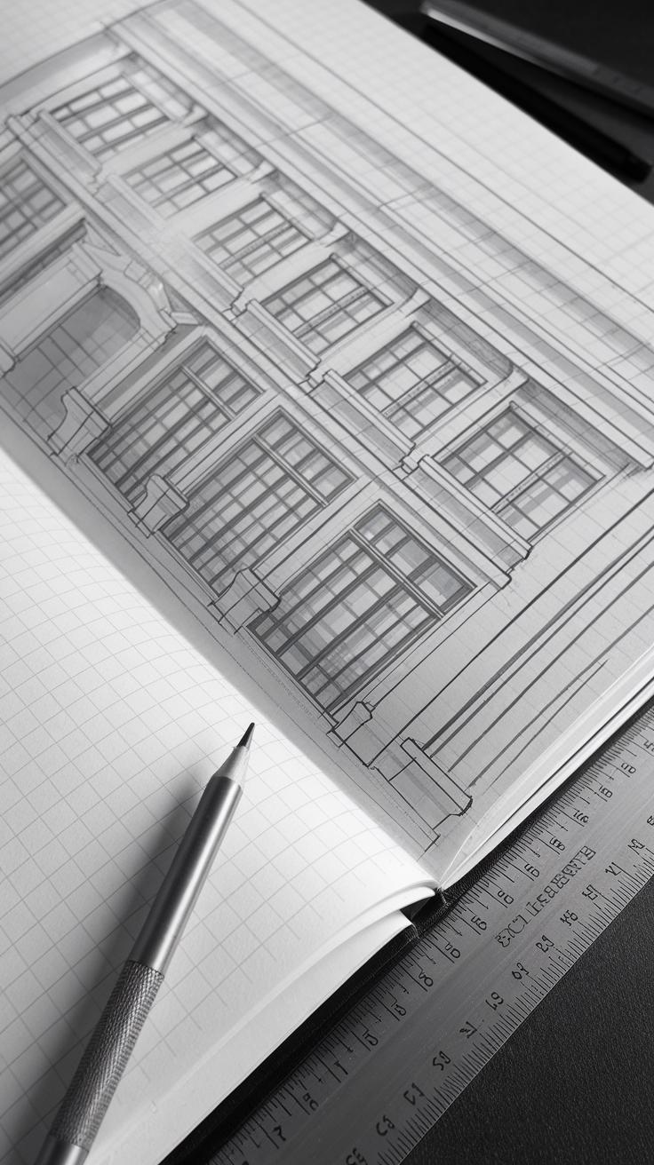
Additional tools like masking fluid, pencils, and rulers assist in achieving crisp edges and maintaining clean lines when sketching buildings.
Ask yourself: What kind of effect do you want in your architecture watercolor? Do you prefer soft washes or sharper lines? Your material choices answer these questions.
Choosing the Right Paper
Watercolor papers come in hot-pressed, cold-pressed, and rough textures. Each texture impacts your architectural painting differently.
Hot-pressed paper has a smooth surface. It allows for detailed, sharp lines, perfect for sketches of buildings. If you want precision in windows, bricks, and architectural details, this paper suits you.
Cold-pressed paper has a subtle texture. It strikes a balance between detail and softness. This paper works well for combining architectural lines with gentle washes of color.
Rough paper adds visible texture. It captures the feel of stone or wood but can make fine details harder to paint. You might use this for more expressive architectural studies.
Consider texture when planning your work. What kind of architectural effect do you want to emphasize? Your choice of paper helps define that.
Selecting Brushes and Pigments
Brush shape and size affect your control in architectural watercolors. Round brushes with fine tips offer precision for window frames and edges. Flat brushes help paint straight lines and broad areas.
Detail brushes with small tips allow you to add fine lines like railings or brickwork. Choose good-quality synthetic or sable brushes for durability and smooth paint flow.
Your pigments influence how vibrant or muted your architectural painting appears. Use pigments that can layer well without muddying. Transparent colors such as Ultramarine Blue and Burnt Sienna are popular for building shadows and highlights.
Tightly pigmented colors help when you want sharp contrast between light and shadow on facades. Mixing pigments carefully avoids dullness that hides architectural details.
Think about how each brush and pigment will help you represent your subject accurately. What details will you need to capture? Your tools should support that goal.
Basic Watercolor Techniques for Architecture
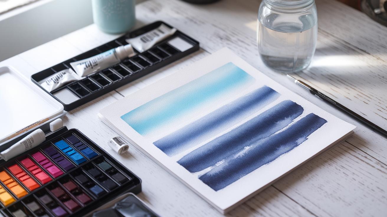
Mastering foundational watercolor techniques is essential to bring architectural scenes to life. Start with washes, which lay a smooth color base on your paper. Flat washes are perfect for large, even surfaces like walls or the sky, providing a clean and consistent tone. Graded washes shift gradually from dark to light or one color to another, adding subtle movement to areas such as fading sky or sunlit building sides.
Glazing strengthens your painting by building layers of transparent color. Applying thin glazes of paint allows you to create shadows, reflections, and textures without losing details in the underlayers. It’s like adding depth one layer at a time, where your colors interact softly.
Dry brushing adds texture and highlights. Use a stiff, nearly dry brush with minimal paint to create crisp lines or rough surfaces, such as bricks or roof tiles. This technique brings a tactile quality to your architectural features.
Which technique do you find most challenging so far? Practicing each method alone will help you know when and where to use them for precise architectural effects.
Effective Wash Techniques
Applying flat washes evenly presents broad architectural elements clearly. You can use a wide brush and enough water to cover walls or the sky smoothly. Keep your brush strokes consistent and work quickly to avoid streaks.
Graded washes require careful control of water and pigment. Begin with a stronger color on one side and gradually add water while brushing across the paper. This technique works well for showing light changes on walls or fading shadows in the sky.
While flat washes focus on uniformity, graded washes add subtle dimension and interest. Both help you block in major shapes before adding details. Practice applying a flat wash for a building wall, then use a graded wash on the adjoining surface to suggest sun and shade.
How might changing your wash technique alter the mood of an architectural scene? Experiment to see how smooth or gradual color shifts affect the final look.
Using Glazing for Depth
Glazing means layering thin, transparent washes over dry paint. Each new glaze adjusts the tone without hiding what’s beneath. This technique builds complexity, especially in architectural shadows and reflections.
Start with a light base color on a building surface. Once dry, add a darker glaze to create shadow areas or to suggest aging and texture. Multiple layers increase richness and dimension without overpowering the initial details.
Glazing works well to emphasize sunlight and shade on facades. You can also use it to deepen color in windows or doorways, giving them more life and realism.
Have you tried glazing to deepen shadows or add texture? Each layer requires patience but improves the precision and depth of your architectural watercolor sketches.
Drawing Accurate Architectural Sketches
Before applying watercolor, your architectural sketch must be precise. Start by carefully observing the building’s main shapes and proportions. Identify key lines, such as roof edges, walls, and window placements, ensuring these align correctly.
Use light pencil strokes to draft the structure’s outline. Arrange your drawing so that the base, height, and depth feel balanced. Check your work frequently by stepping back to compare the sketch with the actual building or reference photo.
Maintain clear, clean lines that will guide your watercolor application later. Pay close attention to where elements meet or intersect, as accuracy here prevents distortion in your final painting. How often do you pause to measure your lines as you sketch?
Taking the time to perfect your architecture drawing will make your watercolor work more successful. Your art will feel solid and believable, setting a strong foundation for adding color and detail.
Mastering Perspective Drawing
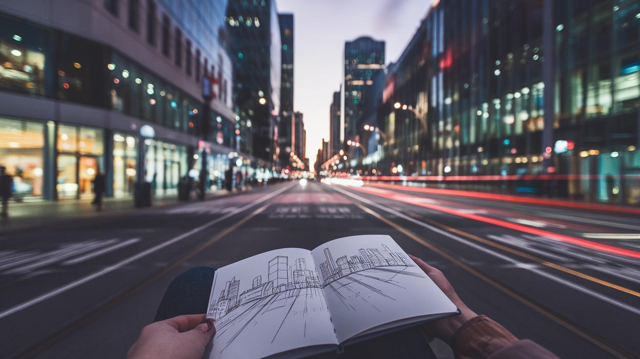
Understanding perspective is key to making buildings appear real in your art. One-point perspective uses a single vanishing point where parallel lines converge. It works well when you look straight down a street or at a building face-on.
Two-point perspective requires two vanishing points, usually placed on the horizon line. This technique better shows a building corner and the two sides receding into space. It creates a more dynamic and realistic view.
Practice by drawing simple boxes or cubes using these perspective points. Then apply those concepts to architectural elements like walls and windows. Where do the lines lead? Do they meet at your vanishing points? Confirming this keeps shapes accurate and believable.
Measuring and Scaling
Correct proportions come from careful measuring. Use tools like a ruler or a proportional divider to compare parts of your subject. Hold your pencil at arm’s length to gauge distances, then transfer those measurements to your sketch.
Measure key features such as door height relative to window width. Use these ratios to scale smaller or larger drawings without losing accuracy. If one door is twice as tall as a window, your sketch should reflect that precisely.
Scaling your drawing ensures it fits your paper and matches your chosen composition. What helps you judge size and distance quickly when sketching architecture? Developing a consistent measuring routine sharpens your ability to capture correct proportions every time.
Capturing Architectural Details
Watercolor allows you to highlight the finer parts of architecture that give buildings their character. Focus your brush where shapes like windows, doors, and trims meet. Use varied brush strokes to suggest texture—try soft washes for glass reflections and sharper lines for frames or moldings. Layering thin washes can build subtle shadows around details without overwhelming your sketch.
Consider adding tiny touches that show wear or decoration, such as bricks or carved elements. Observe how light interacts with these features and replicate that effect by controlling pigment concentration. Think about which details deserve the most attention—those play a key role in telling the building’s story. Ask yourself which parts bring personality to the structure and adjust your focus accordingly.
Using Fine Brushes
Fine brushes are perfect tools for painting delicate details on architectural subjects. Their small tips allow you to paint lines as thin as window mullions or ornate door carvings with control. Choose brushes with synthetic or sable hairs that hold a sharp point for crisp strokes. Using the tip precisely keeps your lines clean and prevents color bleeding.
When painting textures like brick or wood grain, a fine brush lets you add small marks that suggest surface patterns. You can also lift or soften edges with a damp fine brush for subtle effects. Holding your brush closer to the tip increases accuracy, which helps when filling tiny spaces without flooding your work.
Balancing Detail and Simplicity
Too much detail can clutter your watercolor and distract from the overall composition. Decide which architectural elements matter most before painting. Focus on key features like main windows or doorways, while simplifying less important areas. Using fewer details helps keep your artwork clear and easy to read.
Think about the viewing distance. Smaller paintings need less detail since viewers can’t see tiny features well. In larger works, you can include more precise textures and patterns. Use contrast to guide attention—sharper, darker details stand out, while lighter washes recede. Ask yourself which features tell your story best and leave out the rest.
Color Choices for Architectural Watercolors
Choosing the right colors shapes how your architectural painting feels.
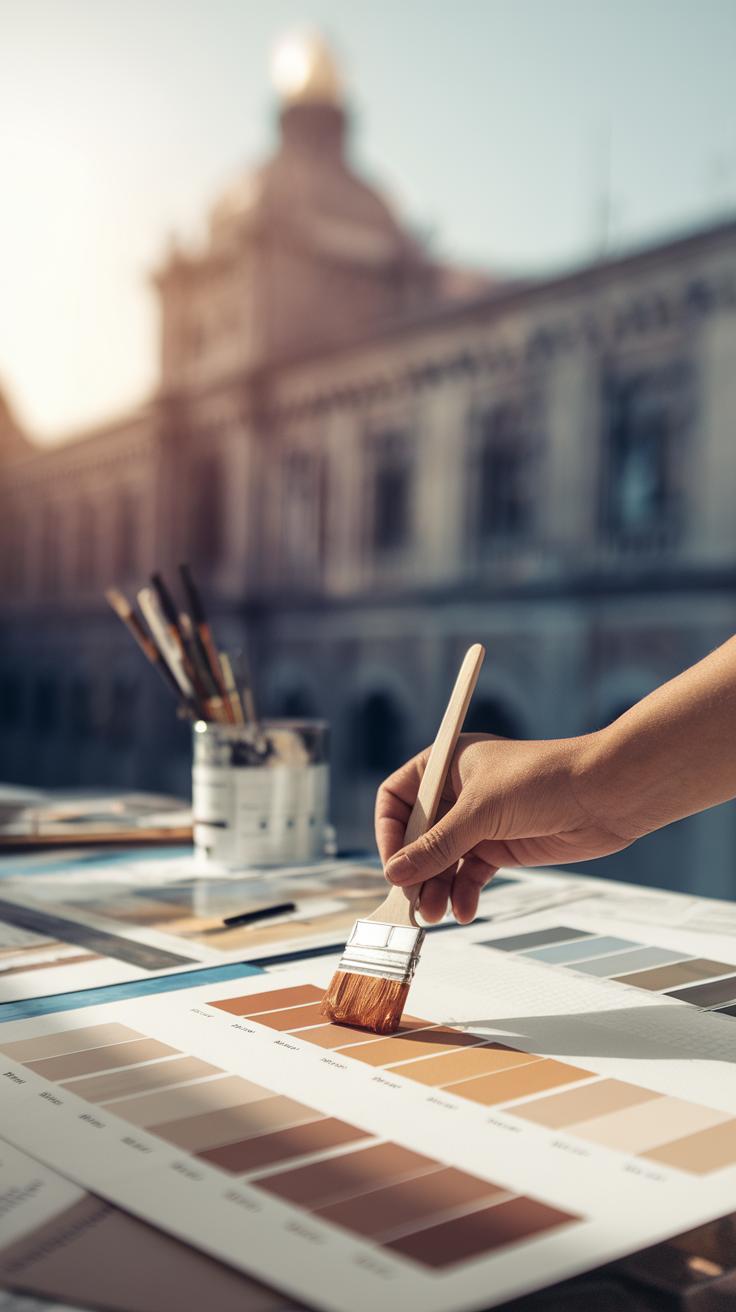
Consider the style of the building you paint. Classic brick buildings often call for warm reds, burnt siennas, and muted browns. Modern glass and steel structures require cooler tones like blues, grays, and silvers to reflect sleek surfaces and light.
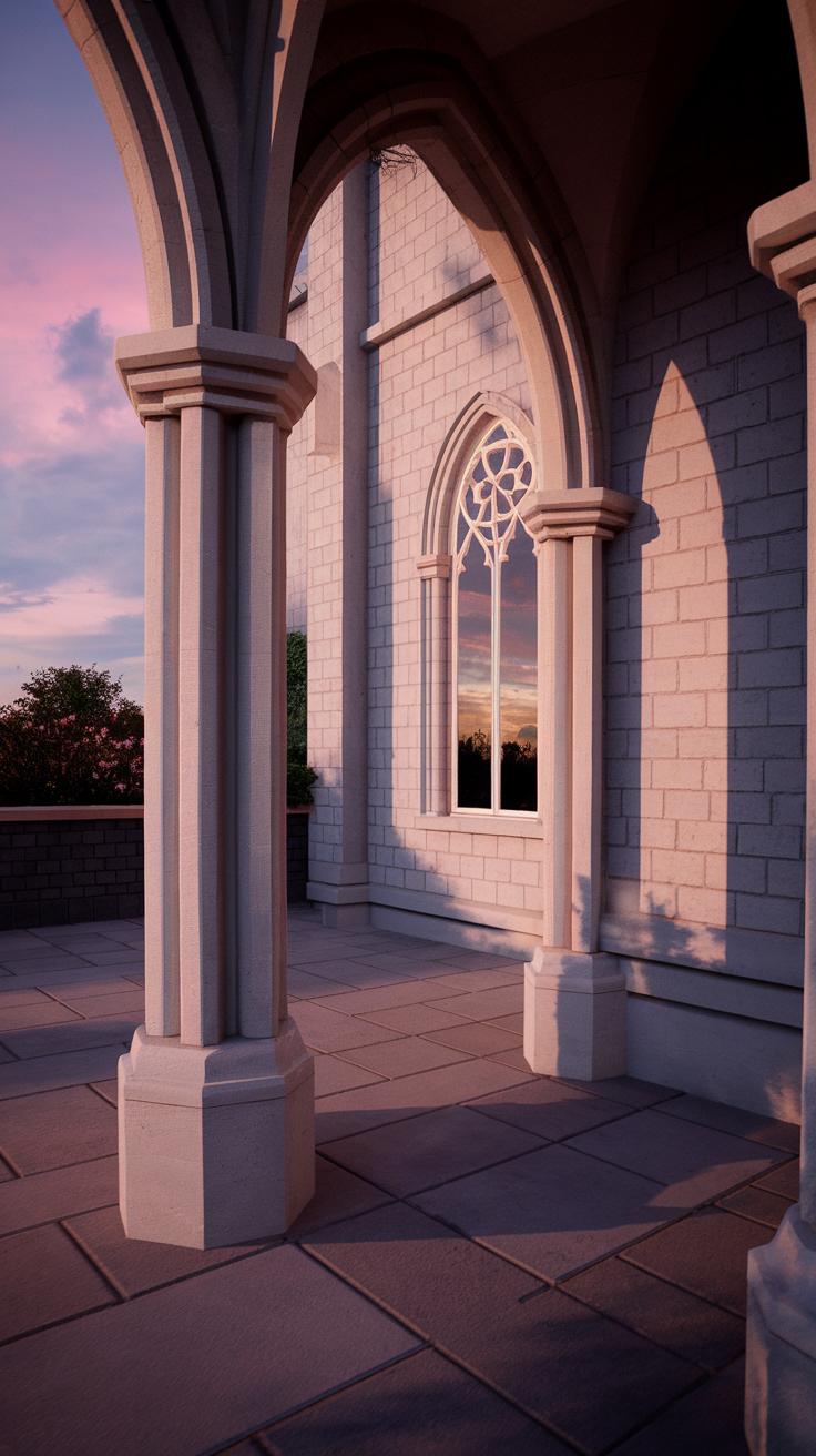
Look at the lighting conditions around your subject. Morning light softens colors with pale yellows and light pinks, while midday brings strong contrasts and bright colors. Sunset light adds warm oranges and deep shadows, changing how colors interact on the building’s surfaces.
Ask yourself what mood you want to create. Do you want a calm, realistic feel or a bold, dramatic impression? Your color choice can guide the viewer’s eye and emphasize architectural angles. Experiment with limited palettes to find harmony or vibrant mixes for energy.
Natural vs. Stylized Colors
Realistic colors capture buildings as they appear to the eye, helping viewers recognize materials and environment. Painting a historic stone wall with gray and beige blends can evoke the true texture and age of the structure.
Stylized colors give you creative freedom. Using unexpected hues like purples or greens can highlight shapes and draw attention to architectural features. This approach can make your work stand out and offer a fresh perspective.
Which approach fits your vision? Try both. Paint the same scene with natural colors, then with stylized colors. Notice how each version changes the story your painting tells.
Mixing Colors for Building Surfaces
Matching building materials starts with understanding their base colors. Brick walls usually need a mix of red, orange, and brown with touches of gray. Stone ranges from neutral grays to warm tans, often with subtle blue or green undertones from moss or weathering.
Wood varies widely but often combines yellow ochre, burnt sienna, and touches of raw umber depending on age and finish.
Mix colors gradually to build depth. Start with lighter tones and add stronger pigments for shadows and details. Test your mixtures on scrap paper before applying them to your painting to ensure you capture the surface texture and color accurately.
Do you observe subtle color shifts in different lighting? Adjust your mix to reflect these changes for a more convincing result.
Layering and Texture Techniques
Building Layers Gradually
Your watercolor architectural painting gains depth by building layers step by step. Begin with a light wash to outline the overall shape and tone of the building. Keep this first layer diluted to allow future layers to show through. Once the first wash dries completely, add a second layer to define shadows and structural details. Each new layer should use slightly darker or more saturated paint to create volume. Resist the urge to apply heavy color all at once; patience helps you avoid muddy colors and loss of detail.
Notice how light hits your structure as you add layers. By applying paint gradually, your walls and roofs will look solid instead of flat. For example, use softer edges on distant elements and sharper lines for closer details. How does the layer order affect the final texture you see in your painting? Experiment with the drying time of each layer to control blending and sharpness.
Creating Textures for Different Materials
Architectural surfaces vary widely. You can use watercolor techniques to mimic these textures convincingly. For brick walls, try dry brushing with a stiff brush to create uneven, rough patches. Add small horizontal and vertical strokes that overlap slightly to imitate the brick pattern. Mixing subtle reds, browns, and greys works well here.
Concrete surfaces benefit from a soft, mottled look. Use a wet-on-wet method by dropping pigment into damp areas, letting colors blend naturally. Add some salt while the paint dries to produce a grainy effect that resembles concrete’s porous texture. For glass, focus on transparency and reflections. Leave some paper areas untouched as highlights and add thin washes of blues or greys. Sharp, angular strokes can suggest window frames and reflections on glass surfaces.
Which material do you want to master first? Practice these techniques on small test patches before applying them to your main work. Building patterns slowly helps you avoid overworking the painting and keeps the surface lively and realistic.
Lighting and Shadows in Architectural Sketches
Identifying Light Sources
When you study an architectural subject, start by locating the main light source. Is it the sun, a streetlamp, or window light? Observe where the light hits most directly. Track how the light changes across surfaces and corners. This tells you the direction and strength of your light.
Try sketching simple shapes and mark the light side and shaded areas before adding details. This helps keep the lighting consistent. Strong light creates clear contrasts; softer light offers gentler transitions. Keep your eye on subtle shifts in tone and value to make your sketch believable.
Ask yourself, what time of day is it? How does the light affect the mood and feel of the building? Light intensity alters colors and shadows, so notice how these qualities change in your scene. You can enhance your architectural story by carefully placing light and shadow.
Painting Shadows with Watercolors
Start with soft shadows by applying a diluted wash of color to shaded areas. Using a wet-on-wet technique can produce smooth gradients that look natural and subtle. These soft shadows add volume without harsh edges.
For harder shadows, allow your brush to stay firmer and use more pigment. Define edges where the shadow sharply stops. This contrast helps separate planes and corners, making your architecture pop.
Layer your shadows gradually to build depth. Too dark too soon loses transparency and detail. Use cooler colors in shadows to balance warm light areas. For example, blue or purple tones work well to suggest shade in sunlight.
Consider how cast shadows fall around and beneath structural elements. These shapes help ground the architecture and give clarity to forms. Keep checking your light source to maintain shadow accuracy. How can you adjust shadow shapes to make your buildings feel real and solid?
Planning and Composition for Architectural Art
Planning your composition sets the stage for a successful architectural watercolor. Begin by observing the scene and deciding what elements to include or exclude. Think about balance—how shapes and lines interact across your paper. Use light sketches to arrange buildings, streets, and open spaces to guide the viewer’s eye smoothly through the painting.
Consider the proportions of your layout. Leaving some open areas can prevent the image from feeling crowded. Try placing the main structure slightly off-center to create more interest. Ask yourself: What story do you want the architecture to tell? What parts do you want to highlight?
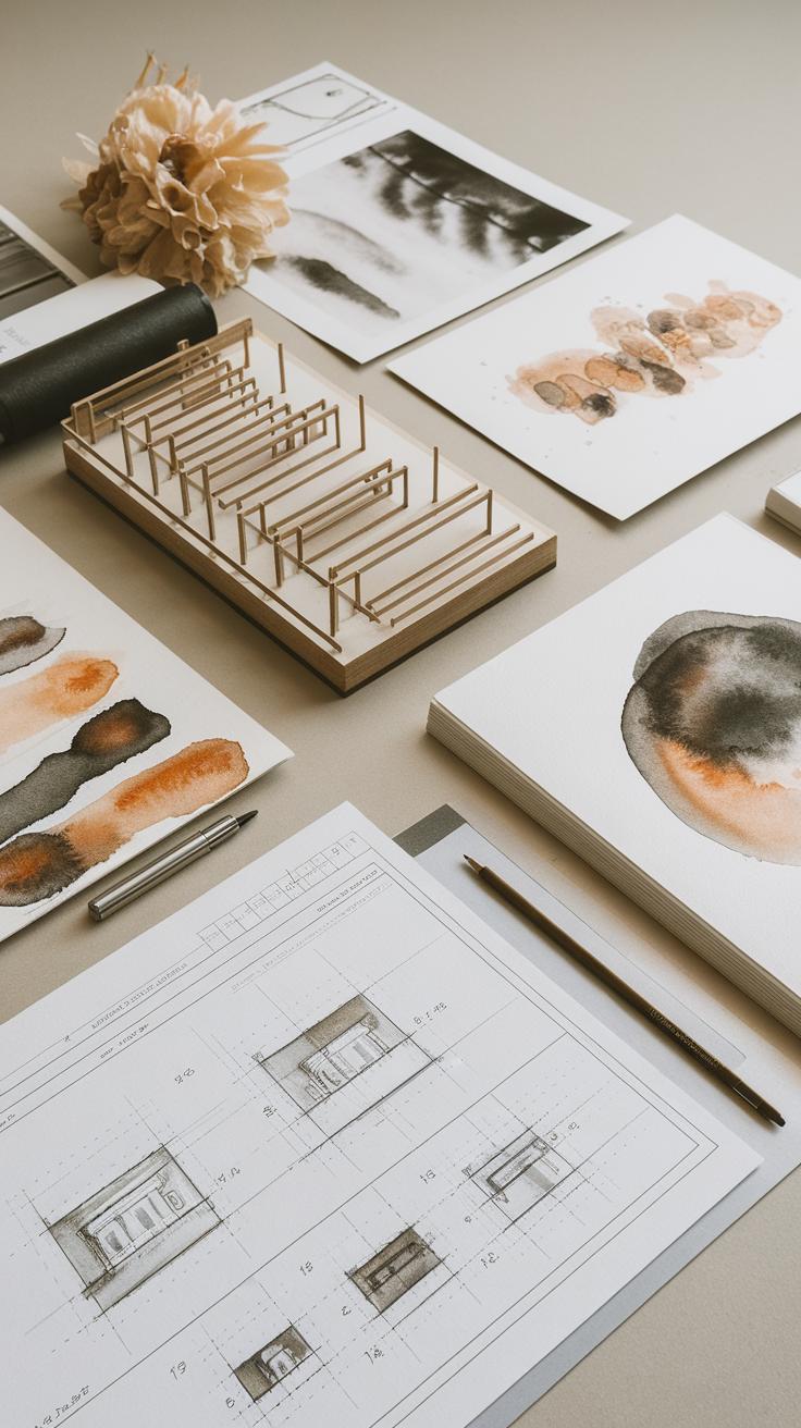
Using simple grid lines or thumbnail sketches before starting can help you visualize the final composition. This preparation saves time and reduces errors during the actual watercolor process. Remember, a well-planned composition helps your painting feel stable and engaging.
Simplifying Complex Scenes
Architectural scenes often have many details that can overwhelm your painting. Simplify these by focusing on key shapes and forms. Break down the building into basic parts like rectangles, triangles, and curves instead of every small window or brick.
Identify which details enhance the character of the architecture and which ones can be left out. For instance, suggest texture with light washes rather than painting every surface feature. This saves effort and keeps your watercolor clear and readable.
Ask yourself: What details support the mood or story? What can you imply rather than define? Simplifying does not mean losing important information; it means choosing what helps your viewer understand the structure without distraction.
Using Focal Points
A strong focal point captures attention and organizes your painting. Choose one element, such as a doorway, a tower, or a window with colorful shutters. Make this area more detailed or use sharper lines to draw the viewer in.
Control light and contrast around your focal point. Darker shadows nearby and lighter edges can make it stand out. Position the focal point where natural eye movement occurs—either near the center or along the rule of thirds lines.
Ask yourself how to guide the viewer. Should they first notice the grand arch or the texture of the brick wall? Use color intensity and detail to lead their gaze. Keeping other areas simpler helps keep the focus where you want it.
Common Mistakes to Avoid
Many beginners struggle with common errors that affect the quality of their watercolor architecture sketches. One frequent mistake is overworking the painting. When you keep adding layers, your colors become muddy and lose the unique transparency that watercolor offers. This dulls the light effects and flattens the depth in your work. Think about how light travels through glass or stone in a real building. Can your painting replicate that? To fix this, apply layers carefully and wait for one to dry before adding another. Plan your color intensity from the start to prevent the urge to paint repeatedly over the same area.
Skipping sketch preparation is another major error. Watercolor needs a solid base to succeed, especially with precise architectural subjects. An inaccurate or rushed initial sketch leads to misaligned perspectives or awkward proportions. If your foundation is weak, it becomes harder to fix mistakes once paint touches paper. Spend time drawing grids and outlines with a light hand. Does the building’s structure look stable and well-measured? Precise sketching guides your brush and keeps details clear. Avoid jumping straight to paint; your sketch sets the roadmap for a clean, balanced final piece.
Overworking the Painting
Overworking happens when you apply too many paint layers or keep reactivating wet areas. Watercolor’s charm lies in its transparent layers that create light and shadow naturally. Continual layering covers this transparency, resulting in dull, lifeless colors. You also risk lifting off pigment or damaging the paper surface, which ruins details in your architectural elements. To avoid this, apply paint in measured washes and pause often. Step back and ask, “Does this layer enhance the design or cover it?” Let the paint dry completely before adding more. Learning to stop at the right time keeps your work fresh and vibrant.
Skipping Sketch Preparation
Skipping the sketch phase leads to inconsistent lines and shapes. Architectural subjects need accuracy to capture details like windows, columns, and angles. Without an accurate sketch, your paintwork struggles to align correctly, causing distortion. This can make your buildings look unstable or unrealistic. Before painting, use light pencil strokes to map out proportions and perspective. Check that all elements follow a logical structure. Are the lines parallel where they should be? Would adding a guideline improve symmetry? Taking the time to prepare your sketch ensures cleaner painting and a more confident workflow, making each brushstroke count.
Practical Exercises to Improve Your Skills
Building confidence in watercolor architectural sketches requires regular practice. Start with focusing on individual parts of buildings like windows, doors, roofs, and columns. Sketch these elements using simple lines, then add light watercolor washes to practice control without overwhelming your work. How does varying your brush pressure affect the texture of bricks or wood?
Set aside time each day for these focused studies. Repeat the same element from different buildings to notice variations in style and detail. Gradually increase complexity by combining elements in small compositions. This step-by-step approach helps you understand structure before tackling full scenes.
Try mixing limited color palettes while painting to simplify your process and sharpen your observation of light and shadow. Observe how different lighting changes the mood and depth of your sketches. Ask yourself what you can learn about the building’s form and material through these color choices.
Daily Sketch Challenges
Pick one architectural feature each day to sketch and watercolor. One day could be ornate doors. The next might focus on rooftops or windowsills. Keep sketches small to encourage quick observation rather than perfection.
Challenge yourself to finish each sketch within 20 minutes. This time limit trains your eye to catch key details and speeds up your hand. Afterward, examine where your lines or colors could be clearer. Which shapes stood out? Which details were hardest to capture?
Involve outdoor drawing if possible. Look around your neighborhood or city for inspiration. Sketching on location makes you notice elements you might miss in photographs. Ask, how does the real light change the building’s colors and shadows compared to my sketches?
Creating Completed Architectural Watercolors
Begin by choosing a simple building with clear, strong shapes. Start with light pencil lines defining the main structure and major architectural details. Use a light hand to avoid heavy marks that are hard to cover with paint.
Create a value study with watercolor washes to establish shadows and light areas. Use at least three tone layers to give depth while keeping the paint transparent. Take your time observing where shadows fall and adjust your washes accordingly.
Add line details last, using fine pens or a small brush to emphasize edges, windows, or texture without overworking the painting. Step back often to see the painting as a whole. Ask yourself if the sketch feels balanced and true to the building’s form before finishing.
Conclusions
Developing your watercolor architecture skills takes practice and attention to detail. By integrating precise sketching methods with watercolor painting, you gain the ability to depict structures with authenticity and style. Understanding your tools and materials helps control the outcome, ensuring your art accurately reflects architectural complexity. Consistent effort in observing and rendering details improves your confidence and creativity. Consider how this blend of water-based color and structural drawing can enhance your artistic expression in architecture.
Embracing watercolor architecture sketch techniques opens doors to numerous creative possibilities. These skills allow you to communicate ideas visually and preserve the beauty of buildings in artistic form. Your journey with watercolors can be rewarding as you explore shading, texturing, and layer effects unique to this medium. Keep experimenting with different approaches, and ask yourself how each technique impacts your visual storytelling. Your commitment to mastering these techniques will lead to compelling and memorable architectural artworks.


