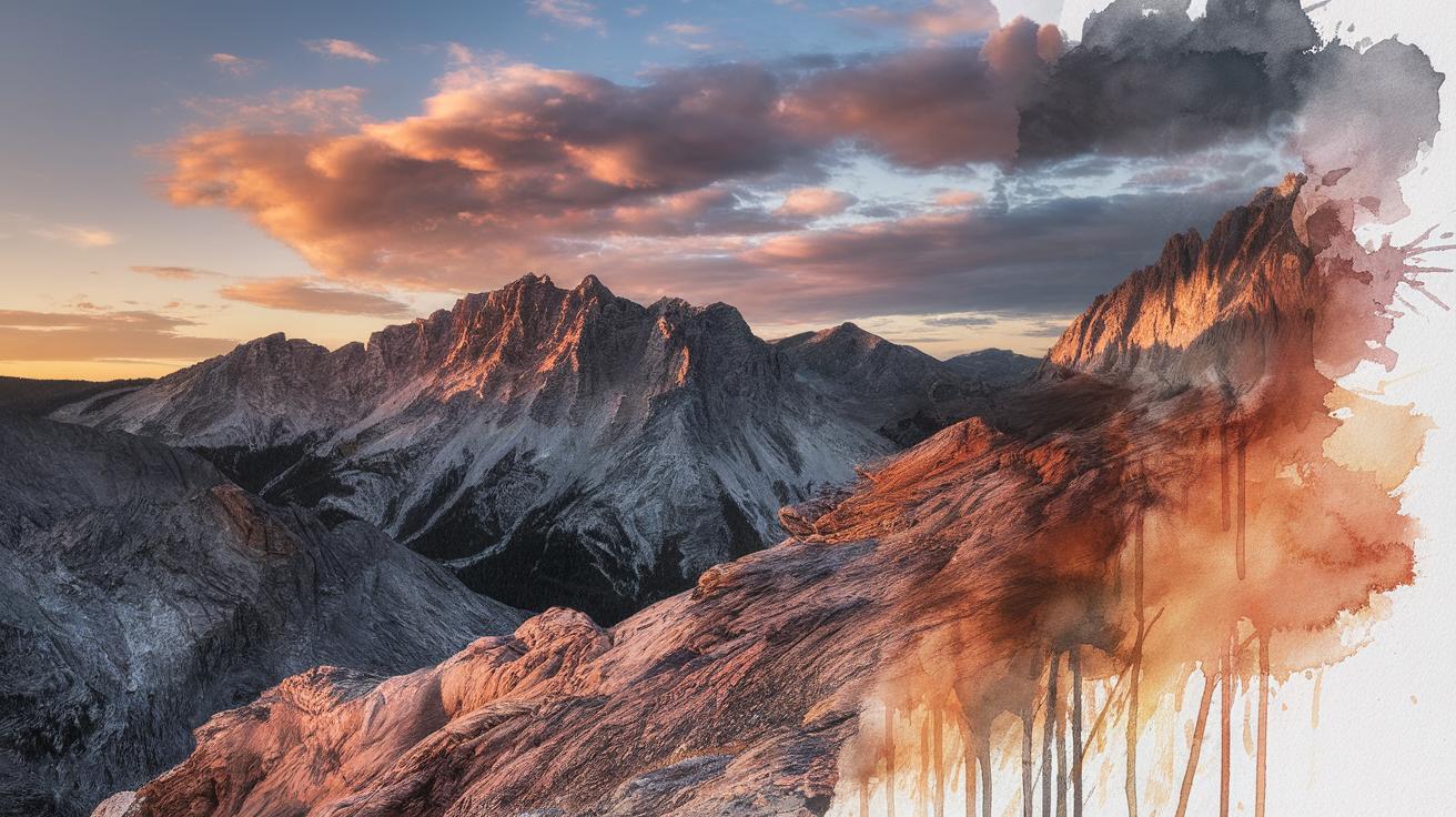
Dramatic Techniques for Watercolor Landscapes
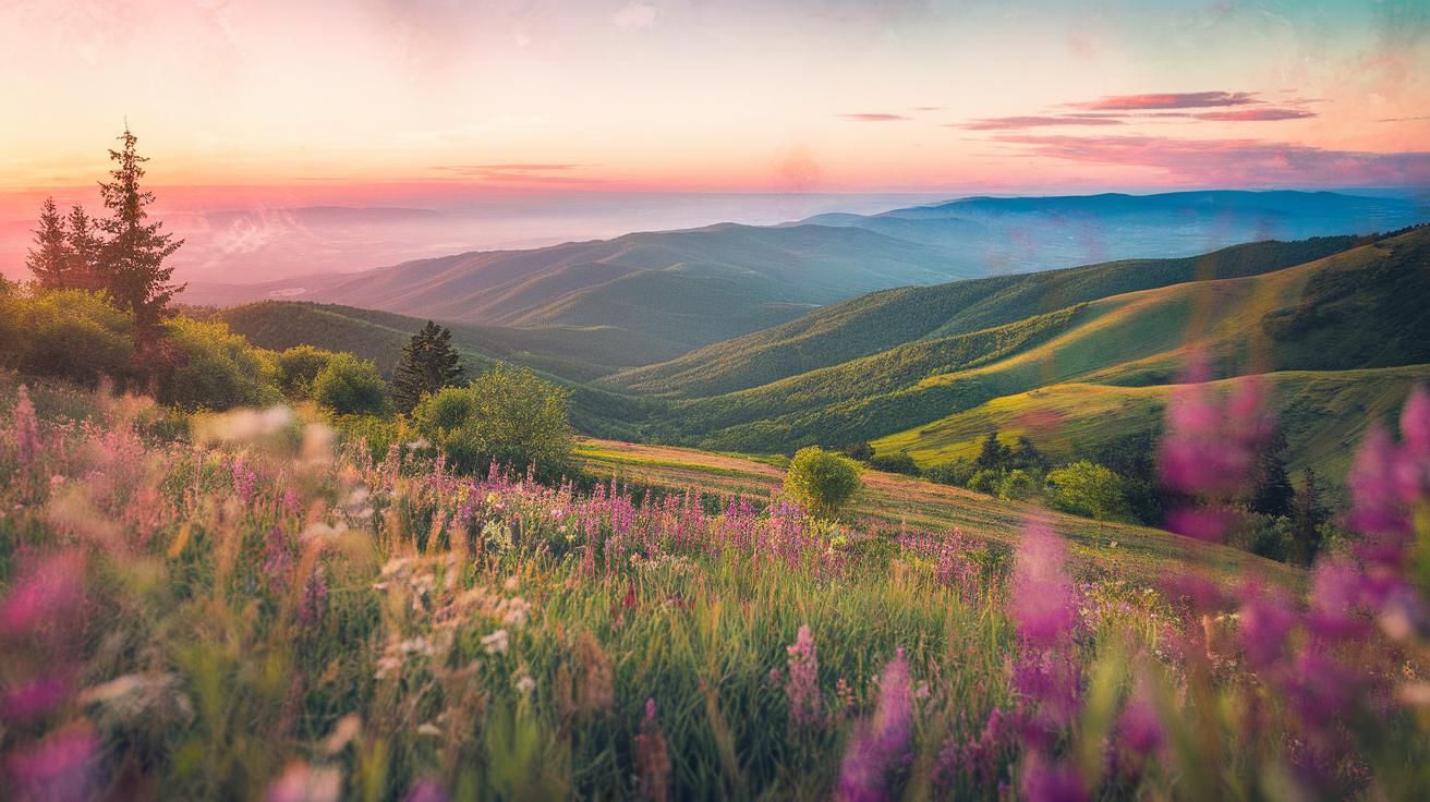
Watercolor painting is a timeless art form that captures the beauty of landscapes with natural pigments suspended in water. This method offers transparency and fluidity, portraying scenes of wide natural views such as mountains, rivers, and trees. Landscapes hold a significant place in painting traditions, inviting artists to arrange nature’s elements into coherent compositions. You can create vivid scenes filled with light, weather, and atmosphere using watercolor. Learning how to use dramatic techniques in watercolor landscapes elevates your artwork, making it bold and expressive.
This article presents a clear path to improving your watercolor landscape skills by focusing on practical techniques for dramatic effects. It guides you through the materials, styles, and methods you can adopt to highlight textures, contrast, and depth. You will learn how to compose your scenes effectively and develop a style that captures attention. Unique approaches in watercolor landscape painting open a new realm of artistic possibilities for your creative expression.
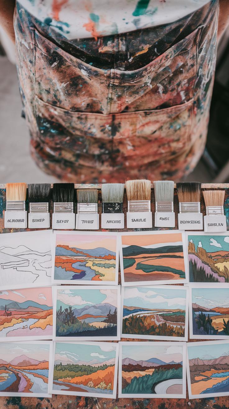
Essential Materials for Watercolor Landscape Painting
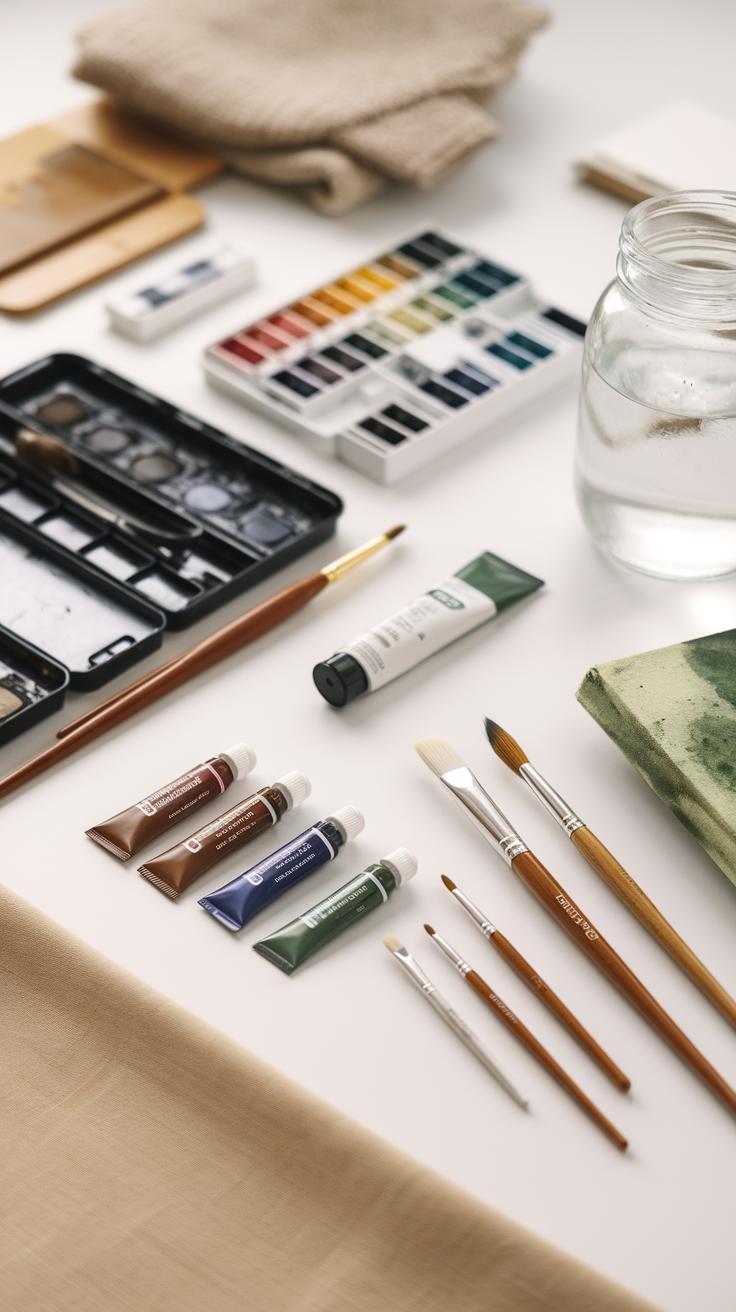
Good-quality watercolor paper makes a big difference in your landscape paintings. Cold-pressed paper has a slightly rough texture that holds water and paint well, giving your work a lively, natural appearance. Smooth paper can limit your brushwork, while rough paper may be too absorbent and hard to control. Choosing the right paper texture depends on the style you want to achieve.
Brushes affect your strokes and details. Round brushes let you paint fine lines and curves. Flat brushes cover broad areas like skies or fields. Mop brushes hold a lot of water for soft washes or lifting paint. Selecting the right brush will help you capture different elements in your landscape.
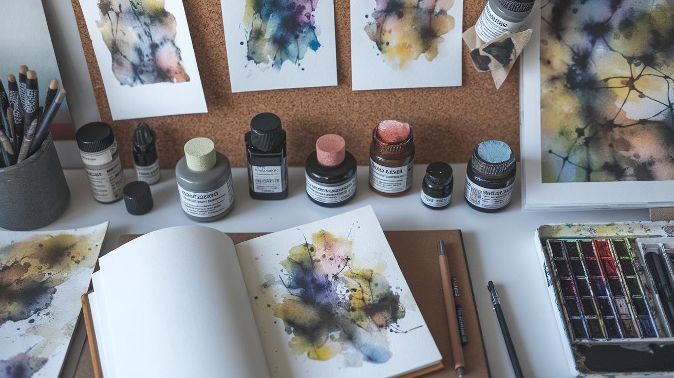
Choosing pigments matters when painting natural scenes. Basic colors like ultramarine blue, cadmium yellow, burnt sienna, and viridian green form the foundation. Mix blues and yellows to create varied greens for trees and grass. Add a touch of burnt sienna to greens for a muted, earthy tone. Mixing colors carefully helps you build convincing land, water, and sky hues.
Choosing the right paper and brushes
Cold-pressed watercolor paper is favored for landscapes because it balances texture and absorbency. It holds washes well and allows for layering without warping. The texture adds subtle richness to skies, water, and foliage.
Round brushes are versatile. They let you paint details like thin branches or textured grass. Flat brushes cover large areas without leaving too many strokes, making them ideal for skies or distant hills. Mop brushes store water for smooth, soft washes needed in broad backgrounds or skies. Using the right brush helps control your painting’s mood and focus.
Selecting pigments and mixing colors
Start with essential pigments: ultramarine blue, cobalt blue, cadmium yellow, burnt sienna, and raw umber. These colors allow you to mix a wide range of natural tones.
Try mixing ultramarine and cadmium yellow for rich, deep greens. Adding burnt sienna warms the green for autumn leaves or dry grass. Mixing cobalt blue and burnt sienna creates muted water and mountain shadows. Experiment with your palette to match the exact tones of the scene you see.
Ask yourself how color changes with light and distance. Using pigment mixes thoughtfully can build atmosphere and depth in your landscape paintings.
Understanding the Basics of Landscape Composition

When arranging elements in your landscape painting, think about placing objects in the foreground, middle ground, and background. The foreground usually holds the most detail and larger shapes, helping viewers connect with the scene immediately.
The middle ground links the foreground to the background and provides context for your scene. The background should have less detail and lighter colors to suggest distance.
The horizon line is a key element. Position it to balance your sky and land. A high horizon emphasizes the earth, while a low horizon highlights the sky. This choice affects mood and focus in your work.
Use focal points to catch the eye, such as a tree, a building, or a bright patch of color. Place these strategically but avoid crowding the scene.
Balance sky, land, and water by varying their amounts to create interest. To guide the viewer’s eye, use natural lines like paths, rivers, or fences that lead toward your focal points.
Layering the Scene with Depth
Depth makes a landscape come alive. Use layers by placing objects at different distances. Objects closer to you should appear larger and sharper, while those far away become smaller and fuzzier.
Change the detail level to create spatial separation. The foreground includes crisp lines and textures; the middle ground has softer edges, and the background is muted.
Color intensity also controls depth. Use stronger, warmer colors nearby, and cooler, lighter tones for distant elements. This shift tells the viewer’s brain how far things are.
Try painting a tree in front with detailed leaves, fading hills behind it in soft greens, and pale blue mountains farthest away. Does this layering help you sense space?
Creating Focal Points in Your Landscape

Focal points draw attention and give your painting a place for the eye to rest. Use contrast in value, color, or detail to make these areas stand out.
Bright colors or sharp lines naturally pull focus. For example, a red barn amid green fields catches the viewer’s eye quickly.
Higher detail around the focal point also guides viewers. Less detail in surrounding areas prevents distraction.
Try using a dark shape against a light sky or a sunlit area contrasting with shadowed ground. These clear differences help viewers spot your main subject immediately.
Ask yourself, what part of your landscape should hold the most interest? How can you simplify the rest to enhance that?
Applying Dramatic Light and Shadow Effects

Using light and shadow can change the mood of your landscape painting instantly. Observe where light comes from in nature—notice if it is soft or harsh, and see how it affects shapes and colors. Light direction tells you where to place highlights and where shadows fall. Shadows often carry cooler colors like blues or purples, which contrast well with warm or bright highlights. This contrast adds depth and energy to your work. Painting shadows with cooler hues makes the scene feel more three-dimensional and believable. Shadows also reveal the form and texture of land, trees, and rocks, helping your landscape look real. How will you use light and shadow next to draw emotion and interest? Try choosing a strong light source and watch how it transforms your painting’s drama and mood.
Observing natural light in landscapes
Light changes during the day, altering how the landscape looks. Early morning light is soft and warm, while midday light grows bright and harsh. Late afternoon casts long shadows and deep colors. Spend time outside watching how shadows shift on hills, trees, or buildings. Notice where sunlight hits first and where shadows gather. These observations help you decide where to make highlights and shadows in your painting. Watching light outdoors sharpens your eye for natural contrasts. What shapes do shadows create? How do colors change in the shade? This practice trains you to translate nature’s light accurately and powerfully on paper.
Painting shadows and highlights boldly
Exaggerating light and shadow can increase drama while staying realistic. Use sharper edges in shadows to show crisp forms like rocks or tree trunks. Soften edges where shadows blend, such as on distant hills or water. You can paint shadows thicker and darker, using cooler tones to push them back visually. Highlights painted with warmer, brighter colors will pop forward. Brush strokes also affect mood; quick, bold strokes bring energy, while gentle washes evoke calm. Try layering shadows with glazes to build richness. What happens if you amplify the sunlit areas and deepen the darkest shadows? Bold contrasts will captivate viewers and highlight your landscape’s focal points.
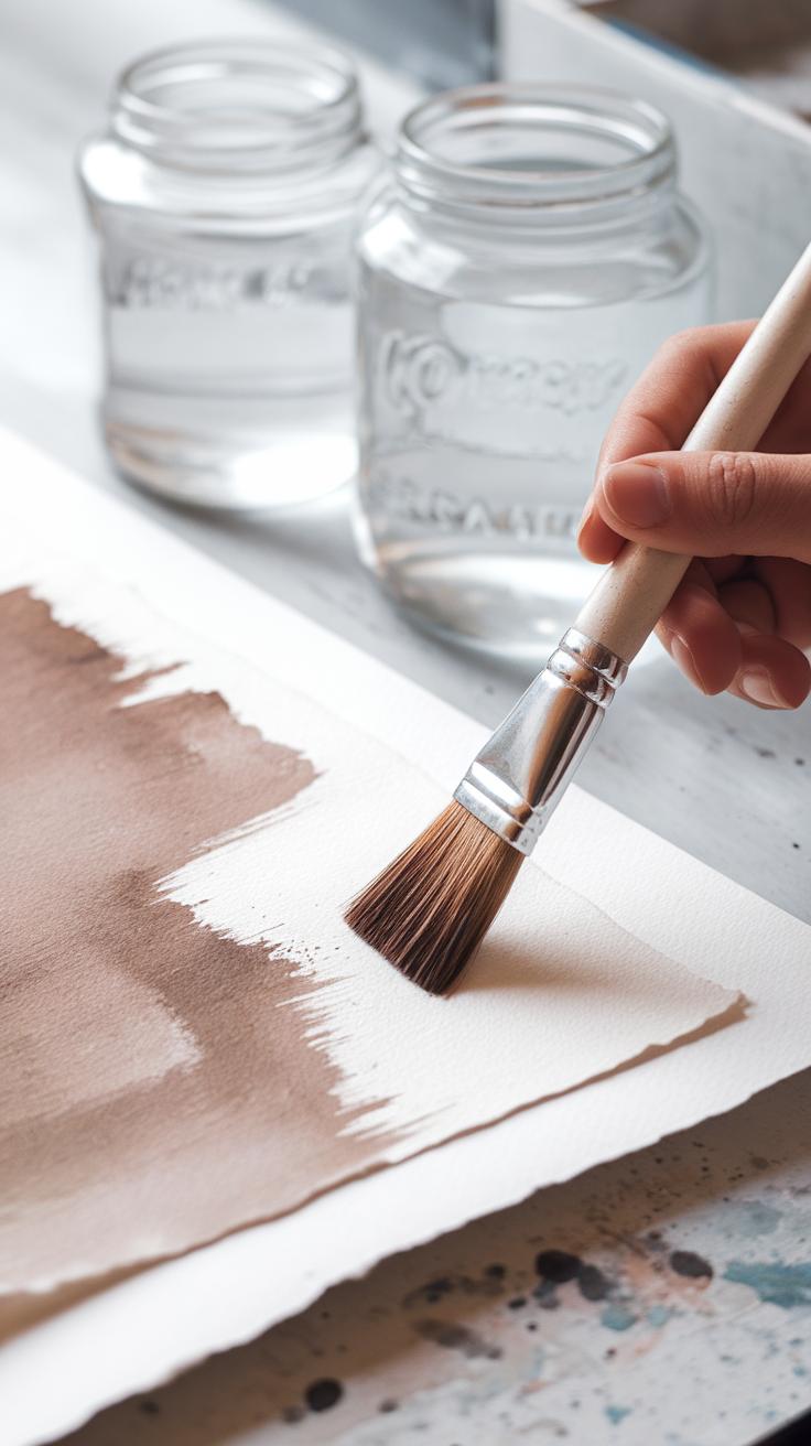
Using Layering Techniques to Build Texture
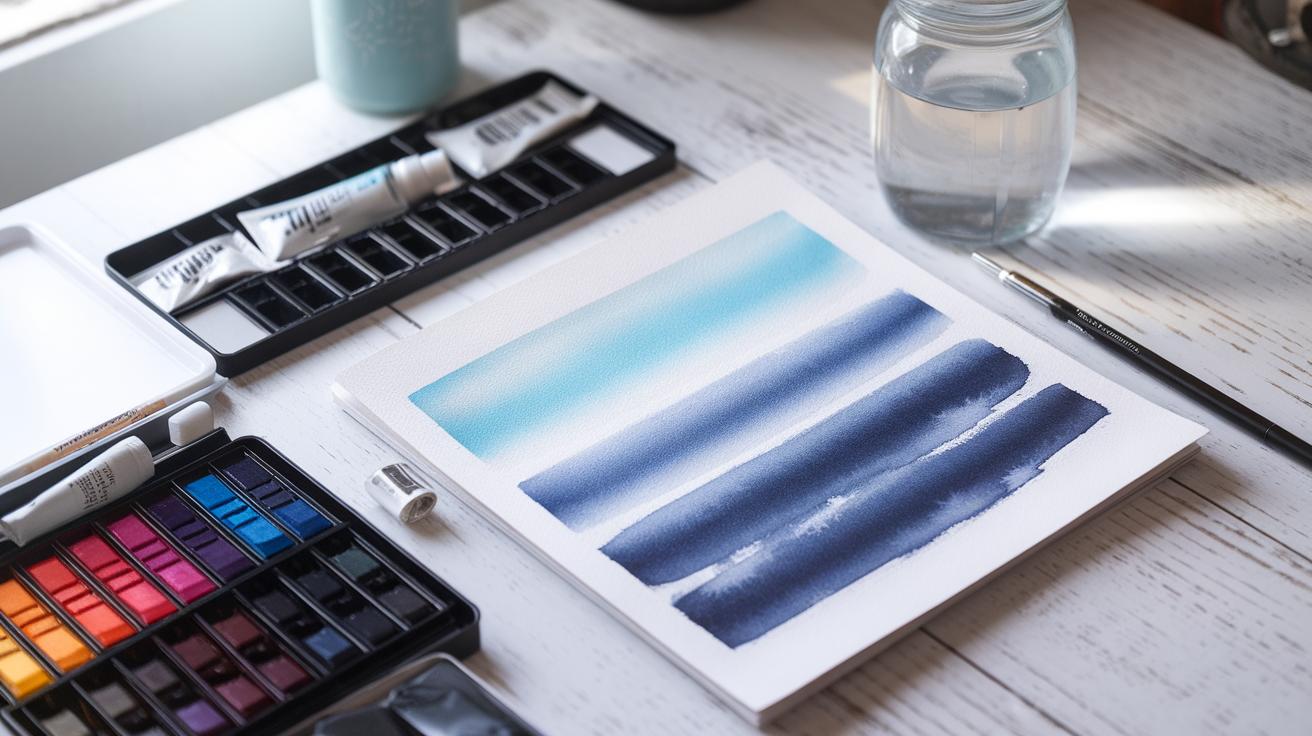
Layering transparent washes is a powerful way to add complexity to your watercolor landscapes. Each layer changes how light interacts with the colors beneath, creating a sense of depth that mimics the natural world. You will find that applying multiple thin layers gives your painting a richer and more detailed look than a single thick wash.
Wet-on-wet and wet-on-dry techniques offer different texture effects. Wet-on-wet spreads colors softly and blends edges, which suits skies and distant hills. Wet-on-dry lets you add sharp details and textures, perfect for trees, rocks, or rippling water. Using both thoughtfully will help build a dynamic scene.
Carefully layering thin washes also helps you avoid muddy colors. Let each layer dry completely before applying the next. This method works well to depict textures like shimmering water, leafy branches, or the rough surface of stones. How can you experiment with layering to enhance your next landscape?
Wet-on-wet and wet-on-dry methods
Wet-on-wet means applying paint onto a damp surface. The colors flow into each other smoothly. This technique works well for soft skies, gentle hills, or misty backgrounds. You can create subtle blends and smooth transitions, which help suggest distance and atmosphere.
Wet-on-dry means painting on dry paper or over a dry layer. This approach produces crisp edges and stronger shapes. Use wet-on-dry when painting tree branches, rock edges, or detailed foreground elements. It allows you to control texture and sharpen contrast where needed.
Knowing when to use each method helps bring your landscape to life. Try painting a soft cloud with wet-on-wet, then switch to wet-on-dry for the sharply defined branches beneath it. What scenes in your landscape require gentler blending, and where do you want clear detail?
Building color depth with multiple layers
To build deep colors, apply several thin washes instead of one heavy layer. Thin layers maintain transparency, so light reflects through the paint, adding luminosity. Avoid mixing thick paint directly on the paper, as this can dull your colors.
Wait until each wash is completely dry before adding the next. Drying times vary by humidity and paper thickness, but patience is key. If you paint too soon, colors may bleed and become muddy.
Layering also helps create texture differences. You might start with a light green wash for distant trees and add darker greens and browns in thin layers to suggest leaves and branches. How will you plan your layers to keep colors vibrant and texture clear?
Capturing Movement and Atmosphere in Your Work
When you want to show motion in your landscape, your brushstrokes need to follow the natural flow of the scene. For example, use long, curved strokes that mimic the direction of water in streams or rivers. Layer colors while they are still wet to blend smoothly, suggesting fluid movement. Wind can be represented with swift, light strokes that push across your paper, blending soft blues and grays to imply air pushing leaves or clouds.
Atmosphere depends on how you handle edges and color tones. Soft edges, created by applying watery pigments on damp paper, blur the outlines, which is ideal for mist or haze. Light, diluted washes in pale gray or warm tones suggest early morning fog. Consider layering thin glazes of cooler colors like blue or lavender over warm tones to create depth in the haze without harsh lines.
Think about how weather changes mood. Wind adds energy. Mist calms and quiets the scene. Try adjusting your brush pressure and using diluted pigments to capture these effects. What sensations do you want your viewers to feel? Use your brush and color choices to guide them through your painted environment.
Expressing water flow and wind
To show water moving, try sweeping your brush in the flow’s path using slightly curved lines. Use gradient color blends from dark to light blue or green to suggest depth and movement beneath the surface. Blend while the paint is still wet for smooth transitions.
When painting wind, use quick, light strokes in the direction the wind flows. Blend pale blues or grays softly into the background to show clouds caught in the breeze. Work with dry brush strokes to add texture for leaves or grass moving in the air. These details bring your landscape to life.
Creating weather effects with color and edges
To paint mist or fog, apply very diluted pigment on wet paper. This makes edges soft and blurry. Build atmosphere by layering transparent washes in light grays, blues, or even muted earth tones. Each layer adds subtle color shifts that mimic real air moisture.
Use gentle gradients, fading from solid shapes to soft, disappearing edges. This suggests distance and softness in the weather. Avoid hard lines and sharp contrasts in these areas. Try painting early morning scenes with pale, cool colors that warm slightly toward the horizon to create a sense of depth wrapped in haze.
Incorporating Contrast for Visual Interest
Contrast helps your landscape paintings stand out by making certain parts catch the eye first. You can create contrast through value, color temperature, and the amount of detail you include. Using dark areas next to light ones brings focus and adds drama. Think about a shadow falling over a bright field or a dark tree against a glowing sky.
Try simple exercises to practice contrast. Paint a small scene with only very dark and very light values. Then create another study using warm colors against cool colors. See how the changes affect the feeling and depth. These studies train your eye to use contrast intentionally before you start a final piece.
Using value contrast effectively
Value contrast means changing how light or dark something appears. Dark and light tones draw your eye and create depth. Avoid using too much of the middle tones, especially in dramatic landscapes. Midtones can flatten your painting and reduce impact.
Focus on placing strong darks near bright lights. For example, a dark tree trunk next to illuminated grass will pop forward. This approach helps guide where you want people to look first. When you limit midtones, your main shapes stand out clearer and feel more dynamic.
Temperature contrast between cool and warm colors
Warm and cool colors work in opposite ways to make a painting lively. Warm colors like yellows, oranges, and reds feel close and bright. Cool colors like blues and greens seem to recede and calm the scene.
Putting warm sunlight areas next to cool shadows creates a push-and-pull effect. This makes your landscape feel more three-dimensional and vibrant. For example, paint warm light on a hilltop while shading the valleys below in cooler tones. This contrast brings life and atmosphere into your work.
Choosing Your Style and Adding Personal Expression
Your style shapes how others see your watercolor landscapes. Start by deciding how much detail you want. Simplify forms to guide viewers’ attention. Exaggerate shapes or lines to highlight your vision. Realism and abstraction both offer paths. Neither choice is better — only different. Realism shows what you see, abstraction shows what you feel. Ask yourself what your landscape should say. Should it capture calm sunlight or wild wind? Experiment with bending rules to find answers.
Try different compositions. Move the horizon or crop a tree for stronger impact. Shift colors away from what’s real to what feels right. Warm tones might bring joy, cool tones calm. Your unique touch comes from these choices. Keep testing until your work reflects your inner landscape, not just the one outside your window.
From realism to abstraction
Some artists fill every leaf and rock. Others suggest shapes with few brushstrokes. Compare two versions of a mountain scene. One detailed, showing each tree. The other loose, using soft washes and simple shapes. Less detail often creates more feeling. It leaves room for your emotions to grow. Try limiting fine lines or background elements. See how your mood shifts when you focus only where it matters. What details can you let go to pull the viewer closer to your message?
Using color and form to express mood
Color and shape shape atmosphere. Red skies or green shadows change the story of a sunset. Stretch a hill or twist a tree to add tension or calm. Pick colors that echo your mood or theme. Use softer edges and muted colors to soothe. Push saturation and sharp shapes for drama. Notice how small shifts in form or hue change your feelings about the scene. What mood do your choices create? Which colors or shapes best tell your story?
Common Challenges and How to Overcome Them
Watercolor landscape painting often leads to common struggles such as overworking areas, creating muddy colors, and uncertain edges. These issues can make your artwork look dull or unfinished.
Planning your composition before you begin helps avoid confusion later. Sketch lightly to map out shapes and value areas so you know where your darks, lights, and midtones belong.
Timing is crucial when applying washes. Applying new layers too soon can cause unwanted bleeding and muddy colors. Wait for areas to dry or nearly dry before adding more paint.
Controlling the water load on your brush affects color intensity and edge sharpness. Using too much water dilutes your pigment and softens edges. Try practicing with different brush wetness to see how it changes your marks.
To reduce errors, try exercises like painting simple shapes or limited color palettes. Practice confident, quick strokes to build trust in your decisions. Ask yourself, “Can this area stay simple and clean, or does it need extra work?” Let that guide your hand.
Avoiding overworking your painting
Overworking happens when you keep adding paint or reworking an area too much. Signs include dull, heavy colors and a loss of transparency.
You can prevent this by limiting brush strokes and trusting your first marks more. Paint with purpose and avoid fussing over small details.
Try setting a rule: make only two passes over any area. Use confident strokes instead of going back and forth.
What if you feel unsure about a section? Step back and view it from a distance. Less often, more is better.
Maintaining clean colors and edges
Watercolor colors lose vibrancy when too much water dilutes pigment or when paints mix unintentionally. Edges blur if your brush or paper is too wet.
Use less water on your brush to keep colors strong. Clean your brush before switching colors to avoid mixing unwanted hues.
Practice loading your brush with paint, then lift some off on a paper towel before applying. This controls the pigment-to-water ratio effectively.
To keep edges crisp, wait for one area to dry before painting next to it, or use masking fluid to protect whites and sharp lines.
Conclusions
Creating dramatic watercolor landscapes relies on mastering key skills such as layering, contrast, and brushwork. These techniques enhance the emotional impact and visual interest of your work. Keeping your paint wet in some areas while allowing others to dry adds texture. Play with light and shadow for depth and mood. Experimentation is essential to discover the effects that work best for you. Each stroke contributes to the overall composition, influencing how viewers experience the landscape you paint.
Your journey in watercolor landscape art becomes clearer by using focused techniques and understanding fundamental principles. Through practice, your ability to transform ordinary scenes into dramatic artworks increases substantially. With commitment and exploration, you develop a personal style that stands out. These insights empower you to create evocative and memorable landscapes that connect with viewers and express your artistic vision fully.


