Painting Nature Scenes in Watercolor
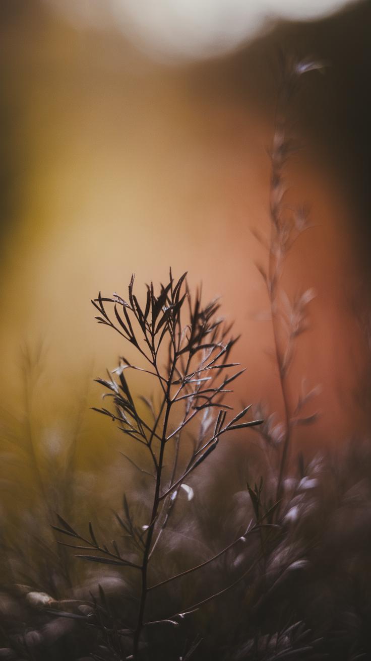
Watercolor paintings have a long history rooted in art traditions around the world. This technique uses pigments suspended in water to form vivid yet delicate images. You will find watercolor used extensively to capture the natural beauty of landscapes, plants, and wildlife. Artists appreciate how watercolor offers transparency and fluidity, lending a unique softness to scenes of nature. With its ancient origins dating back to various cultures, watercolor painting continues to be a popular medium for artists wishing to portray the outdoors with a gentle touch.
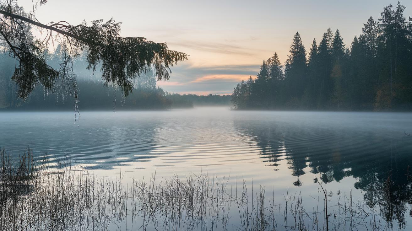
Stunning watercolor paintings of nature showcase elements such as forests, rivers, mountains, and skies. These paintings often highlight intricate details like the texture of bark, the reflections on water surfaces, and the subtle gradations of light in the atmosphere. This article will guide you through the key aspects of watercolor painting focused on nature scenes. You will learn techniques to enhance your own work and appreciate the craftsmanship behind amazing watercolor art inspired by the natural world.
Understanding Watercolor as a Medium
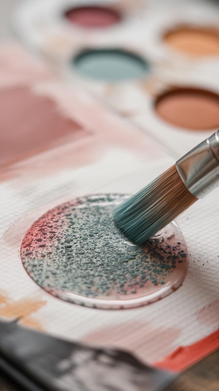
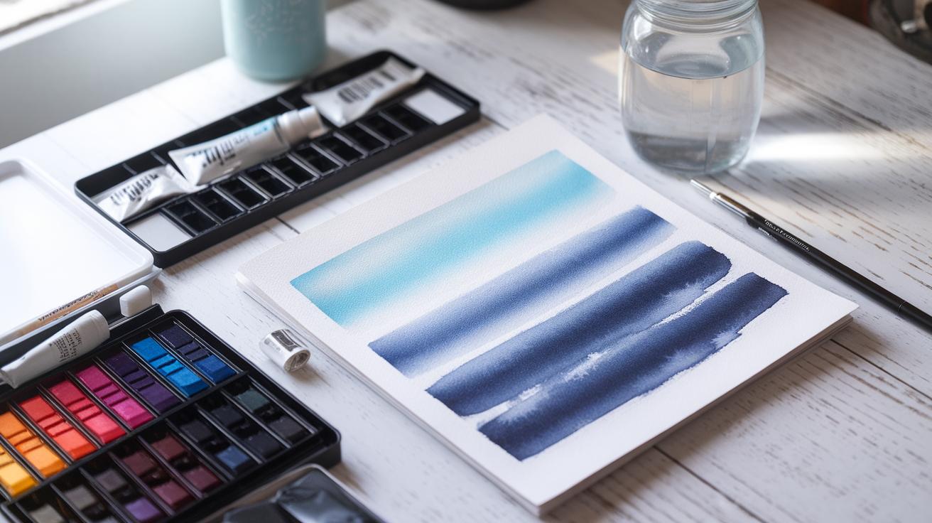
The basic elements of watercolor painting include water-based paints and a suitable surface, usually watercolor paper. Watercolor paints contain pigments mixed with a water-soluble binder. When you add water, the paint thins and flows smoothly on paper. This fluidity allows artists to create soft washes and delicate effects. Transparency is a key property. Because watercolor paints let light pass through layers, colors blend gently without becoming muddy. You can build up color gradually by layering washes. Paper texture influences how the paint behaves. Rough paper catches more pigment, while smooth paper lets paint glide easily. These qualities make watercolor ideal for capturing natural scenes where light and subtle color shifts matter. Your choice of materials affects your final result more than you might expect. How will you use these unique traits to express the beauty you see around you?
Material Characteristics
Watercolor paint combines three basic parts: pigments, binders, and a water-based solution. Pigments give color and come from natural or synthetic sources. The binder, usually gum arabic, holds pigment particles together and binds them to paper. Water acts as the vehicle, controlling the paint’s flow and dilution. Different pigments can change how paints behave, offering brightness or softness. The texture of watercolor paper plays a huge role. Rough paper offers bumps and grooves that trap pigment, creating grainy effects and texture. Smooth paper produces clean, sharp edges and finer details. Paper weight also matters—heavier paper resists warping when wet. Choosing paper is as important as selecting your colors. What kinds of surfaces will you experiment with to see how your paints come alive?
Historical Use
Watercolor painting began thousands of years ago with East Asian artists. They used ink and mineral pigments on paper and silk, focusing on nature and landscapes. In Europe, watercolor was popular during the Middle Ages for manuscript decoration. By the 18th century, artists like J.M.W. Turner elevated watercolor to fine art, using it to capture light and atmosphere. The medium evolved with new pigments and paper types, allowing more varied techniques. Many artists favored watercolor for its immediacy and freshness. Understanding this history helps you appreciate the tools and methods passed down through time. How does knowing the roots of watercolor inspire your own approach to nature art?
Capturing Nature with Watercolors
Watercolors offer a unique way to capture the details and essence of natural scenes. Their fluid nature helps you recreate the flow and movement found in forests, rivers, and skies. Using soft washes and wet-on-wet techniques, you can blend colors smoothly, just like the gradual shifts in a sunset or cloud formations. The ability to layer colors allows you to build depth without masking the light underneath, maintaining a natural glow.
Watercolor lets you react to the unpredictable moments that nature presents. For example, by controlling the amount of water and pigment, your brushstrokes can show delicate leaves or rough tree bark with realism. Do you notice how the colors in a lake shift from blues to greens? Watercolors help mimic those subtle transitions.
How do you handle the delicate balance between detail and softness in a scene? Experimenting with varying brush sizes and drying times can help reproduce nature’s textures while preserving the overall mood. Watercolors challenge you to observe nature closely and respond with fluid, thoughtful strokes.
Light and Color
Transparency is key in showing light and atmosphere in watercolor paintings. Because watercolors are see-through, you can layer light washes to show sunlight filtering through trees or the glow at dawn. Instead of covering the paper, you let its brightness shine through.
Changing weather and light conditions create complex color effects. When you paint wet colors into wet areas, you can reproduce blurred reflections or mist. Dry brush techniques add crisp shadows where needed.
Have you tried painting a sky at dusk? You can start with a pale wash and gradually add more saturated blues and reds, letting colors bleed gently for realistic gradients. Watercolors encourage you to think about light as a transparent force that shapes everything landscape painting.
Texture Representation
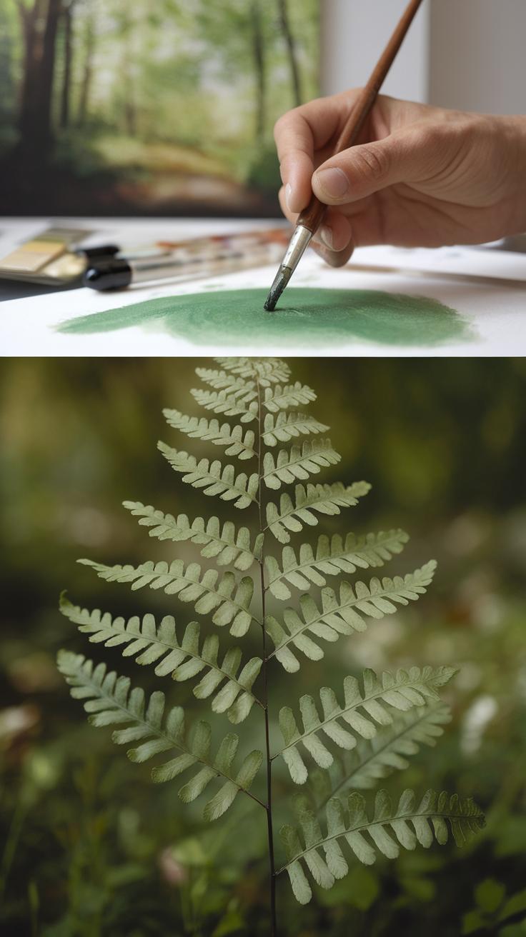
Watercolor techniques can mimic many natural textures. For leaves, try dabbing with a sponge or flicking paint with a brush to create irregular spots that suggest foliage. For bark, use dry brush strokes to add roughness without complete coverage.
Layering is useful for showing depth in textures too. Applying several thin washes builds complexity on tree trunks or grassy fields. You can lift paint with a damp brush or paper towel to highlight ridges or sunlit spots.
Water reflections require soft edges; painting wet on wet works well here. You can also use scraping with a palette knife or brush handle to create fine lines for water ripples. What texture in nature do you want to capture next? Playing with different marks helps you connect with your subject in new ways.
Composing Stunning Nature Scenes
When painting nature scenes with watercolor, arranging elements thoughtfully shapes the story your artwork tells. You want your composition to feel balanced, with no part overwhelming another. Imagine placing a large tree on one side; balance it with a group of smaller bushes or a reflective pond on the opposite side. This keeps the eye moving around the painting.
Your focal point draws attention and should stand out clearly. It might be a bright-colored flower, a mountain peak, or a winding path. Place this feature off-center using the rule of thirds to create interest rather than symmetry. Think about how your viewer’s eye will travel from one element to another.
Use perspective to add realism. Elements closer to you should be larger and more detailed. Distant objects appear smaller and softer. This makes viewers feel like they could step into the scene. How can you guide the viewer’s gaze deeper into your painting? What natural lines or shapes lead the eye forward? Each choice impacts your image’s success.
Element Placement
Choosing where to place trees, water, and mountains shapes your artwork’s mood and flow. Avoid clustering too many features in one spot. Spread them out to create breathing space and prevent confusion. For example, position a tall tree near the foreground, with a meandering river leading toward distant hills.
Water bodies can reflect light and add calmness. Place them where they support the scene’s rhythm. Mountains work well in the background, anchoring the view. Try sketching thumbnail layouts first. Ask yourself if the scene feels natural and if each part has a purpose. Which feature do you want to highlight? Where should your eye rest?
Creating Depth
Depth turns a flat painting into a vivid landscape. You achieve this by changing color intensity and sizing elements correctly. Use stronger, clearer colors and more details in the foreground. This pulls objects forward. Soften colors and reduce contrast as you move back. For instance, a bright green tree in front can fade to pale blue hills in the distance.

Size matters too. Objects appear smaller the farther away they are. Paint nearby leaves larger and sharper than those far off. Layer washes with lighter tones to create a misty or hazy effect, enhancing distance. How can you combine these tricks to make viewers feel they are looking through your painting into a wide-open space?
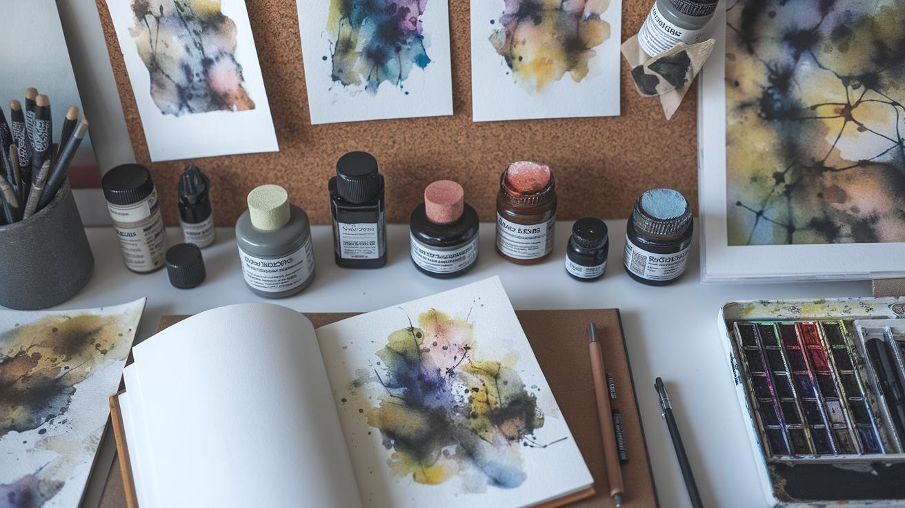
Selecting Tools and Materials

Your choice of tools and materials shapes the success of your watercolor nature paintings. Picking the right brushes helps you capture fine details like leaf veins or bird feathers, while broader brushes allow smooth washes for skies or water. Consider the sizes and shapes for each part of your scene before you start.
Brush Choices
Round brushes suit most nature painting needs. Smaller rounds, like size 2 or 4, help you paint tiny details such as twigs or bark textures. Larger rounds, around size 8 or 10, let you cover bigger areas like flower petals or backgrounds quickly.
Flat brushes create sharp edges and straight lines. Use them to paint tree trunks or horizon lines. Fan brushes spread paint in thin strokes, which works well for grass or leaves. You might also try a mop brush to add wide washes of color to skies or lakes.
Try testing different brushes to find what fits your style. Ask yourself, do you want crisp shapes or soft transitions? This affects which brush you’ll reach for more often.
Paper and Paint
Watercolor paper weight plays a key role in your painting’s durability and ease. Heavier paper, 300 gsm or more, resists buckling when wet. Lighter paper may wrinkle or tear under multiple washes.
Texture matters too. Rough paper adds grainy effects good for natural surfaces like rocks or bark. Hot-pressed paper is smooth and suits delicate subjects like flower petals or distant landscapes. Cold-pressed paper strikes a balance for general use.
Paint quality affects color and blending. Tubes with high pigment concentration offer richer colors and better coverage. Low-quality paints may appear dull and frustrate layering.
Think about how much water you will use and how intense your colors should be. The right balance of paper and paint ensures your nature scenes come alive with depth and clarity.
Basic Watercolor Techniques for Nature
Mastering basic watercolor methods helps you capture the spirit of nature scenes. Starting with washes, you spread thin, even layers of color over large areas to create skies, fields, or water surfaces. The wet-on-wet technique involves applying wet paint onto wet paper, allowing colors to blend and flow naturally. This method suits soft backgrounds like fog or distant trees.
Dry brush offers contrast by using a brush with minimal water and pigment. It helps you add rough textures like bark or grass blades. Layering builds depth by letting each layer dry before applying the next. This fosters complexity in colors and shapes, mimicking the many elements in nature.
Practicing these basic steps in your workflow lets you combine softness and precision. Can you spot which areas in a nature scene benefit from loose washes versus detailed brushwork? This balance will improve your paintings and deepen your observation skills.
Wash Techniques
Gradient washes let you replicate smooth color changes in the sky and water. Begin with a wet paper surface. Load your brush with paint and start at the darkest area, usually the horizon or the bottom of a pond. Move your brush steadily to lighter zones, diluting the paint with clean water as you go.
This gradual shift in tone mimics natural light effects and reflections. Tilt your paper slightly to help the paint flow evenly. Experiment with mixing colors like blue and purple to enrich depth in skies or greens and browns for shallow streams.
Have you tried using both horizontal and vertical strokes to control the flow? These simple actions enhance realism and avoid harsh edges in your watercolor landscapes.
Detailing Techniques
Dry brush technique helps create fine textures in leaves, tree bark, and grasses. Use a stiff brush with little water, dragging it lightly across rough watercolor paper. This leaves uneven, broken strokes that mimic natural surfaces.
Layering comes next. After each layer dries, add small touches with darker or varied colors to define shapes and shadows. This step is key for foliage, where overlapping leaves create rich patterns. Light washes under darker marks make the scene feel alive and believable.
What details stand out most in a forest or garden? Focus your layering there. Careful dry brush work combined with patient layering can transform simple shapes into vivid natural elements.
Advanced Techniques to Enhance Realism
You can bring more realism and emotion to your watercolor nature paintings by using advanced techniques that control how colors and textures interact on paper. Building depth with glazing and layering lets you add richness while maintaining delicate transparency. Applying thin layers of color gradually intensifies tones and allows subtle color shifts that mimic natural light and shadow.
When you lift paint from the paper, you can fix mistakes or create bright highlights that add contrast and realism. Removing pigment selectively also draws attention to specific areas, like the sparkle of water or light filtering through leaves. Controlled bleeding helps produce organic shapes and soft edges essential for natural scenes.
Try combining glazing, lifting, and bleeding in one piece to capture the unpredictable beauty of nature. Ask yourself what emotion or moment you want your painting to express, and use these methods to guide the viewer’s eye and create lifelike effects that feel both spontaneous and deliberate.
Glazing and Layering
Glazing means applying transparent layers of watercolor over dry paint. This builds up color slowly without covering the details underneath. Use thin washes to add depth and adjust hues. For example, layering blues and greens creates rich shades for leaves and water.
Each glaze adds warmth or coolness, depending on the pigment. Wait for each layer to dry completely before adding another to avoid muddying colors. This technique helps you capture complex lighting and atmospheric effects in nature, such as early morning fog or the glow of sunset.
Layering also allows you to refine shapes subtly. You can make shadows darker or highlights softer by adjusting the number and intensity of layers. This control improves realism by reflecting how light interacts with natural surfaces.
Corrections and Effects
Lifting paint is essential when you want to correct a spot or add bright highlights after layers dry. Use a damp brush or a sponge to gently blot or scrub the paint, taking pigment off the paper. This method can soften hard edges or bring out details like veins of a leaf or reflections on water.
Controlled bleeding happens when you add wet paint next to or on top of wet areas, but carefully direct the flow to prevent unwanted mixing. This creates smooth color transitions and natural textures, like clouds drifting or petals blending.
Combining lifting and bleeding enables texture variations that make your painting lively. Test these techniques on scrap paper to understand how water moves and pigment reacts. How can you use these effects to make your nature scenes more dynamic and true to life?
Inspiration from Famous Nature Watercolor Artists
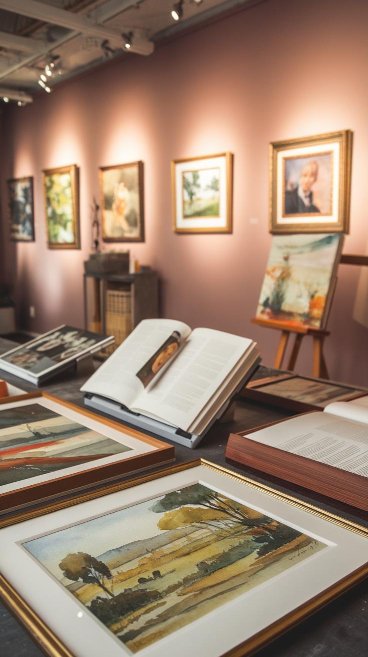
Historical Figures
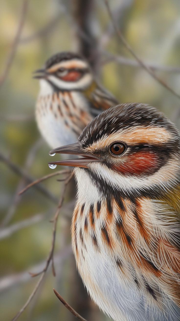
John James Audubon was a pioneer in painting birds with watercolor. His detailed and scientific approach helped set a high standard for nature art. He combined careful observation with precise brushwork to capture lifelike animal forms. What can you learn from his focus on accuracy when painting wildlife?
William Henry Hunt focused on rural landscapes and plants. He used transparent washes to show subtle changes in light and texture. Hunt’s work reminds you that observing small details, like the veins on leaves or play of sunlight on grass, can add depth to your nature paintings.
Beatrix Potter painted plants and animals with a clear, delicate style. Her artwork balanced simplicity and realism, teaching artists that attention to natural patterns can make subjects feel alive. How might you apply this thoughtful observation in your next piece?
Contemporary Artists
Joseph Zbukvic is known for his loose, atmospheric watercolor scenes of nature. His use of wet-on-wet techniques allows soft blends of color and light. Zbukvic’s style shows how mood and emotion can be conveyed without strict details. Have you tried painting with a freer hand to express feeling rather than exact form?
Marie-Eve Lecavalier paints forests and water with bold contrasts and vivid colors. She layers washes to build richness, creating energy in her landscapes. Lecavalier’s work encourages you to experiment with color intensity and layering to capture the spirit of a scene.
Carol Carter focuses on capturing fleeting moments in natural settings. Her fast, expressive brushstrokes suggest movement like wind or water flow. Carter’s paintings inspire you to paint quickly and confidently, catching the essence of nature before it changes.
Studying these artists’ approaches can expand your way of seeing and painting nature. Which style will push your work forward? Try blending precision, mood, color, and motion in your own watercolor nature art.
Common Challenges and How to Overcome Them
Handling Water Control
Water is a key element in watercolor painting, especially when working on nature scenes. Managing how much water you use on your brush and paper can change your whole painting. Too much water can cause the colors to spread where you don’t want them. Too little water might make your strokes look harsh or uneven.
Try testing your brush on scrap paper before applying paint to your artwork. Notice how the water flows and how the pigment spreads. If you want sharp edges or details like leaves or branches, use less water. For soft backgrounds, increase water on your brush to create smooth blends.
Another trick is to let areas dry before adding new layers. Waiting helps avoid unwanted smudging and keeps colors clear. If you see puddles of water forming on your paper, use a dry brush or a paper towel to soak up the extra moisture.
Achieving Color Precision
Getting the exact color you want can be tricky when mixing watercolors for natural scenes. Colors change based on how much water you add and how you mix pigments. Too much water can make your color too transparent or light, while too little can make it thick and hard to control.
Start by mixing small amounts of paint with water until you reach the shade you need. Test colors on scrap paper before applying them. Think about the colors in nature around you—do the trees look bright green or muted? Adjust your mix to match.
If your colors look muddy or dull, you might be mixing too many pigments. Use fewer colors in one mix for clearer results. When layering colors, let the first layer dry completely. This keeps each color distinct and vibrant in your nature scene.
Developing Your Own Style in Watercolor Nature Painting
Finding your personal style in watercolor nature art means trying many different approaches to see what fits you best. The more you experiment, the clearer your preferences become. Start by painting varied nature subjects—trees, flowers, skies, or water scenes. Notice how each subject challenges you in a new way.
Test different techniques like wet-on-wet, dry brushing, or layering colors. Observe which techniques feel natural or exciting to use. Play with color choices too. You might prefer soft, muted tones or bold, bright hues. Each choice adds to your unique voice as an artist.
Experimentation
Try painting the same scene with different methods. For example, paint a forest once with detailed leaf shapes, then again with loose brushwork focusing on mood. Compare your results to see what style speaks to you more. Change your palette to include unexpected colors like blues in leaves or purples in water. This keeps your work fresh and pushes your creativity. What have you not yet tried that might surprise you?
Reflective Practice
Look back on your previous paintings regularly. Ask yourself what parts you enjoy and where you struggled. Did certain colors work well together? Did some details stand out while others got lost? Writing down your thoughts helps too. This reflection reveals patterns in your strengths and areas needing more practice. It leads to growth and deeper understanding of your own work. How can your next painting focus on improving your weakest part?
Conclusions
Watercolor painting offers a versatile and expressive way to capture the essence of nature. Its transparent quality allows artists to build layers and create depth, enriching the portrayal of landscapes and natural scenes. When you understand the materials, methods, and styles involved, you can create artworks that communicate the beauty and complexity of the outdoors. Practical insights into the approach will help you improve both your technique and artistic interpretation.
The appreciation of stunning watercolor nature scenes can deepen your connection with the environment. Reflect on how these artworks show light, color, and texture. Contemplate your own experiences in nature and consider how you might express them through watercolors. Whether you are an artist or an admirer, the study of watercolor paintings focused on nature offers inspiration and satisfaction. Crafting or viewing these pieces invites you to see the environment with fresh eyes and renewed appreciation.


