
Introduction
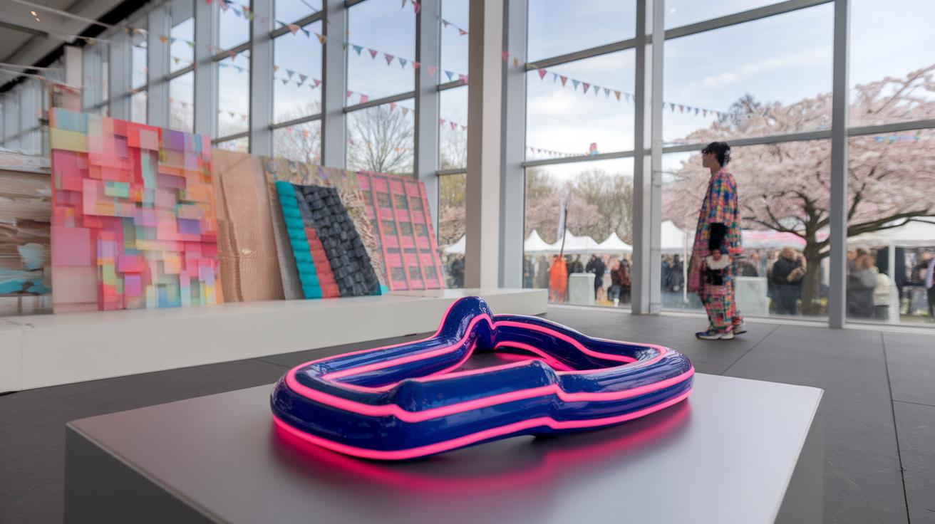
Minimalist posters focus on clarity, simplicity, and elegance. They strip away unnecessary elements to emphasize the core message. Using minimal design allows for a more profound visual impact. A well-executed minimalist poster communicates ideas effectively and resonates with viewers. It challenges traditional notions of design while creating memorable visuals.
This article explores various aspects of minimalist poster designs. It delves into essential principles, techniques, and the elements that contribute to their success. You will discover how to create posters that not only attract attention but also convey your message. The future of poster design increasingly trends towards minimalism, making this topic relevant for designers and marketers alike.
Understanding Minimalism in Design

Minimalism in design focuses on simplicity and clarity. It removes unnecessary elements to spotlight the essential aspects of a piece. This design philosophy traces back to the 20th century, gaining momentum in the 1960s and 1970s. Artists like Donald Judd and Agnes Martin championed minimalism, influencing various fields including graphic design.
The significance of minimalism in visual communication lies in its effectiveness. A clear message often stands out amid chaos. Simple designs cut through distractions, grabbing your attention quickly. For instance, a minimalist poster can convey a complex idea with just a few words and images, making it memorable.

Have you considered how often cluttered designs fail to capture your eye? Embracing minimalism can enhance your communication, ensuring your audience understands your message almost instantly. How can you apply this principle in your own projects?
Key Elements of Minimalist Poster Design
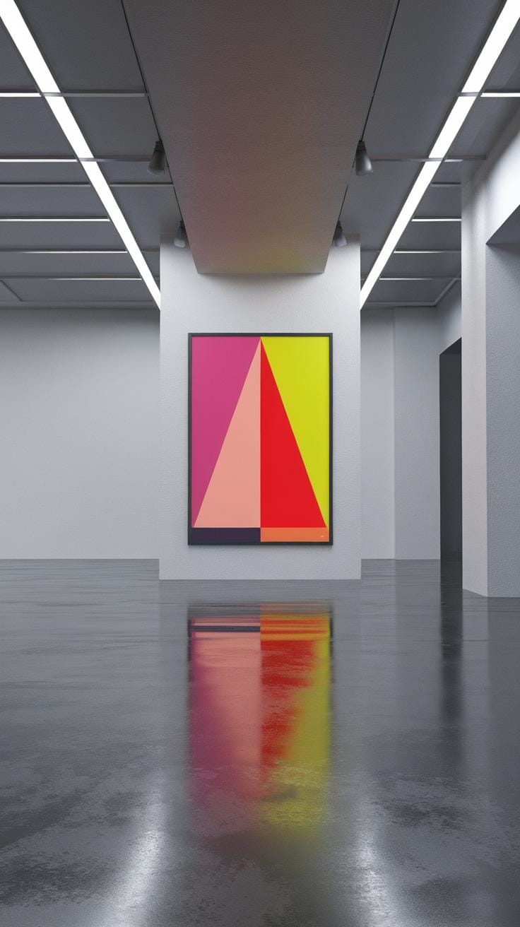
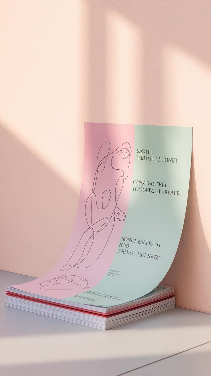
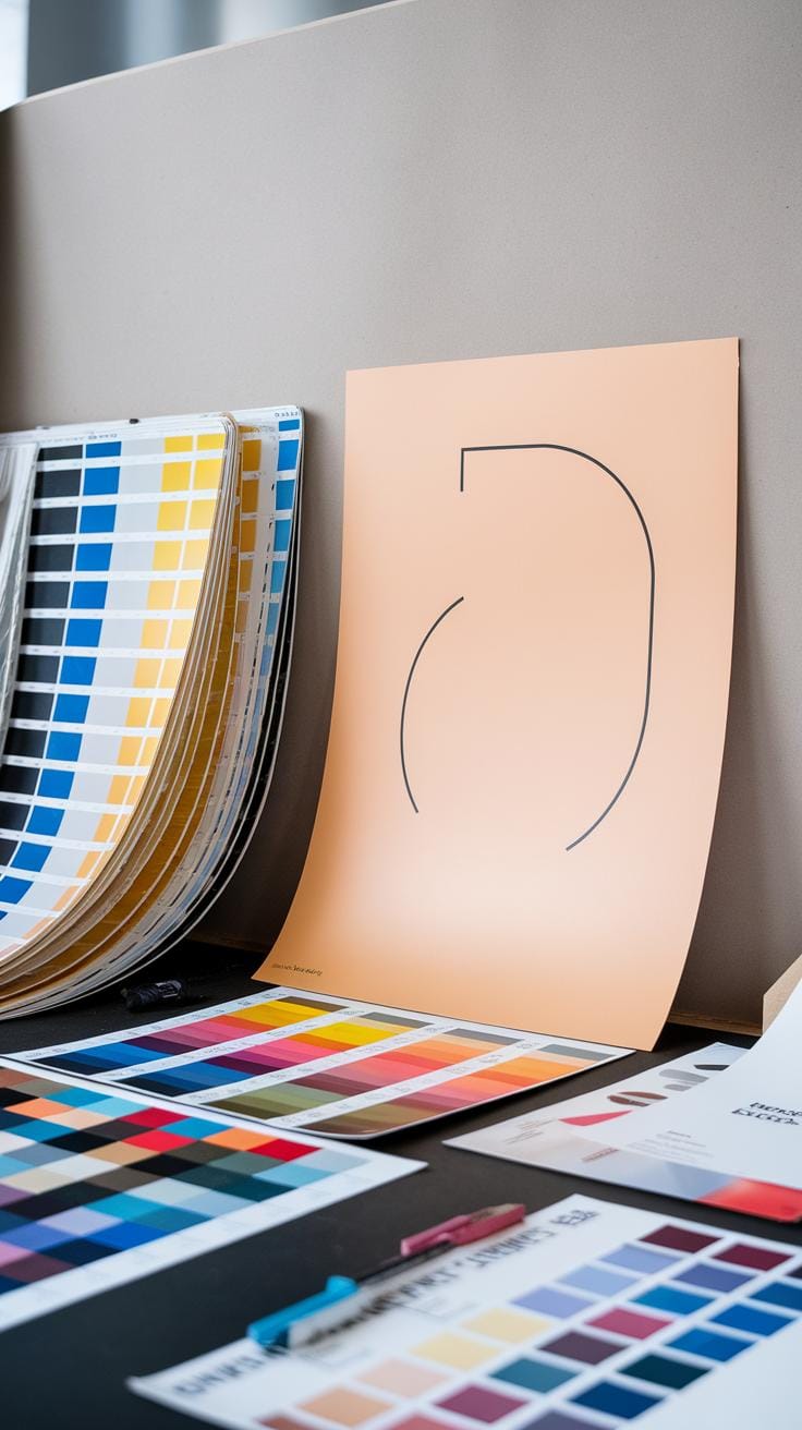
Several elements shape minimalist poster design. Color plays a vital role; often, designers use a limited palette to evoke feelings or focus the viewer’s attention. For example, a striking contrast between black and white can highlight important text.
Typography serves as another key element. Choosing the right font can communicate your message effectively. A clean, sans-serif font can maintain clarity and modernity. The size and placement of the text also impact readability.
Space is essential in minimalist designs. Adequate white space allows the viewer’s eye to rest, creating a balance between elements. How do you currently use space in your designs? Could a more minimalist approach provide greater clarity and impact?
Key Elements of Minimalist Poster Design Defining Visual Simplicity

Minimalist posters rely on specific elements to create striking visuals. Color plays a primary role. A limited color palette helps eliminate distractions. Bold, contrasting colors grab attention. For instance, using a vibrant red against a soft white background can evoke strong emotions. This approach makes you focus on the message.
Typography is another key element. The choice of font can convey mood and meaning. Clean, sans-serif fonts are common in minimalist design. They enhance readability and maintain clarity. You want your audience to absorb information quickly. Less complex fonts allow your message to shine.
Space, or white space, is crucial in minimalist posters. It creates balance and emphasizes key elements. Too much information can overwhelm viewers. By strategically placing objects, you guide their attention. Think about how much space you want around your message and visuals.
Your designs should evoke curiosity. Are you capturing the essence of your idea while maintaining simplicity? Evaluate your work with these elements in mind. What stands out the most in your design? Use these insights to refine your approach and create impactful visual messages.
Typography in Minimalist Posters Crafting Effective Type Use

Typography plays a vital role in minimalist poster designs. It establishes tone and communicates messages clearly. By choosing the right font, you invite viewers to engage with your content. Strong typography stands out, even in a simple layout.
Limit your font choices to maintain focus. Often, one or two fonts suffice. Using a bold typeface for the title and a lighter one for the details can create a hierarchy. This contrast guides your viewer’s eye. Ask yourself, does your type draw attention? Will it resonate with your audience?
Spacing is also key. Allow ample white space around your text to enhance visibility. This approach improves readability and keeps the design uncluttered. Remember, less is truly more in minimalist designs. Experiment with scale and alignment to create balance.
Effective use of color can influence the impact of your typography. A simple black on white scheme exudes elegance, while a pop of color can evoke emotion. Select colors that align with your message. Do your choices enhance understanding or distract?
Observe successful examples in the real world. Iconic movie posters and event flyers often use typography masterfully. Study these designs to inspire your own work. Your approach to typography can either elevate or undermine your minimalist vision.
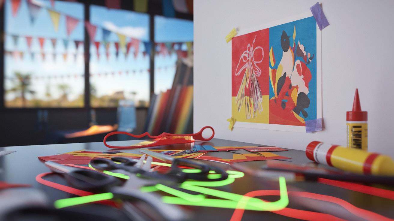
Creating Impactful Graphics Focus on Graphic Elements in Minimalist Posters

Graphic elements form the backbone of minimalist poster designs. Icons and illustrations contribute significantly to visual impact. Each element should serve a purpose. The goal is to create clarity and attraction in your design.
Icons simplify complex ideas. They convey information at a glance. For instance, using an outline of a book can immediately communicate a reading theme. This approach prevents clutter and keeps the viewer engaged.
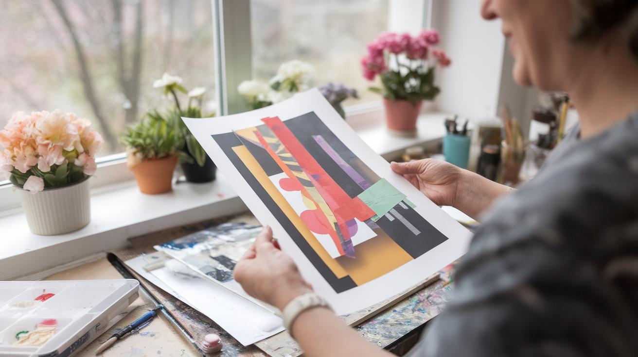
Illustrations can add personality to your poster. A simple sketch can evoke emotions that text alone cannot. Think about how a single, well-placed illustration can draw focus. How can your chosen image enhance your message?
Consider the color palette. A limited range reinforces simplicity. Choose hues that complement each other and the theme. This can further elevate your design.
Simplifying graphic elements allows the audience to grasp your message quickly. Are your icons and illustrations working together for maximum clarity? Aligning these elements effectively leads to a more impactful visual narrative. Get your audience’s attention and keep it. It’s all about design choices that resonate.
Balancing Text and Imagery in Minimalist Posters
Creating a strong balance between text and images is key in minimalist poster designs. You want your message to be clear without overwhelming the viewer. Too much text can clutter a minimalist aesthetic. Find the right amount of words to convey your idea effectively.
Think about using short phrases or single powerful words. This allows the imagery to shine while delivering your message. For example, consider a poster for a music festival that uses just the name of the event in bold letters against a striking image. This immediately grabs attention.
Visual elements should complement your text. They can guide the viewer’s eye and enhance understanding. Use images that resonate with what you communicate in your words. This creates a cohesive design. Ask yourself: Does the text support the imagery? Does the imagery reinforce the text? Aim for a harmonious relationship between both elements.
Color Theory in Minimalism The Emotional Impact of Color in Minimalist Poster Designs


Color plays a crucial role in minimalist poster designs. It influences how viewers feel and react to your work. Understanding color theory helps you make informed choices about the palette you use.
Each color evokes specific emotions. For instance, blue often brings feelings of calmness, while red can create a sense of urgency or passion. When you design a minimalist poster, think about the emotions you want to spark. What message do you want to convey?
Consider using a limited color palette. This approach amplifies the emotional impact. A single bold color against a neutral background can draw attention and emphasize a key idea. For example, a yellow sun on a white background captures warmth and positivity.
Experiment with contrasting colors to create tension. If you want to evoke excitement or energy, pairing complementary colors can make your poster stand out. Analyze successful minimalist posters and take note of their color choices. What can you learn from them?
The colors you choose will shape your viewers’ reactions. Apply color theory thoughtfully in your designs for a powerful emotional connection.
Tools for Designing Minimalist Posters Popular Tools and Software

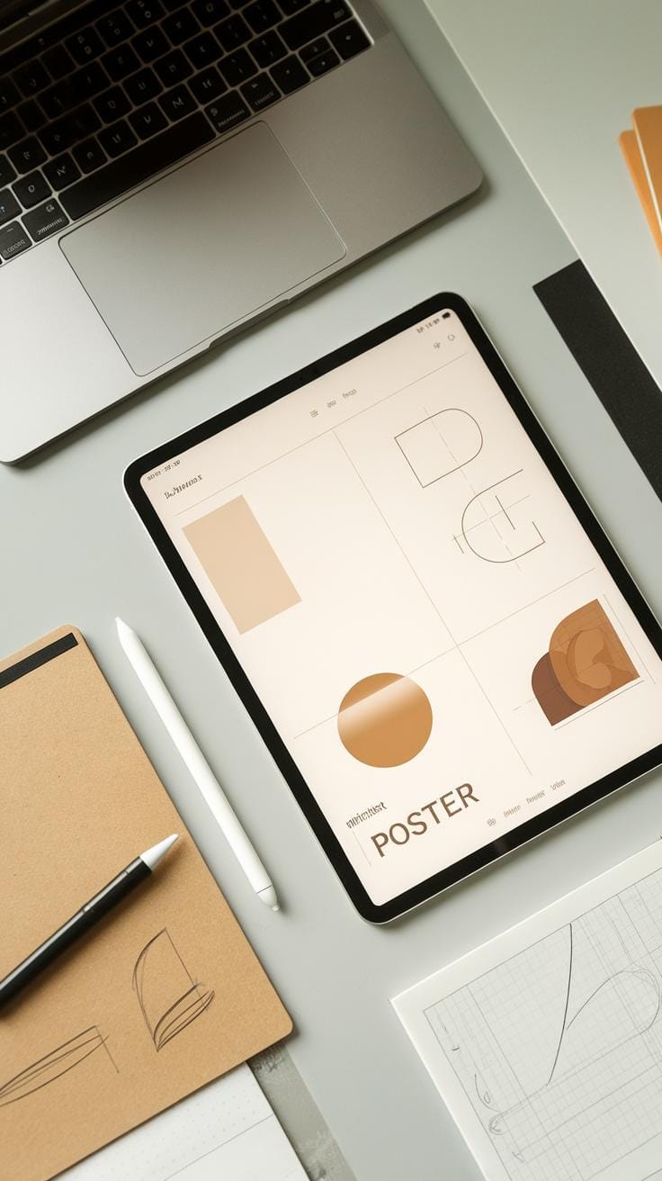
Software Options for Creation
You have many software options at your fingertips for designing minimalist posters. Adobe Illustrator stands out due to its vector graphics capabilities. This allows you to create sharp, clean designs that maintain their quality at any size. Using Illustrator’s tools, you can experiment with layouts and typography elegantly.
Canva is another excellent choice for beginners. It offers user-friendly templates that simplify the design process. You can easily drag and drop elements while maintaining a minimalist approach.
Essential Design Tools
Don’t overlook tools like Procreate for digital illustration. This app lets you sketch and refine your poster designs directly on a tablet. It blends traditional drawing techniques with modern technology.
If you seek inspiration, platforms like Pinterest can spark your creativity. You can explore countless minimalist poster designs to find ideas for your own projects.
These tools help streamline your designs. Which software will you choose for your next project?
Inspiration from Minimalist Design Masters
Influential Designers and Their Work
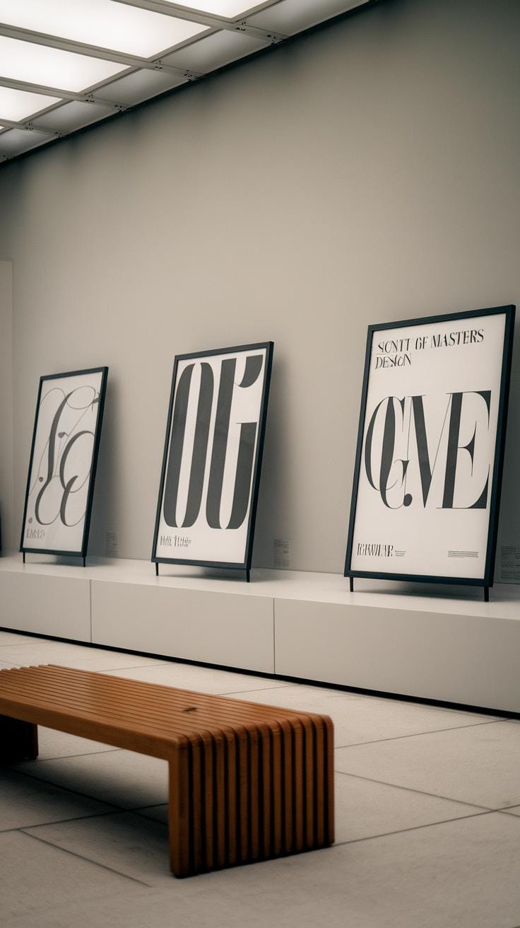
Minimalist design masters have shaped the way you can approach your own poster creations. Consider the work of Massimo Vignelli. His use of bold typography and limited color palettes creates striking visuals that remain impactful. You can learn from his focus on form and function.
Look at Saul Bass, known for his film posters that simplified complex themes into clear visuals. His design for “The Man with the Golden Arm” shows how a single image can convey powerful messages. What can you distill from your own concepts?
Another significant figure is Milton Glaser. His famous “I ♥ NY” logo demonstrates how simplicity can lead to powerful emotional connections. How might you employ similar techniques in your own design work?
Study these designers to inspire your own creations. What elements resonate with you? Find ways to incorporate their insights into your minimalist posters for stunning elegance.
Common Mistakes to Avoid in Minimalist Poster Design
Creating a minimalist poster can be challenging. Many designers fall into common traps that dilute their impact. One frequent mistake is overcrowding the design with visuals or text. Each element must serve a purpose. Keep your message clear and uncluttered. Limit yourself to the essentials.
Another pitfall involves poor font choices. Typefaces should enhance readability, not distract. Choose simple, bold fonts that align with your theme. Play with size and placement to create hierarchy, but avoid mixing too many fonts.
Ignoring color theory also leads to weak designs. Fewer colors can create stronger feelings. Develop a limited palette that reflects your theme. Think about your audience: what colors resonate with them?
Neglecting the layout can disrupt flow. Organize your content logically. Use white space to guide viewers through your poster effectively. This space adds elegance without taking away from your message.
Capturing Your Audiences Attention

Strategies for Engaging Minimalist Posters
To create a minimalist poster that captures attention, you need a clear understanding of your audience. Start by identifying their interests and preferences. What emotions do you want to evoke? Tailor your design to reflect those feelings.
Use bold typography to highlight key messages. A single powerful word or phrase can drive your point home. Think about posters that feature just a quote or a striking image. They stand out and invite curiosity.
Color choice plays a crucial role. Limit your palette to two or three colors that resonate with your theme. High contrast can draw eyes immediately. For example, a black-and-white poster can convey sophistication, while bright colors might attract a younger crowd.
Use ample white space to create breathing room. This makes your message stand out even more. Do not overcrowd your design. Besides, ask yourself: does this design make people stop and think? If yes, you are on the right track.
Conclusions
Minimalist posters represent a modern approach to visual communication. Their simplicity makes them visually striking and memorable. By focusing on essential design elements, these posters can convey complex messages effectively. You can create impactful posters by following the principles outlined in this article.
Utilizing minimalist design can enhance your brand and message. Whether for advertising, art, or personal projects, minimalist posters hold immense potential. Explore this creative avenue and harness the power of visual simplicity in your designs.