Understanding Color Combinations in Painting
Color plays a vital role in our lives, influencing moods, perceptions, and even behaviors. When it comes to painting, the choice of color combinations can make or break a design. Understanding color theory is essential for creating stunning visual experiences that resonate with the viewer. This article explores effective color combinations in paint, diving into the principles of color harmony, contrast, and the psychological effects of colors. Whether you’re a professional painter, an interior designer, or a DIY enthusiast, mastering these concepts will elevate your projects to new heights.
Unraveling the secrets of color combinations involves not only knowing the basics of primary, secondary, and complementary colors but also exploring extended terms such as analogous and triadic color schemes. This comprehensive guide will provide insights and practical tips for selecting paint colors that enhance aesthetics and functionality. Prepare to transform your spaces through the power of well-thought-out color palettes that reflect your personal style or brand identity.
Foundations of Color Theory
Understanding the foundations of color theory requires a journey into its historical context, illustrating how various artists and scientists have shaped our perception of color throughout centuries. The study of color can be traced back to ancient civilizations, where philosophers like Aristotle speculated about the nature of color and its relation to light. Aristotle proposed that colors were derived from the blending of four primary elements: earth, air, fire, and water. This early understanding laid the groundwork for subsequent explorations into the nature of color.
During the Renaissance, color theory took significant leaps forward with the work of artists such as Leonardo da Vinci and Michelangelo. They began to systematically study how colors interacted with light and shadow, leading to the development of more sophisticated techniques in painting. Their efforts emphasized the importance of contrasts and the psychological effects different colors could evoke in the viewer.

The evolution of color theory continued with Sir Isaac Newton in the 17th century, who famously conducted experiments using prisms to demonstrate that white light could be separated into a spectrum of colors. His discoveries established the basis for understanding colors in terms of wavelengths and frequencies, entering a new phase of scientific inquiry into the nature of light and color.
The 18th and 19th centuries heralded more specialized studies of color with the advent of figures such as Johann Wolfgang von Goethe. Goethe’s treatise on colors introduced a more subjective approach, exploring how colors affected human emotions and perceptions, in contrast to Newton’s strictly scientific methodology. This duality of thought reflects the complex nature of color — an intersection of science and art.
In the 19th century, the Industrial Revolution further transformed color theory with the creation of synthetic dyes and pigments, broadening the spectrum of colors available to artists and designers. Artists such as Claude Monet and Vincent van Gogh experimented with these new pigments, exploring impressionistic techniques and the impact of light on color perception.
Throughout the 20th century, color theory became increasingly formalized, with notable contributors such as Josef Albers, who focused on the interaction of colors and their relationships within various compositions. His work showcased how perception could dramatically shift based on surrounding colors, reinforcing the idea that color is a dynamic element that can evoke emotional responses and influence the aesthetic quality of spaces.
Today, the study of color theory continues to influence paint combinations and design strategies in interior spaces, offering vital insights into creating stunning environments that resonate with both beauty and psychological well-being.
Understanding Color Models

Color models serve as the foundation upon which artists and designers build their palettes. In the realm of paint and color application, the understanding of various color models—such as RGB, CMY, and RYB—plays a crucial role in achieving stunning combinations. Each model encapsulates a different method of color mixing, influencing both the visual outcome and the emotional resonance of interiors.
Examining Color Models
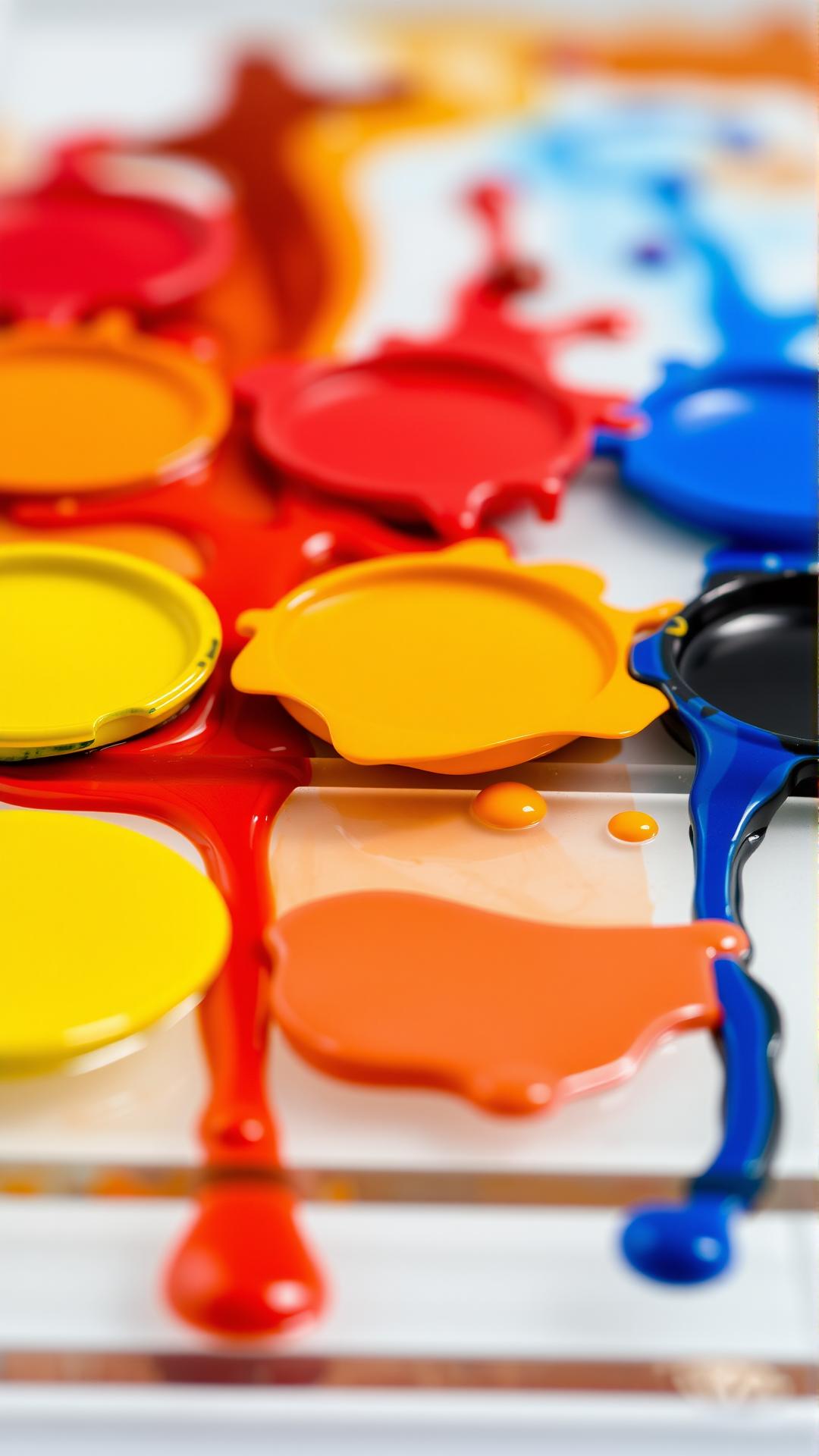
The RGB (Red, Green, Blue) model, primarily used in digital and electronic displays, relies on the additive color mixing principle. When combined, red, green, and blue light creates white, representing an ideal scenario for screens. However, this model doesn’t translate directly to paint mixtures, where subtractive color mixing takes over. Therefore, understanding RGB is useful for envisioning digital spaces but requires adjustment when applying color in physical form.
Conversely, the CMY (Cyan, Magenta, Yellow) model operates on subtractive color mixing principles, where the combination of colored pigments absorbs certain wavelengths of light, reflecting others. This model is fundamental in print design and can assist painters in mixing and selecting colors. For instance, combining all three can yield a rich black, helping to achieve deeper, more saturated hues in paint formulations.
The RYB (Red, Yellow, Blue) model holds particular importance in traditional painting and art classes. Frequently referred to as the artist’s primary colors, this model allows for intuitive color mixing. Here, red, yellow, and blue pigments can mix to create secondary colors—green, orange, and purple—thus broadening the palette available to artists and interior designers alike. The RYB model simplifies the understanding of color nuances, helping users evoke specific moods and atmospheres in their work.
Understanding the implications of these models allows for flexibility and creativity when choosing color combinations in paint. By experimenting with mixtures and using the right models, one can unlock an expansive array of stunning color pairings. The results not only enhance the aesthetic appeal of spaces but also contribute to the emotional atmosphere, setting the stage for how interiors resonate with their occupants. Each model offers unique advantages, shedding light on the intricate dance of colors within artistic expression.
The Psychology of Color
Understanding Emotional Influences
Colors have a profound ability to evoke emotions and trigger behavioral responses, making their strategic selection foundational in interior design and branding. The psychology of color examines how hues can influence mood, perceptions, and even actions. Warm colors like reds, yellows, and oranges are known to stimulate energy and warmth, often creating an inviting and vibrant atmosphere. In contrast, cool colors such as blues, greens, and purples tend to create a calm, serene environment, promoting relaxation and tranquility.
In interior spaces, these reactions can enhance the user’s experience. For instance, using soft blue tones in a bedroom may facilitate restful sleep, whereas a bold yellow in a kitchen could inspire creativity and appetite. This distinction highlights the necessity of understanding the implications behind color choices when planning spaces.
Colors and Branding: Engaging Audiences
In branding, color has the power not only to establish an identity but also to influence consumer perception and behavior. Companies often leverage color to convey specific messages or emotions associated with their brand values. For example, blue signifies trust and dependability, making it a popular choice among financial institutions. Conversely, red, with its associations of urgency and excitement, can drive impulse buying behaviors—common in sales and promotional materials.
Brands carefully consider color palettes when presenting their products to ensure alignment with their desired emotional response. The selection of colors in packaging, logos, and company-related materials can significantly impact consumer engagement and loyalty. Studies show that colors can affect buying decisions by up to 85%, underscoring their importance in marketing strategies.
Understanding the psychological effects of color encourages both designers and marketers to be intentional about their color combinations. When creating stunning interiors or compelling branding, it is essential to match color choices with the intended emotional outcome, resonating with the audience on a deeper level. The effective use of color can transform spaces and perceptions, leading to stunning results that captivate and engage the viewer.
Complementary Colors and Contrast
The Concept of Complementary Colors
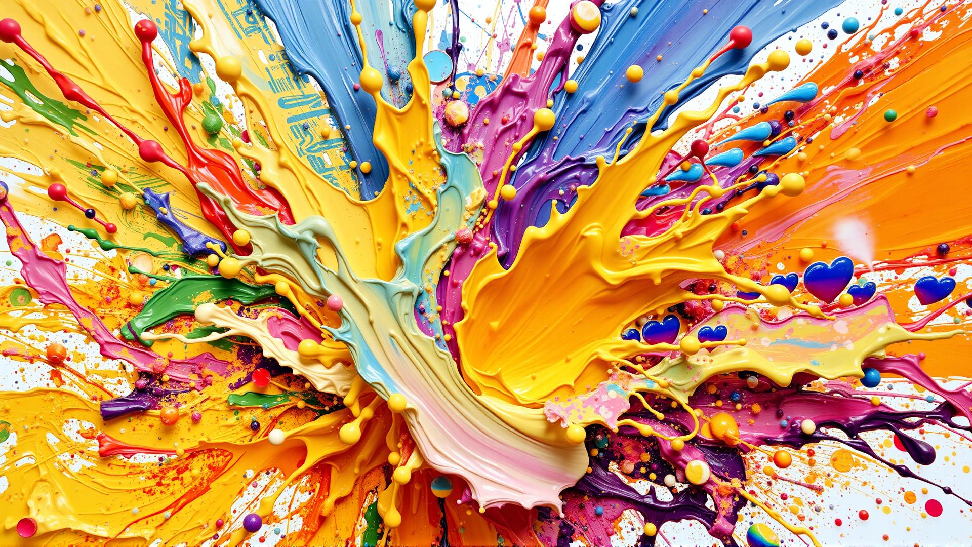
Complementary colors, situated opposite each other on the color wheel, hold the key to creating dynamic contrasts in design. When paired together, these colors energize the space, offering a visual equilibrium that captivates the eye. For example, the pairing of blue and orange or red and green can turn a dull room into a vibrant environment. The natural tension created by these combinations produces a feeling of excitement and depth, encouraging viewers to engage more fully with their surroundings.
This phenomenon occurs due to the way our eyes perceive color. When complementary colors are used in close proximity, they make each other appear more vivid, creating a stunning visual effect that can dramatically enhance interior spaces. Using complementary colors strategically can draw attention to specific areas or objects within the room, guiding the observer’s gaze where desired and creating focal points that are both functional and aesthetically pleasing.
Applying Contrast Effectively

Using complementary colors also amplifies the effect of contrast in a space, serving to highlight shapes, patterns, and textures. This strategy can be particularly effective in rooms where light plays a significant role, such as living rooms or kitchens. A bright yellow wall adorned with navy blue accents, for example, can create a striking effect that feels both cheerful and grounded. This technique invites exploration and interaction, making the space feel more inviting and stimulating.
For successful application, it’s important to strike a balance between overwhelming and underwhelming combinations. A well-thought-out scheme might include a dominant complementary color to set the mood, supported by neutral tones that allow the vibrant hues to shine without competing for attention. Matching furniture or accessories in complementary shades can pull the design together, enhancing the overall flow.
It’s essential to consider the materials and textures used alongside these colors. A matte finish in one color combined with a glossy texture in its complementary can create an interplay that adds depth and dimension to the space. Whether it’s paint, fabric, or furniture, each layer adds to the narrative established by the colors.
Analogous and Triadic Color Schemes
Understanding Analogous Color Schemes
Analogous color schemes consist of colors that sit next to each other on the color wheel. These colors share similar hues, creating a serene and cohesive aesthetic when used in design. Typically made up of three colors, an analogous scheme often includes a primary color, along with its two neighboring hues. This combination generally evokes a sense of harmony and is particularly effective in creating a soothing atmosphere in interior spaces.
In practice, when employing an analogous color scheme, it is advisable to choose one dominant color and then select one or two secondary shades to complement it. For instance, a pairing of blue, blue-green, and green can transform a room into a tranquil oasis, ideal for bedrooms or meditation areas. Conversely, using warmer tones such as red, red-orange, and orange can inject enthusiasm and energy into social spaces like living rooms or kitchens.
The Impact of Triadic Color Schemes
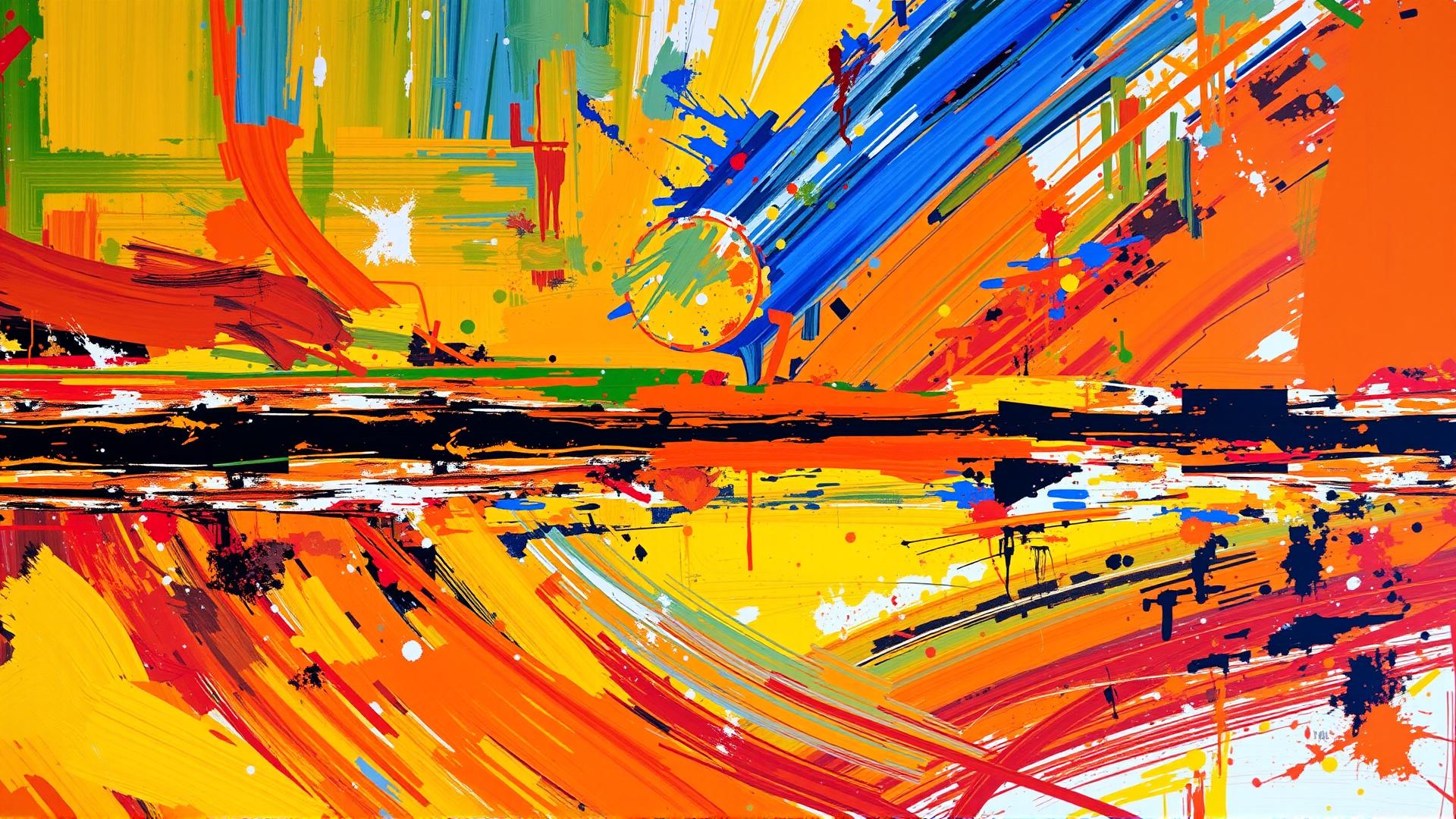
Triadic color schemes, on the other hand, involve three colors that are evenly spaced around the color wheel. This method offers a dynamic yet balanced approach to color application. A classic example would be the combination of red, yellow, and blue. By utilizing a triadic scheme, a room can achieve a vibrant and playful ambiance, making it perfect for children’s spaces or creative studios.
The beauty of a triadic scheme lies in its capacity to maintain vibrancy without overwhelming viewers. The key to mastering this technique is to balance the colors based on intensity and saturation. For instance, if one opts for a bright yellow as the dominant color, it might be beneficial to tone down the other two colors—such as using muted red and blue—to avoid visual chaos. This balance is essential for keeping the space inviting while still playful.
Both analogous and triadic schemes have their unique advantages, empowering designers and homeowners to enhance interiors aesthetically without the need for intense contrasts. By understanding and applying these color relationships effectively, one can create stunning environments that resonate harmony and creativity, setting the stage for beautifully orchestrated interiors filled with enriching color narratives.
Practical Tips for Choosing Colors

Selecting paint colors that harmonize beautifully is both an art and a science. Individuals often find themselves overwhelmed by the multitude of choices available, yet mastering this process can transform spaces dramatically. Here are practical strategies to help homeowners and designers choose paint colors that complement each other effectively.
Understand Color Relationships
A fundamental aspect of color theory involves understanding the relationships between different colors. Familiarize yourself with the color wheel. Complementary colors—those located opposite each other on the wheel—offer striking contrasts, while analogous colors—adjacent on the wheel—create soothing blends. Consider incorporating these dynamics into your project, whether designing a vibrant living room or a serene bedroom.
Consider Lighting Conditions
The color of your walls will be perceived differently depending on lighting conditions. Natural light, fluorescent, and incandescent bulbs can significantly alter the appearance of paint colors. Always test paint samples under the specific lighting conditions of the space. Paint patches on different walls to observe how colors transform throughout the day.
Create a Mood Board
Visualizing your ideas can greatly simplify the decision-making process. Compile a mood board featuring elements like fabric swatches, furniture, decorative items, and paint samples that inspire you. This collage will serve as a guide when selecting paint colors that not only match but also enhance your intended atmosphere.
Select a Base Color
Begin your color selection process with a base color that resonates with the overall theme of your home. Whether opting for a neutral, bold, or pastel hue, your base color will set the tone for the entire project. From here, build your palette by choosing complementary or contrasting colors that showcase your base effectively.
Incorporate Natural Elements
Magically inspired by the surrounding landscape can aid in selecting beautiful paint combinations. Consider colors that mirror nature, such as earthy greens and soft browns, or vibrant floral shades. Using nature as a guideline helps ground your choices in realism, ensuring your palette connects with both interior and exterior settings.
Experiment with your selections. Sometimes unexpected combinations yield stunning results that resonate personally. Trusted by many, these actionable tips can lead to remarkable outcomes, enhancing any interior or exterior project with vivid, harmonious color combinations. Aim for a palette that not only looks good but also feels right for your space.
Trends in Color Combinations
In the dynamic landscape of interior design, the paint industry is constantly evolving, reflecting cultural shifts and aesthetic preferences. Recent trends in color combinations reveal a fascinating blend of classic hues and novel shades that appeal to modern sensibilities. Understanding these trends is crucial for anyone aiming to create spaces that resonate with both beauty and personality.
Popular Color Palettes
One of the standout trends is the resurgence of earth tones. Shades like terracotta, sage green, and soft taupe have gained immense popularity, providing warmth and a connection to nature. These hues create calming environments, ideal for living spaces where relaxation is paramount. When combined with crisp whites for trim or accent walls, they achieve a balance that is both welcoming and sophisticated.
Vibrant jewel tones are making a noticeable impact. Deep emerald greens, royal blues, and rich burgundies add drama and elegance to interiors. Pairing these bold colors with lighter neutrals not only creates contrast but also allows for a dramatic flair without overwhelming the senses. Such combinations are perfect for accent walls or statement furniture pieces, providing a focal point that draws the eye.
Emerging Styles in Color Use
Another exciting development is the trend of monochromatic schemes, where varied tones of a single color are used to create depth and dimension. This approach allows for subtle variations that can make a room feel cohesive yet visually interesting. For instance, different shades of blue can be layered from the walls to furnishings, creating an immersive experience that envelops the inhabitant.
There is a shift towards unexpected color pairings that challenge traditional notions of aesthetics. Combinations such as mustard yellow with muted lavender or teal with rusty orange are gaining traction, promoting individuality and creative expression. These unique pairings encourage homeowners to showcase their personality through bold choices, transforming spaces into reflections of their owners’ unique styles.
As sustainability continues to influence consumer choices, paint brands are also responding with eco-friendly options in trendy colors. This aligns well with a growing desire for responsible living, enabling the creation of beautiful interiors that respect the planet.
The evolving trends in color combinations within the paint industry highlight a blend of comfort, individuality, and sustainability. By understanding and utilizing these trends, anyone can cultivate stunning interiors that are both contemporary and timeless.
Conclusions
The intricacies of color combinations in paint extend far beyond mere aesthetics. By applying the principles of color theory and understanding the emotional responses evoked by various hues, you can create stunning environments that inspire and uplift. The right color palette has the power to influence moods and enhance living spaces, making it an essential consideration in any design project.
Experimenting with color combinations allows for personal expression and creativity. As you embark on your painting endeavors, remember to consider both the harmony and contrast of your chosen colors. Armed with the knowledge of effective color schemes, you are now ready to unlock a world of stunning possibilities that will bring your visions to life.


